Promo Cards in Shopify Using Metafields
#1. What Are Promo Cards?
Promo cards are non product assets displayed alongside products within the grid. The most common types of assets are Images, Text, CTAs, & Links, but can also include GIFs for a more dynamic experience.
- The use cases are many, and include for example:
- Highlighting new assortments/categories.
- Pushing shoppers to campaign pages.
- Storytelling around material, processes, or origins.
- Displaying promotions to drive behavior e.g, free shipping above a set limit.
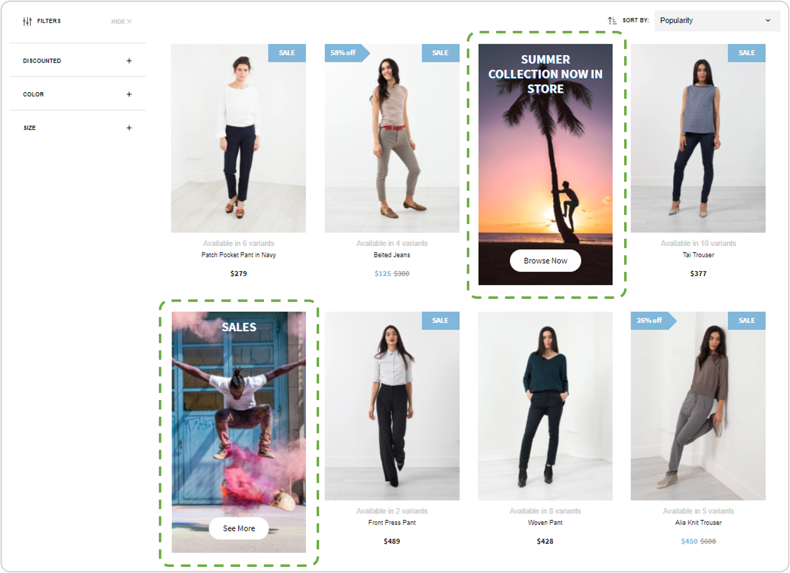
Example: Two Promo Cards displayed in the product grid.
#2. Input Values
In Findify best practice, we utilize the following input values to enable a wide set of different use cases. If unpopulated, a field will not appear - therefore it is not necessary to utilize all of them at the same time.
Input Values that can be utilized:
- Position: Where in the grid the card should be displayed. #1 = first, etc.
- Image URL: Image displayed. We advise this be hosted within Shopify.
- Overlay: Should there be a transparent color overlay? Stated as RGBA color.
- Target URL: Should the area be clickable, and where should it then lead?
- Header: Main message.
- Top-header: Text shown above header.
- Sub-header: Text shown below header.
- CTA: "Button" displayed with call to action.
- Footer: Text shown below the image area.
#3. Requirements To Apply This Guide
- This guide is applicable for Shopify only.
- This integration requires the merchant to set up the necessary data and populate the promo cards through the use of metafields.
- This solution is built for individual collection control. Bulk management can however be utilized by bulk editing the input values in metafields.
#4. Time Estimates
- Set up in Shopify: 1 hour
- Integration: 1 hour
- Styling: 5-15 hours
- Populating Cards: Depends on the scope
#5. Overview Of Integration Steps
Step 1: Set up required metafield structure (merchant)
Step 2: Populate at least one card
Step 3: Make the data available
Step 4: Integrate front end activation through Findify DevTools
Step 5: Styling
Step 1: Set Up Required Metafield Structure (Merchant)
In order to manage metafields in Shopify, you need the capability in place.
For this overview we have utilized the 'Custom Fields' app.
Choice of Meta Fields App
The following guide is done using the 'Custom Fields' app but meta fields are stored in Shopify so please use the meta fields app you prefer. The UX of the dashboard setup might alter, but functionality in your store will be the same.
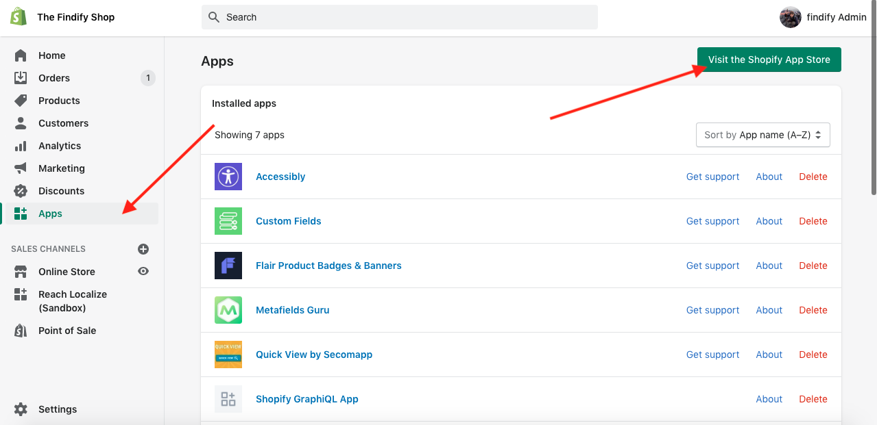
In your Shopify dashboard, visit the App Store.
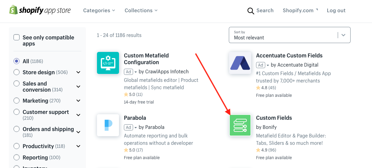
Install the 'Custom Fields' app.
Enter the app, ensure you are adding data on a collection level, and set up custom fields. These fields will later be used to populate the cards with all necessary information (Images, text, links etc.)
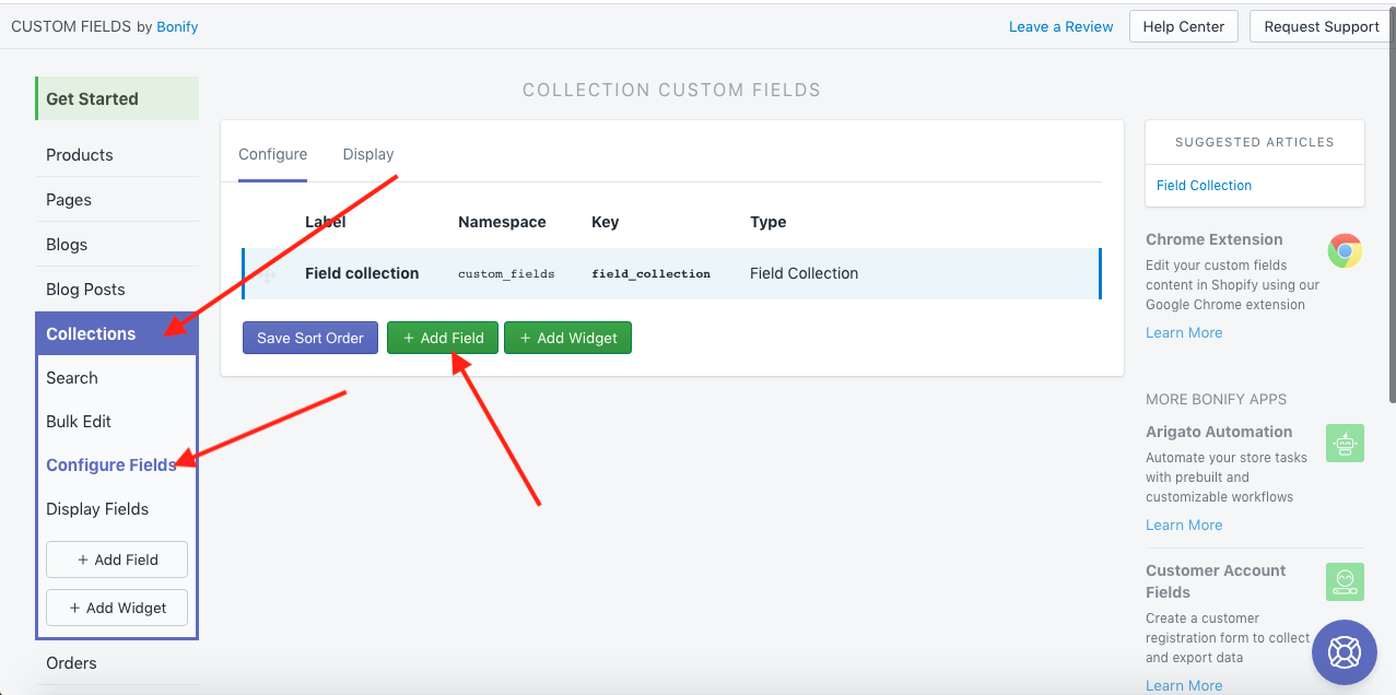
Select "Add Field" in the collection configurations.
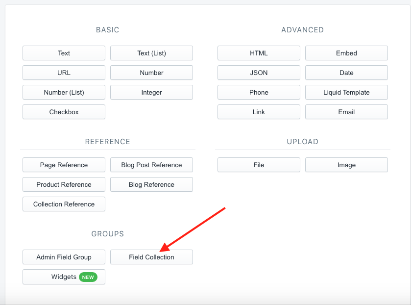
Select "Field Collection".
Define the Field Collection Label (e.g. Findify Promo Cards) and add the required fields.
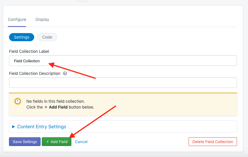
Define Name & click "+ Add Field".
Overview of the added fields.
You have now set up the fields that are required.
The next step is to start populating the fields with specific Promo Card data.
Step 2: Populate At Least One Card
Go back to the Shopify Dashboard and visit a specific collection page.
Products > Collections > "Collection Name"
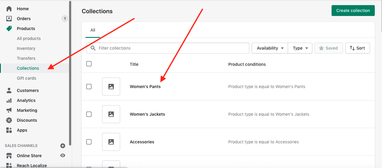
Select a collection to set up promo cards for.
Populate the custom fields you previously set up.
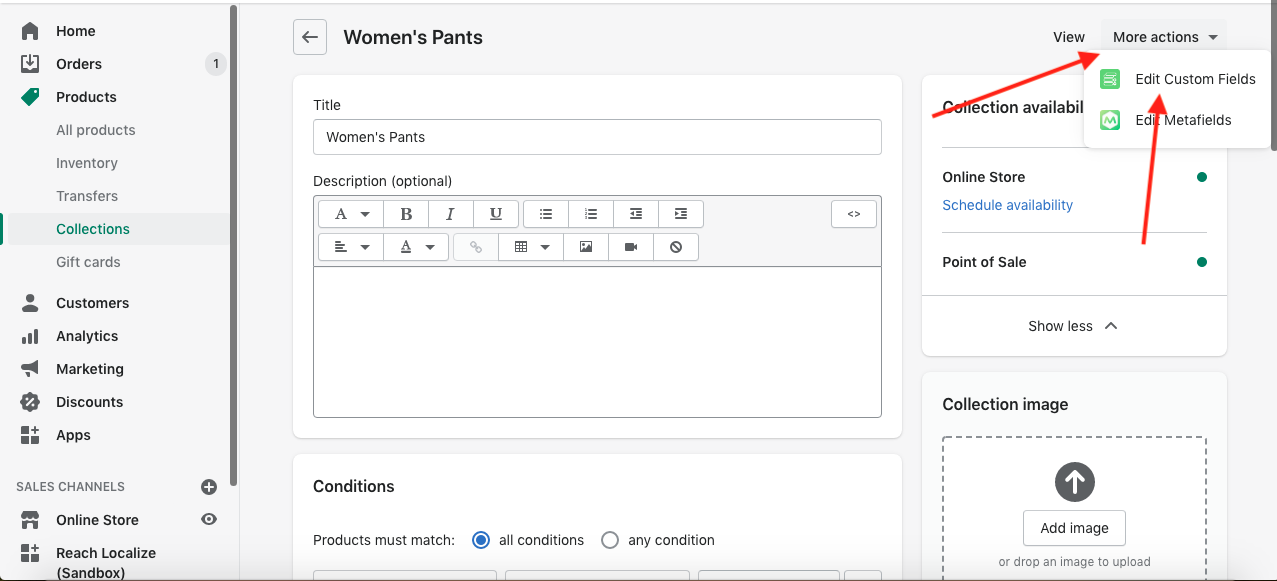
Click on "More actions" and choose "Edit Custom Fields".
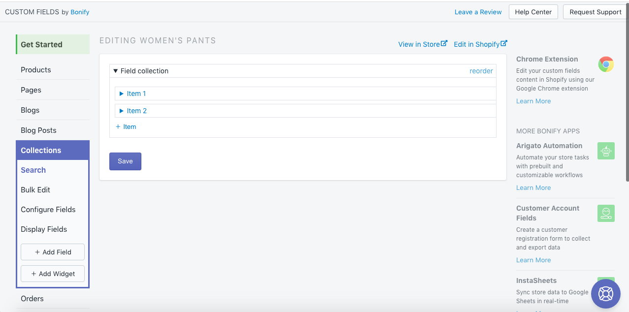
Click "+Item" to add a new Promo Card and populate the fields you want to display.
This card is created populating the following data:
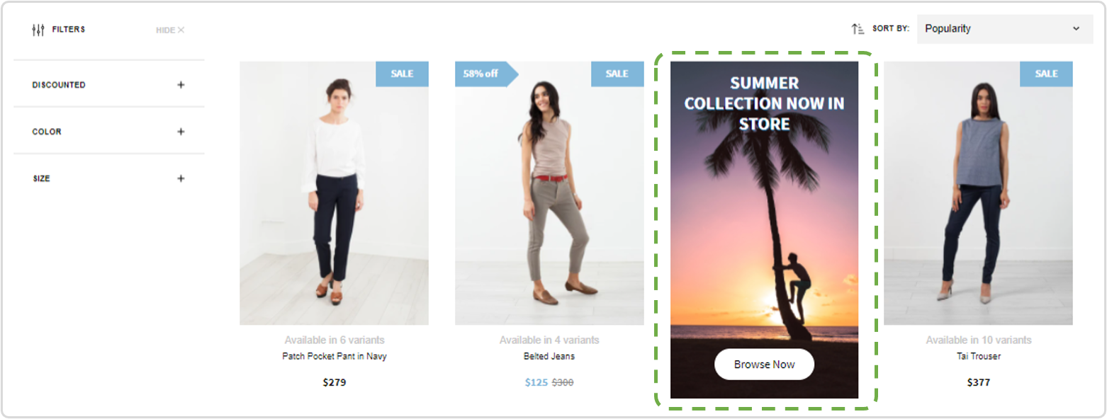
Example card...
...created by adding data in these fields, leaving the remaining empty.
Step 3: Make The Data Available
In the opened window you can edit the items which will be shown on collection pages.
Then you need to add some code to your collection template. You need to go to the theme files and edit code.
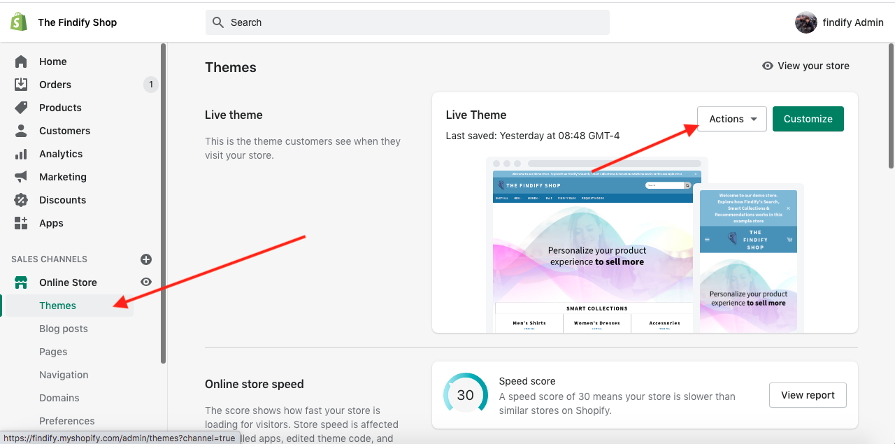
Open "Templates" and choose "collection.liquid" file. Add this code into findify-fallback container.
<div class="findify-promo-cards">
      <script data-collection-json>
          {{ collection.metafields.custom_fields["field_collection"] | json }}
      </script>
     </div>
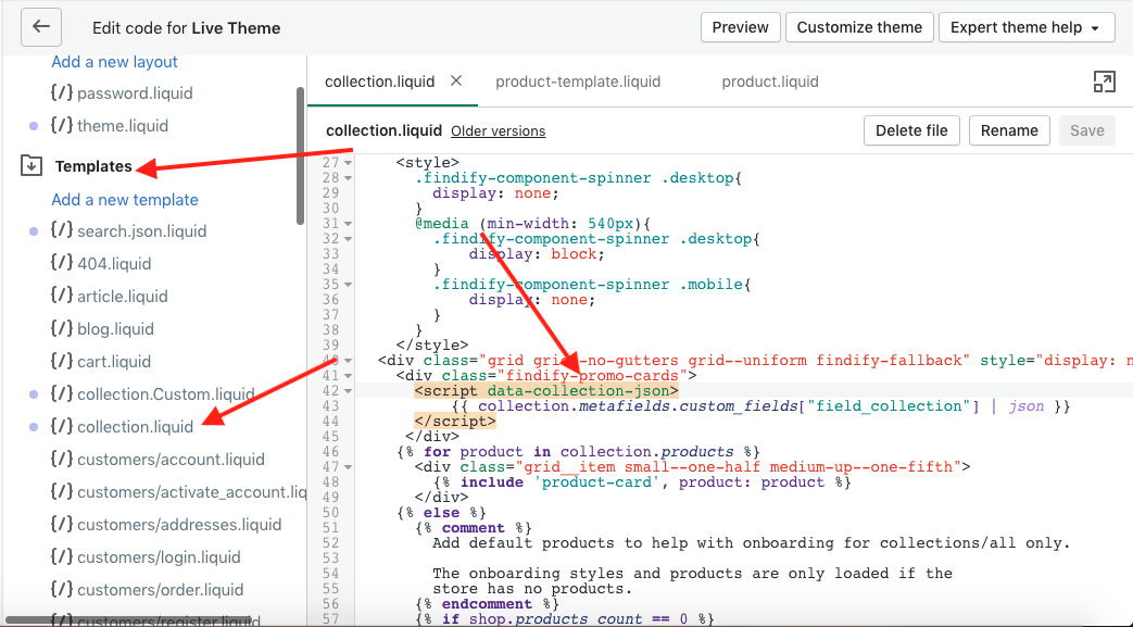
Don't forget to save your changes!
Step 4: Integrate Front End Activation Through Findify DevTools
The promo cards are activated by adding a standard code into the MJS for your store.
Findify's team will be happy to assist with this task.
Part 2
Please follow these steps to activate the promo cards
Step 5: Styling
Each component (e.g. Title & Sub-header) can be styled freely utilizing the DevTools.
However, each component will be shown with a consistent style across cards.
Changing the styling between cards is a complex task.
If you want to be able to apply alternative styling (e.g. two different styles for the header) it is much easier to utilize different fields and style each one differently. For example, the field "Header" is used for the standard appearance of the header and the field "top-header" for the alternative style.
Updated over 1 year ago
