Size Control for Promo Cards
Control size of Promo cards across the site
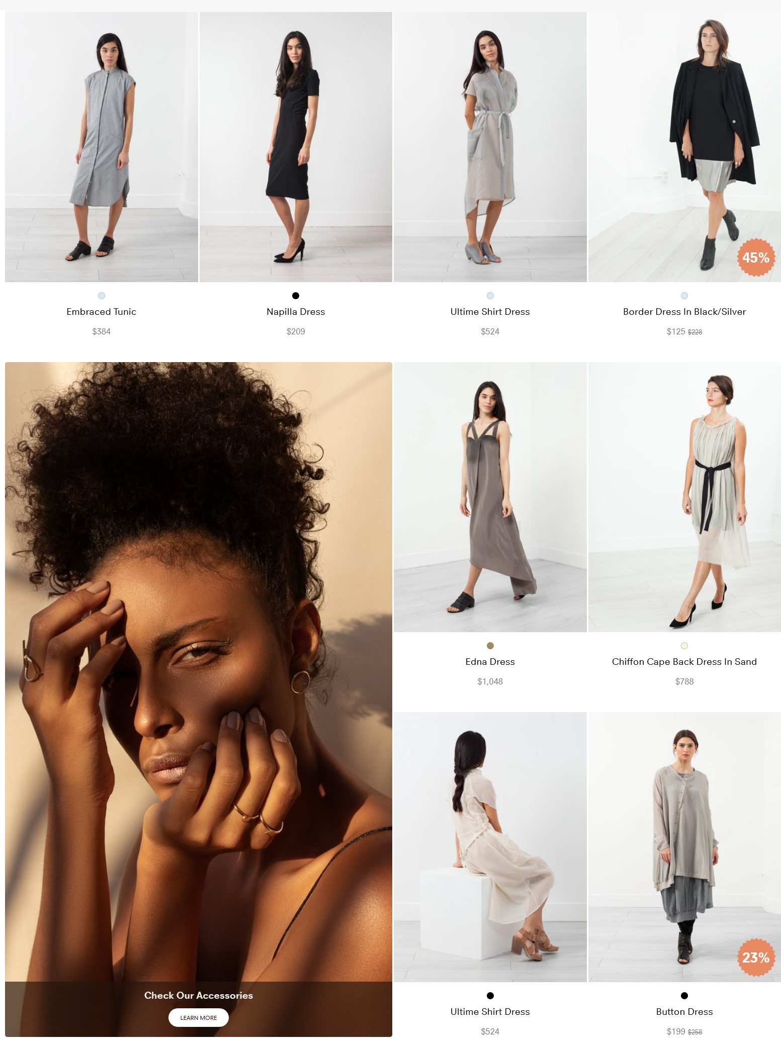
Large sized promo card in the product grid
#1. What are Promo Cards?
Promo Card are non-product information that is shown in the grid. The most common use-cases (when you might want to utilize Promo Cards) are for campaigns, education, buyers guides etc. The Campaign functionality makes it easy set up Promo Cards within the Findify Merchant Dashboard. It is also easy to control for what search queries & within which collections your Promo Cards should appear.
Read More about Promo Cards.
#2. What is Size Control?
Size control adds the ability to alter size of different promo cards across the store.
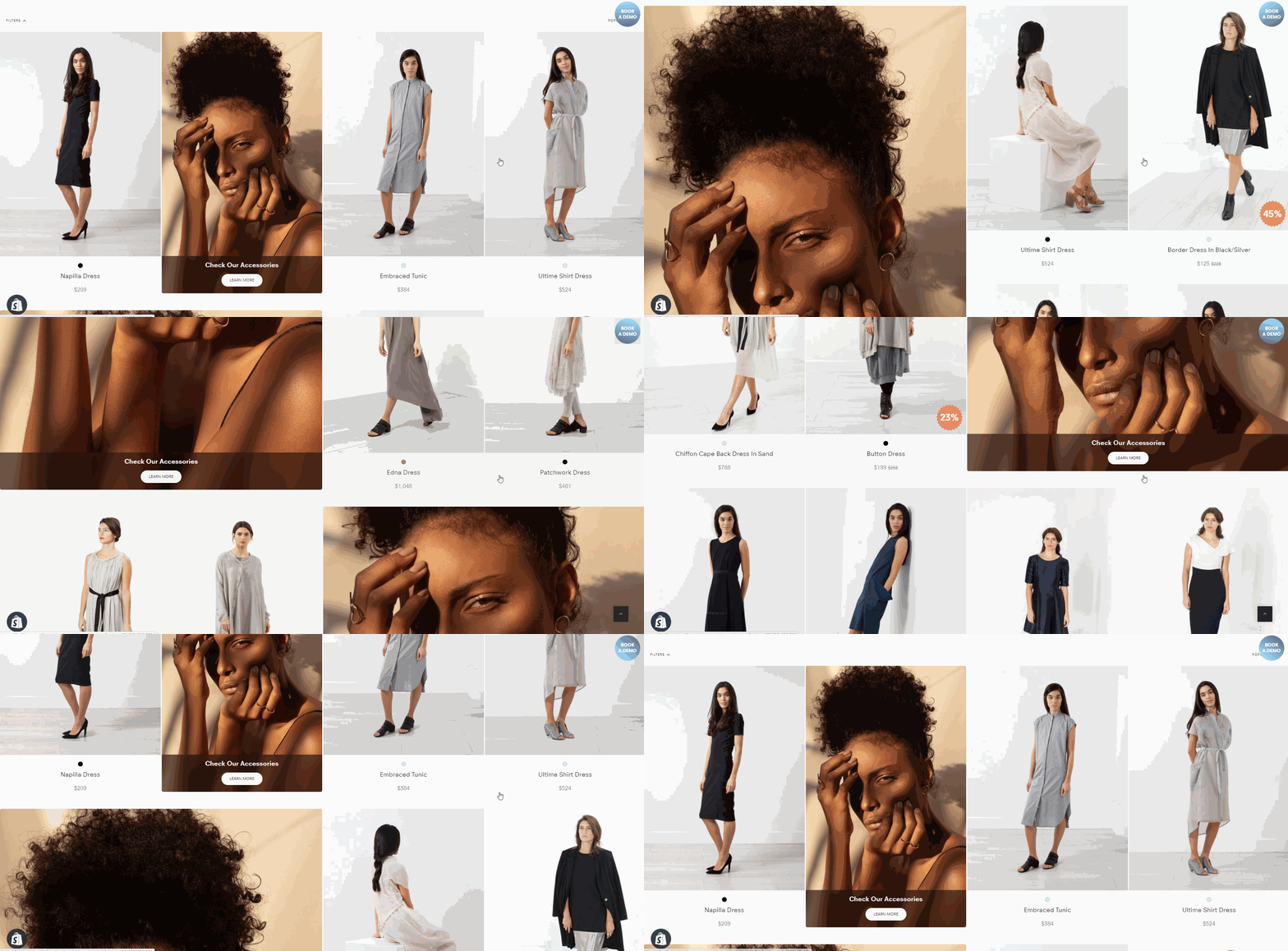
Three different sizes of promo cards shown in one collection
#3. Control Mechanism
First Generation
Please note, this is the first generation of Promo Card Size Control utilizing existing dashboard components.
The purpose of this is to generate client feedback to steer further development in the most optimal direction."I would call the UX of this first generation of control mechanism pragmatic, rather than ideal. But it's better to release an MVP version early so that we can gather real life use cases and client feedback, rather than spending time perfecting a setup that might not perfectly fit how clients want to use it."
/Joakim Amadeus Olsson, Findify CCO
We have defined three size profiles
- Size:1 - Regular one product card position
- Size:2 - Horizontal takeover of 2 product card positions
- Size:4 - Horizontal & Vertical takeover of 2 x 2 product card positions
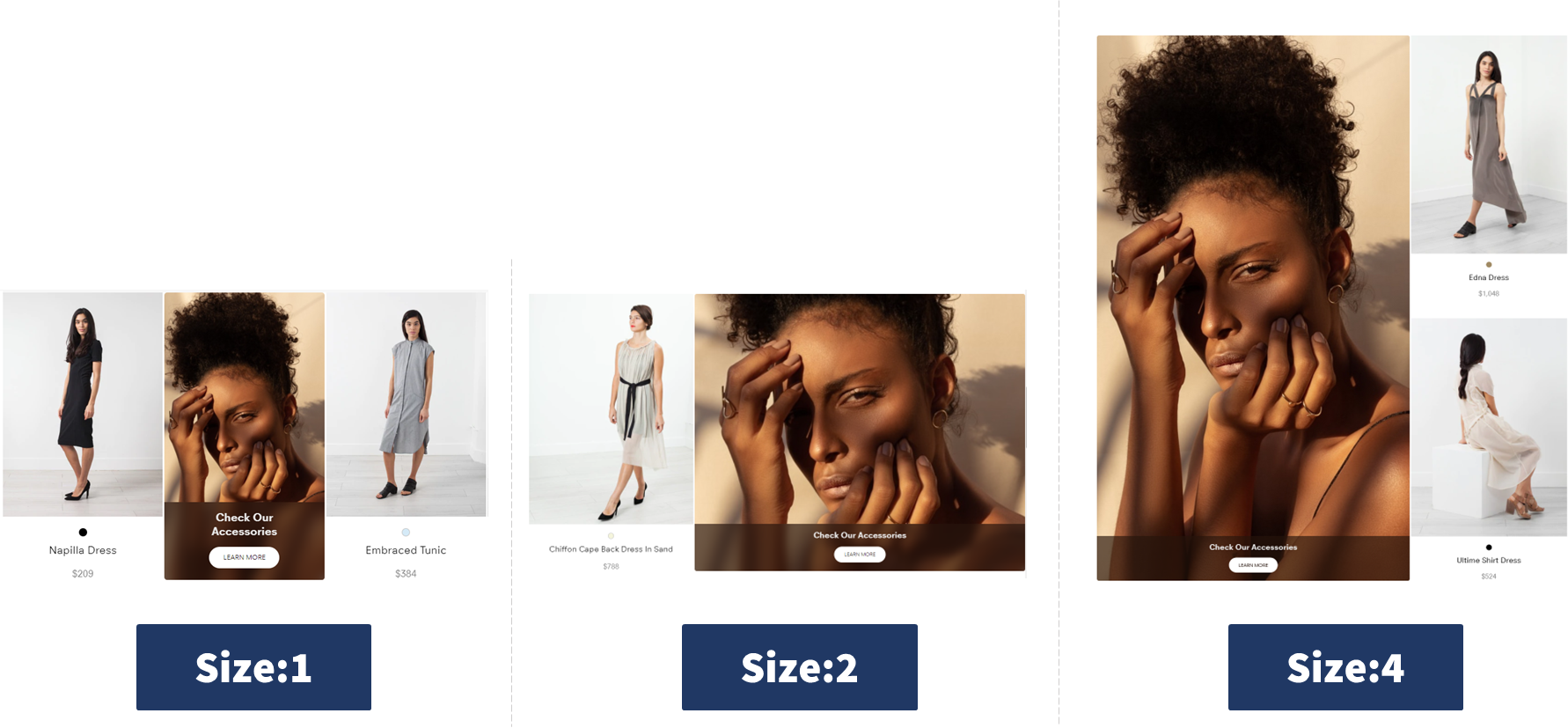
The three size profiles currently available for Promo Cards
To alter the size of a Promo Card, simply add the desired size profile to the Card Name field.
If no size profile is specified, default size will be applied. Default size can be changed per merchant, but is usually 1-tile.
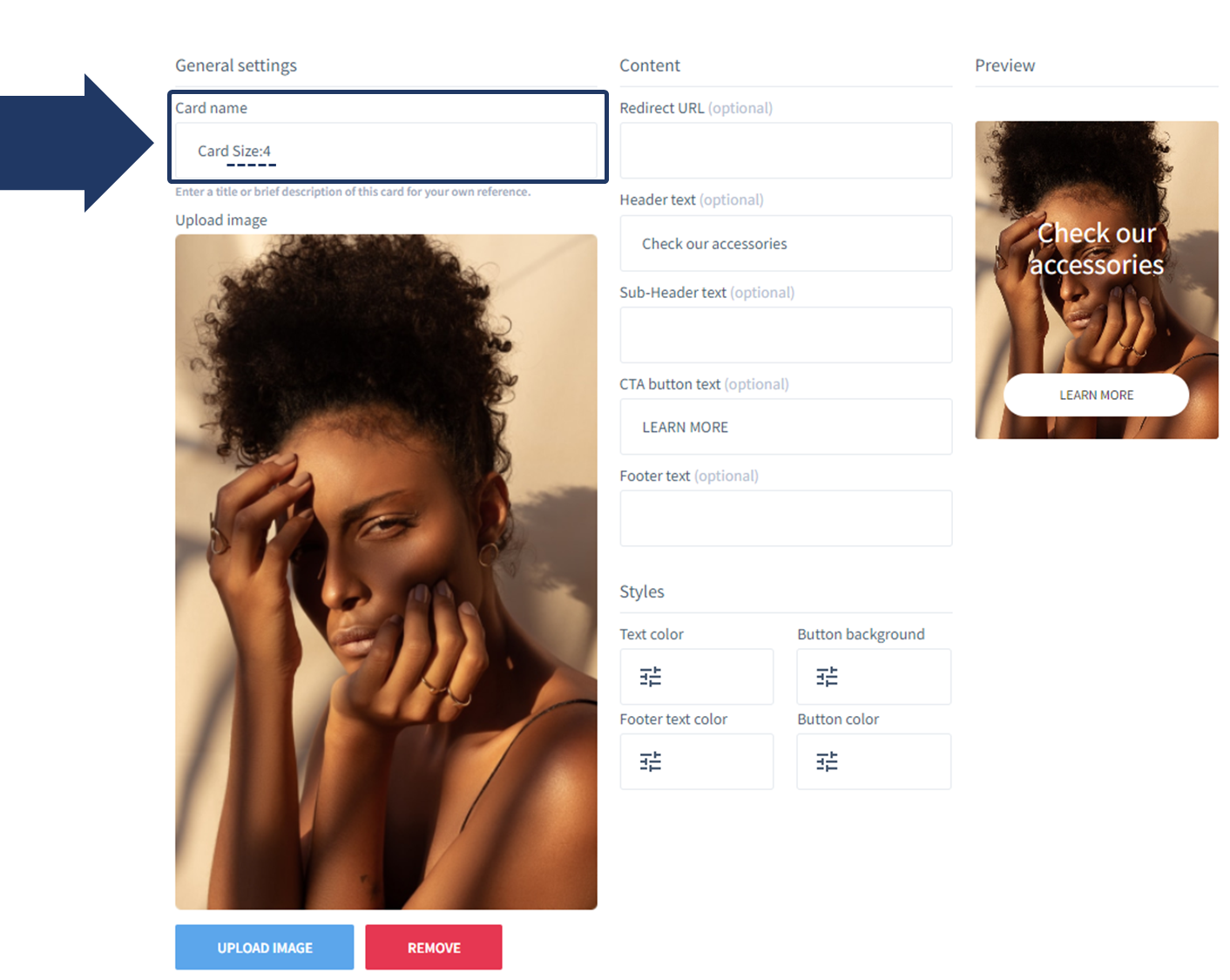
Size profile selected in the dashboard
#4. Consideration: Dynamic Positions
In developing this functionality, we had the options to either restrict possible positions (to avoid risk of overlapping cards) or enable all positions (to allow merchants freedom to tailor the experience).
Since the purpose of the size control is to enable many more use cases, we did not want to restrict this functionality but, rather, leave it up to the merchant to define where to display each card. This might be an assumption that changes in future versions based on merchant feedback.
Freedom to Overlap Card Positions
Please be considerate in where you place large sized cards so that they do not overlap.
If you have more than one large card in a campaign, we recommend to place them with a fixed position and not dynamically since that can lead to them overlapping.
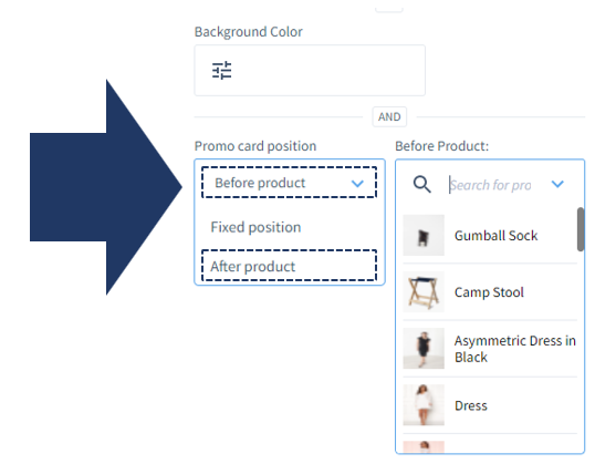
Two of the position options are dynamic i.e. that they change position based on where selected product is placed. The options are: "Before Product" & "After Product"
Fixed Positions are Recommended
Since large cards can overlap if placed next to each other, we recommend to position them with a fixed position and not dynamically if you have more than one large promo card per campaign.
#5. FAQ
Activation
Q: Does Size Control come out of the box?
A: Not Yet. This is a new functionality that we want merchant feedback around before releasing broadly. If you want to apply it, please get in touch through [email protected] or follow the steps in Technical Implementation
Position
Q: How do I define the position for Promo Cards with larger size profiles?
A: Position is defined in the dashboard, just like it is for regular sized Promo cards:
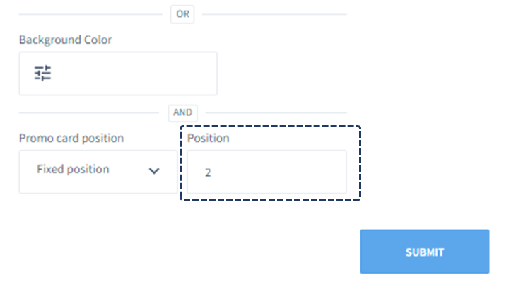
Position defined in dashboard
The larger card position will be determined from the upper left corner.
Only exception is on the edge of the grid. See next section.
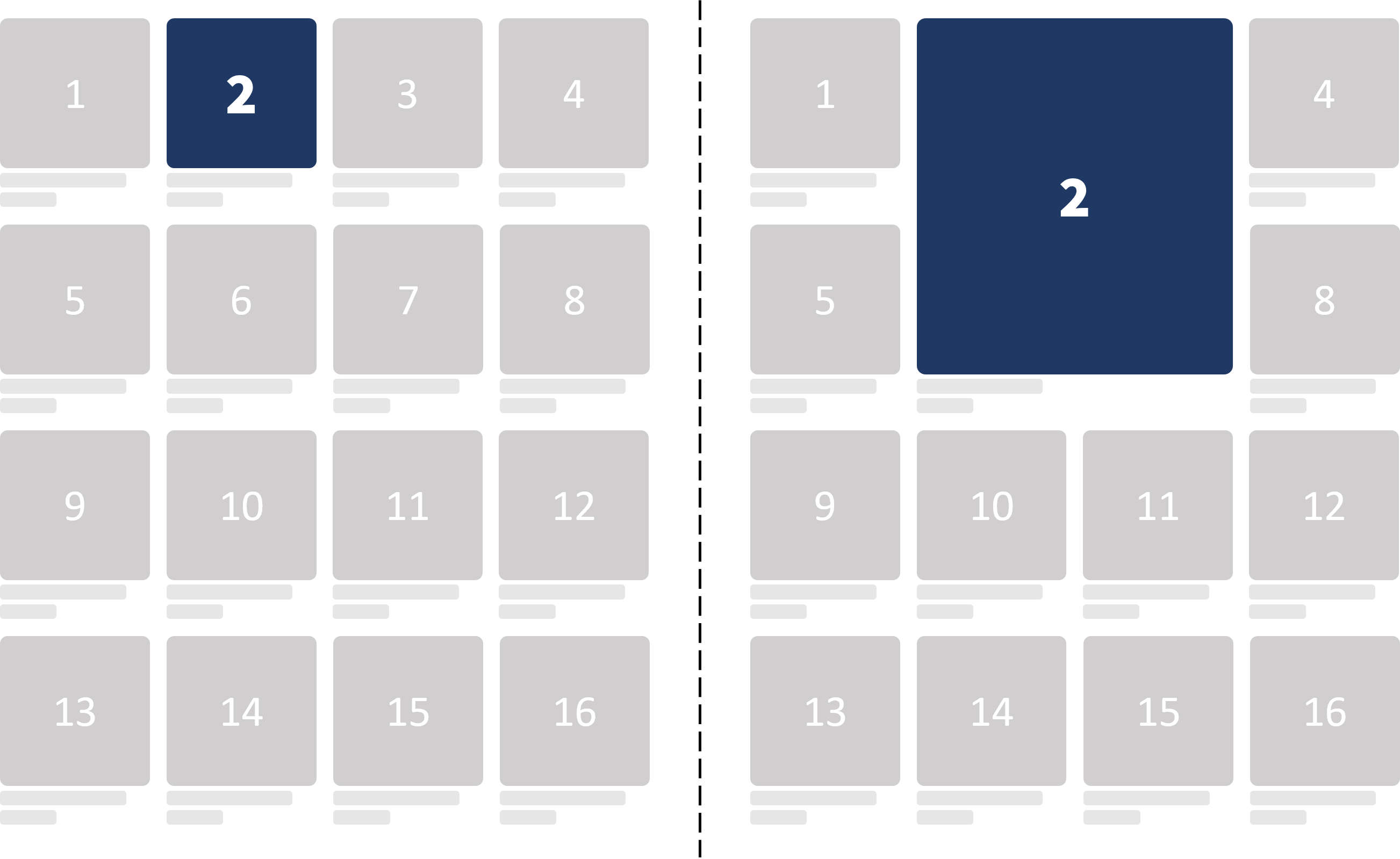
Position is determined by upper left corner
Q: Will placing a Large Promo Card at the edge of the grid break the pattern?
A: No. If you have e.g. a 4 column grid, placing a large promo card on position 4, 8, 12 etc. will not break the grid but place the card taking over the four tiles furthest at the right. If placing it at position 4, it will affectively be displayed like it's been placed on position 3.
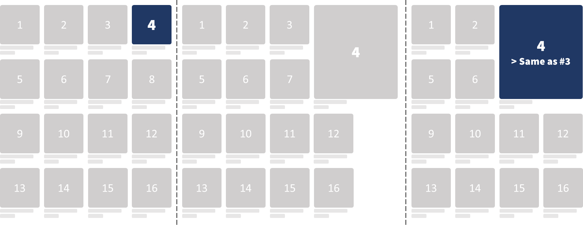
Large card placed at the edge of the grid won't break the grid.
Q: Will adding large promo cards further up influence lower cards since the product count is affected?
A: No. *In order to create consistency and predictability, position is based on fixed grid position, not relative product count.
In the graph below, the Promo Card is displayed on grid position 9, no matter if there is a promo card above or not. Note that the product count (marked in green) will vary.*
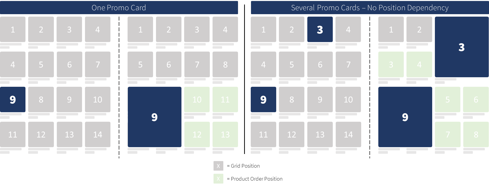
Positions are fixed, not dependent on product count
Filters
Q: How will Promo Cards behave when filtering products?
A: Too few products in the grid can make the experience feel unbalanced. Because of this, we advise merchants to stick with the default option of hiding promo cards whenever a filter is applied
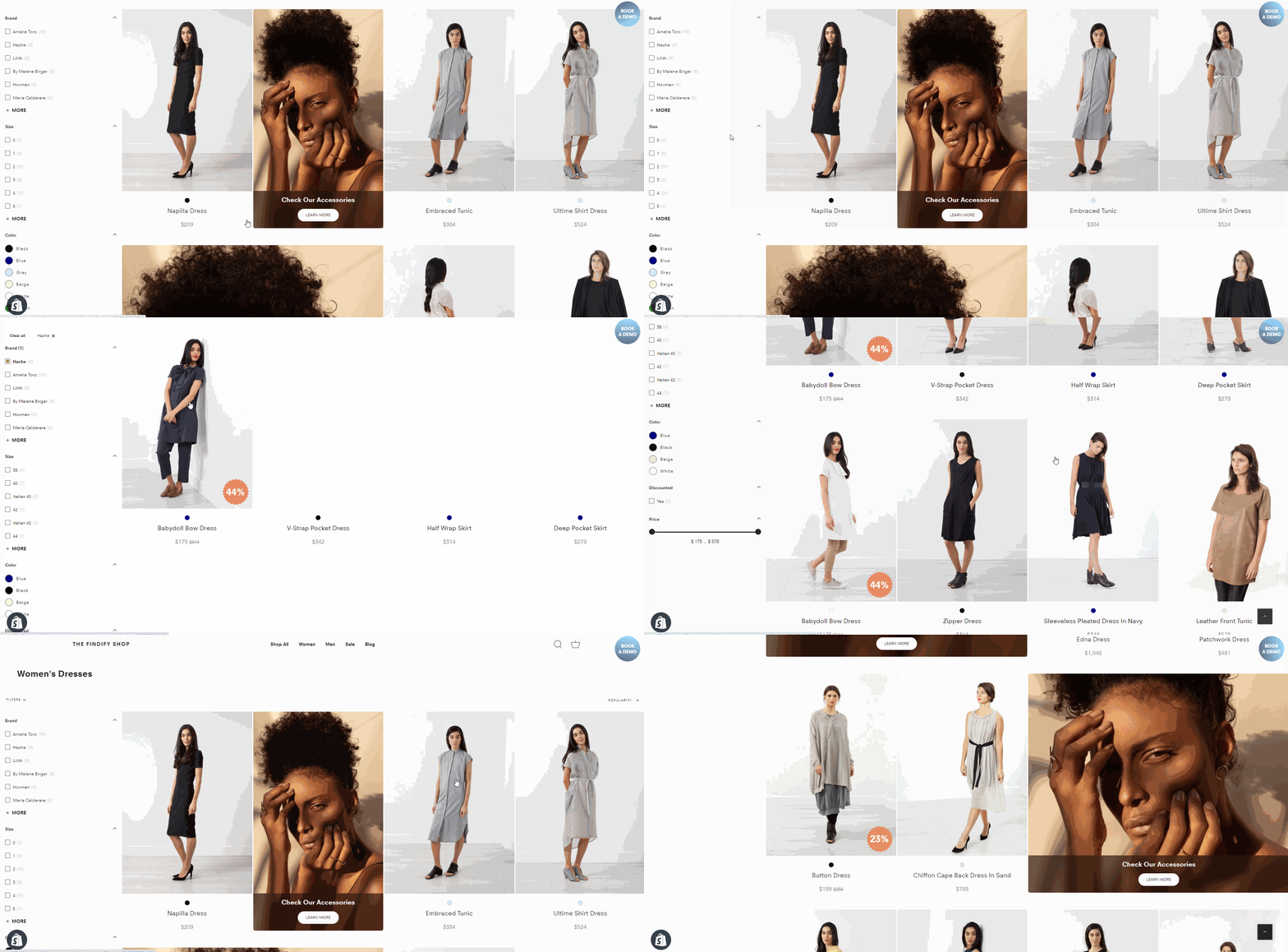
Promo cards are automatically hidden when a Filter is applied
Styling
Q: Can I still customize my Promo cards cards with Size Control?
A: Yes. You can freely customize the Promo Cards no matter the size.
#6. Technical Implementation
First, you need to create a Promo Card within the Merchant Dashboard.
Files
layouts/Search/index.tsx
components/Cards/Promo/index.tsx
handleColumns
Open layouts/Search/index.tsx file and add below code under Search and add some css.
import { handleColumns } from 'handleColumns';

{/* ...some code... */}

const sortedBreakpoints = config.getIn(['breakpoints', 'grid']).toJS().sort((a, b) => b.width - a.width);
const checkColumns = () => handleColumns(sortedBreakpoints);

useEffect(() => {
  checkColumns();

  {/* call func on resize */}
  window.addEventListener('resize', checkColumns);
  return () => window.removeEventListener('resize', checkColumns);
}, []);
/* Grid Control */

.findify-layouts--search ul.findify-components-common--grid{
  display: grid !important;
  padding-left: 0 !important;
}

li.big-grid .findify-components--cards--product__content {
  flex: 0;
}

li.big-grid .findify-components--cards--product__image {
  flex: 1;
}

li.big-grid .findify-components-common--image {
  height: 100%;
}

li.big-grid .findify-components-common--image img {
  height: 100%;
  object-fit: cover;
}

ul.findify-components-common--grid[findify-data-grid="2"] { grid-template-columns: 20% 20% 20% 20%; }
ul.findify-components-common--grid[findify-data-grid="3"] { grid-template-columns: 25% 25% 25% 25%; }
ul.findify-components-common--grid[findify-data-grid="4"] { grid-template-columns: 33.333% 33.333% 33.333%; }
ul.findify-components-common--grid[findify-data-grid="6"] { grid-template-columns: 50% 50%; }
ul.findify-components-common--grid[findify-data-grid="12"] { grid-template-columns: 100%; }
Create handleColumns component.
{/* function changes findify-data-grid attribute when
 		columns chaning and resets all broken-grid elements */}

export const handleColumns = (sortedBreakpoints) => {
  let currentColumn = false;
  sortedBreakpoints.map((el) => {
    if(window.innerWidth > el.width && !currentColumn) {
      if(currentColumn === el.value) { return false }
      currentColumn = el.value;
    }
  });

  const container = document.querySelector(".findify-layouts--search ul.findify-components-common--grid");

  if(container && currentColumn) {
    if(parseInt(container.getAttribute('findify-data-grid')) !== currentColumn) {
      container.setAttribute('findify-data-grid', currentColumn);

      document.querySelectorAll('.big-grid').forEach((product) => {
        product.style.gridColumn = null;
        product.style.gridRow = null;
        product.classList.remove('big-grid');
      });

      window.currentColumn = currentColumn;
    }
  }
}
In components/Cards/Promo/index.tsx, add below code before return(). Don't forget to import useRef, useEffect.
const promoTitle = card.get('title')?.toLowerCase();
const promoRef = useRef();
const promoParent = promoRef?.current?.parentElement;

const promoSize =
      promoTitle?.includes('size:2') ? true
: promoTitle?.includes('size:4') ? 'expanded' : false;

if(promoParent && promoSize) {
  promoParent.className.includes('promo-broken-grid')
    ? ''
  : promoParent.classList.add('promo-broken-grid')

  const column =  window.currentColumn;
  const order = parseInt(promoParent.style.order);

  {/* rowOrder returns number of row where our Promo Card should be. For example: order = 5; columns = 4;
    5 / (12 / 4) = 1.666667. We round this number to bigger one, so it is 2. We should locate our Promo Card on the second row. */}

  const rowOrder = Math.ceil(order / (12 / column));

  {/* If we have expanded Promo, we need to expand height.
    For example, if we have Promo if first row, we expand the height, so it will be grid-row: 1/3 */};

  promoSize === 'expanded'
    ?  promoParent.style.gridRow = `${rowOrder} / ${rowOrder + 2}`
  :  promoParent.style.gridRow = `${rowOrder} / ${rowOrder}`


  {/* If columnOrder === 1 || 2, we position our Promo Card to the left. Else, to the right.
    rightValues keys are columns. Example: column = 3; If positioning is right, grid-column = 3/5 */}

  const rightValues = {
    '2': '5/7',
    '3': '3/5',
    '4': '2/4',
    '6': '1/3',
  }

  const columnOrder = order % (12 / column);

  columnOrder === 1 || columnOrder === 2
    ? promoParent.style.gridColumn = '1/3'
  : promoParent.style.gridColumn = rightValues[column]

}
Finally, add 'ref={promoRef}' attribute to Promo Card wrapper
return (
    <a
      onClick={onClick}
      className={cx(theme.root, `findify-promo-${card.get('id')}`)}
      href={card.get('url')}
      ref={promoRef}
    >
Updated almost 2 years ago
