Color Swatches
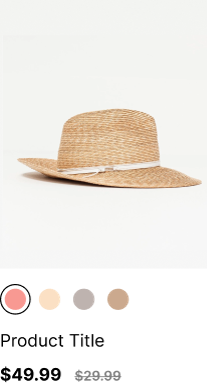
Color swatches play a crucial role in enhancing the visual appeal and user experience of ecommerce platforms. They provide customers with a quick and intuitive way to browse products based on color preferences, facilitating easier navigation and informed purchase decisions.
Here’s how to integrate Findify-powered color swatches within your Shopify store using Findify’s native Shopify app (built using Liquid).
Default Behavior
When integrated, the Color Swatches component exhibits the following default behavior:
- Hover Effect: On hover, the color name corresponding to the Findify color mapping is displayed.
- Active Selection: Clicking on a color activates it, highlighting the selected option.
- Display Limit: A maximum of six color options are displayed initially. If there are more than six options, a little indicator is shown to prompt users to explore additional colors by opening the product.
Merchant Configuration
Before implementing the Color Swatches component, merchants must ensure proper configuration within their Findify dashboard.
Follow these steps:
-
Configure Color Field:
- Navigate to Merchant Dashboard > Primary Settings > Filters.
- Search for "color" and ensure it is configured to be returnable on search, autocomplete, and for variants and liquid.
-
Configure ID Field:
- Similar to the color field, ensure that the "id" field is configured to be returned for variants.
-
Update Color Mapping:
- It is crucial to keep the color mapping updated. This mapping dictates which colors will be displayed. If a variant has a color that is not mapped, it will not be shown. This concept also applies to filters based on colors.
Integration with Liquid
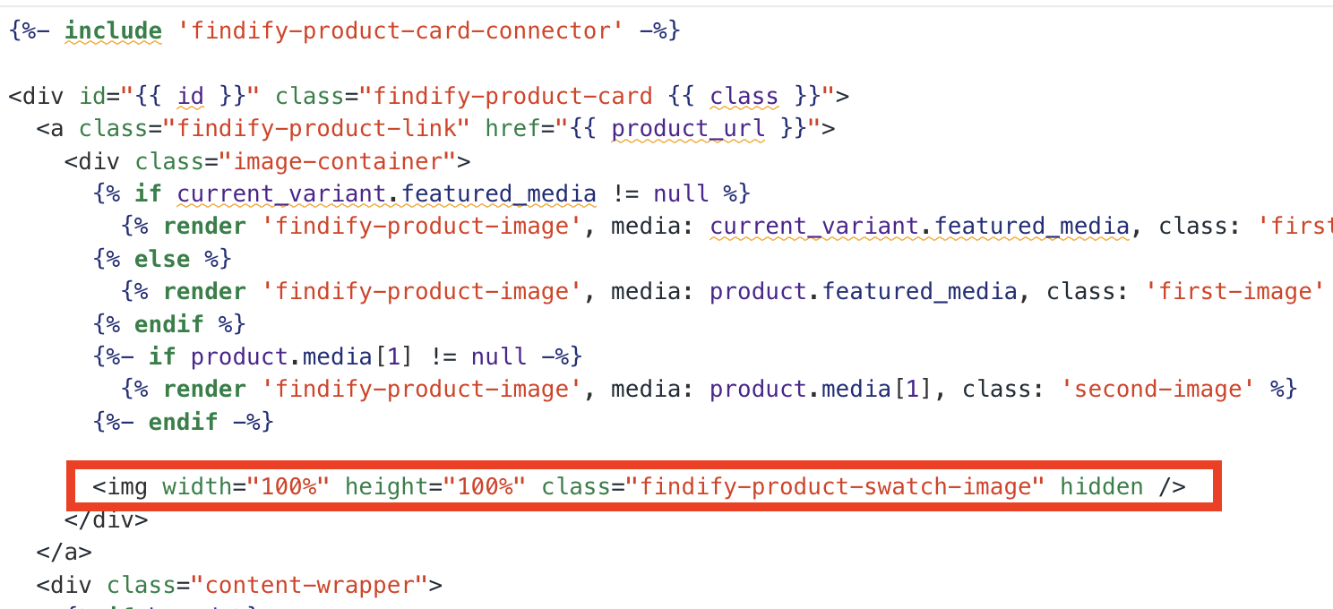
The Color Swatches component is available as a Liquid snippet within the Findify Liquid Components (https://github.com/findify/findify-liquid-components/tree/main/snippets) repository.
Since you've already imported all the files from this repository, including findify-product-swatches-color.liquid and findify-product-swatches.css, you don't need to download them again. Simply ensure that both of these snippets are included within your theme's snippets directory, particularly within findify-head-injector.liquid.
-
Confirm Snippets:
- The Color Swatches component is available as a Liquid snippet within the Findify Liquid Components GitHub repository.
- Ensure that both 'findify-product-swatches-color.liquid' and 'findify-product-swatches.css' snippets are included within your theme's snippets directory, particularly within 'findify-head-injector.liquid'.
-
Modify
findify-product-card.liquid:- Locate the file
findify-product-card.liquidwithin your theme's sections directory. - Uncomment the following code snippet to display Color Swatches:
- Locate the file
{% render 'findify-product-swatches-color',
  product_url: product_url,
  product: product,
  colormap: colormap,
  variants: variants,
%}
.findify-product-swatch-image {
  display: block;
  top: 0;
  position: absolute;
  width: 100%;
  height: 300px;
  object-fit: cover;
  z-index: 1;
}
Select 'id' and 'image_url fields' and return them in:
- Autocomplete response
- Search response
- Liquid Framework
Conclusion
By following these integration steps, you can effectively incorporate Findify-powered color swatches within your Shopify store. Enhance the visual appeal, navigation, and user experience of your ecommerce platform, thereby driving engagement and boosting sales.
For further assistance or inquiries, feel free to contact us on [email protected].
Updated about 1 year ago