Slide-in Mobile Filters for Desktop
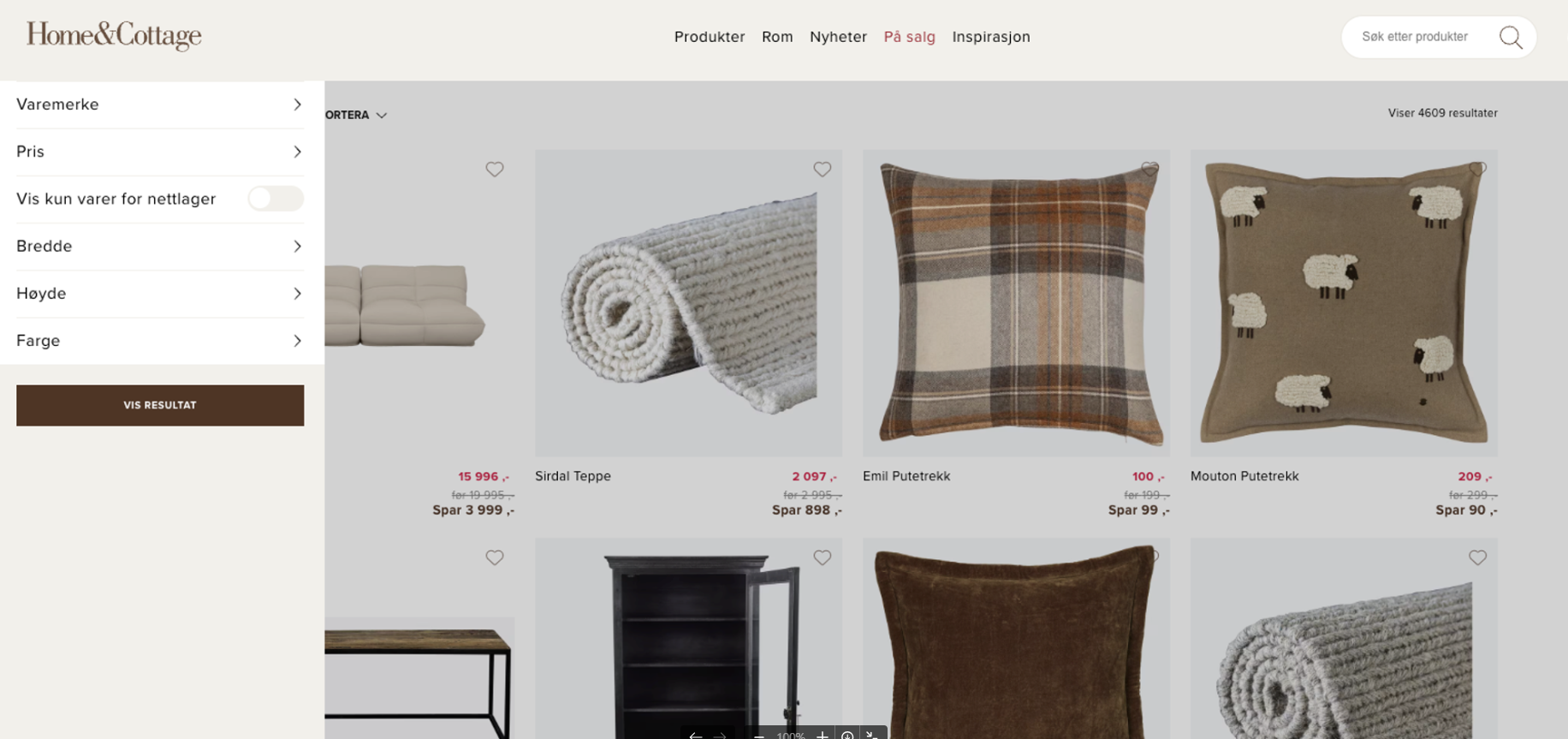
The mobile filters slide-in feature enables Shopify merchants to offer a seamless filtering experience for their customers, regardless of the device they are using. By integrating this functionality into the Findify app, merchants can improve user engagement and facilitate product discovery.
Implementation Steps
Follow these steps to integrate the mobile filters slide-in functionality into your Shopify theme:
1. Update findify-grid-search.liquid
findify-grid-search.liquidFind and remove the following code snippet from the findify-grid-search.liquid component:
{% render 'findify-toolbar-desktop'
        , results_count: results_count
        , terms: terms
        , sort_options: sort_options
        , default_sort_by: default_sort_by
        , sort_by: sort_by
        , active_filters: active_filters
        , color_layout: color_layout
        , filter_component_id: findify_filters_component_id
      %}
2. Update findify-sidebar-mobile.css
findify-sidebar-mobile.cssRemove the existing media query (line: 11 & line: 91):
@media (max-width: 768px) {
//don't remove css, remove only media query string
}
And add the following CSS to ensure the filters slide-in properly:
.findify-modal .findify-filters-wrapper,
  .findify-modal .findify-filters-container{
    width: 100%;
  }
Adjust the width of .findify-modal as needed to customize the size of the sidebar.
3. Update findify-grid.css
findify-grid.cssSearch for the following styles in the findify-grid.css file (usually found around line: 118) and remove them:
.findify-search-header.mobile {
    display: none;
  }
Conclusion
By following the instructions outlined in this document, Shopify merchants can seamlessly integrate the mobile filters slide-in functionality into their online stores, providing users with an intuitive and efficient way to refine their product searches.
For further assistance or inquiries, feel free to contact us on [email protected].
Updated over 1 year ago