Customisation Design Scope
What does a great design brief look like?
#1. Purpose of this post
Findify is built to be versatile - ensuring the end result fits the merchant's unique requirements in terms of both functionality and brand tonality. An important component to achieve this is the front-end.
Findify can either be implemented through:
- An API integration: Utilizing our backend to power a tailored front-end.
- A MJS integration: Utilizing our prebuilt front-end React library.
This post covers the endless opportunities to customize the MJS.
Read more about our API integration
Read more about the API Integration or visit our API Library
#2. Overview of Assets
Findify's MJS is installed with a full set of assets to power Personalized Search, Recommendations, and Smart Collections. A great design brief covers the following assets for both Mobile and Desktop to be comprehensive:
- Autocomplete
- Product Grid
- Product Cards
- Filters & Sorting
- Recommendations (If applicable)
#3. Autocomplete
Orientation: The Autocomplete is the fold-out seen when interacting with the search bar. The purpose of the Autocomplete is to nudge the shopper towards the search results page - which is why it's advised to keep it clean and only include functionality that is absolutely crucial.
Out of the box:
Findify's Autocomplete appears in two different states:
- Before Interaction: When initially unfolded, the Autocomplete shows search terms and products that are trending in the store.
- During Interaction: Once the shopper starts typing, the view shifts to interpret the intention of the query with matching search terms and products.
Desktop:
Desktop Autocomplete before the shopper starts typing.
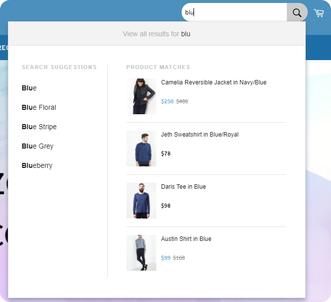
Desktop Autocomplete once the shopper has started typing.
Mobile:
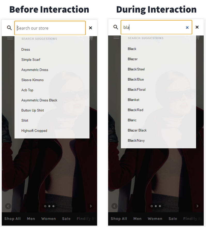
i) Required Design Elements
- Desired fonts, text color & sizes: Default is Karla, sans-serif, dark grey, 12-14px; where headings are displayed uppercase.
- Product Information: Default is Headings, Price, Discounted Price & Miniature Image.
- Element Structure: Any of the components you want to move?
- Element Inclusion: Any components you want to add? (e.g. with Findify's Yotpo Integration you can activate rating stars.)
ii) Dashboard Control
The following elements can be adjusted in the merchant dashboard and do not require Customizations, but alterations are ideally included in the designs for a comprehensive overview:
- Titles Displayed: All text displayed can be modified in the dashboard: Trending Searches, Trending Products, Search Suggestions, Product Matches, and Show All Results For: "__"
- Number of search terms shown (Individual control for Mobile/Desktop)
- Number of products shown (Individual control for Mobile/Desktop)
iii) Optional Design Elements
- Bold Match: Part of the query matched in Search Suggestions is bold. Styling can easily be adjusted but distinction advised to remain.
- Flame Icon: Included by default but can easily be removed.
- Capitalized Search Terms: Capitalized first letter for Search Terms by default but can easily be adjusted.
- Trending Searches in Italic: Displayed in Italic by default but can easily be adjusted.
iv) Best Practice Examples
- Full screen Autocomplete for greater product focus.

Full Screen Autocomplete with trending products/searches and suggestions.
- Including Product Suggestions: Vertical for greater product focus.
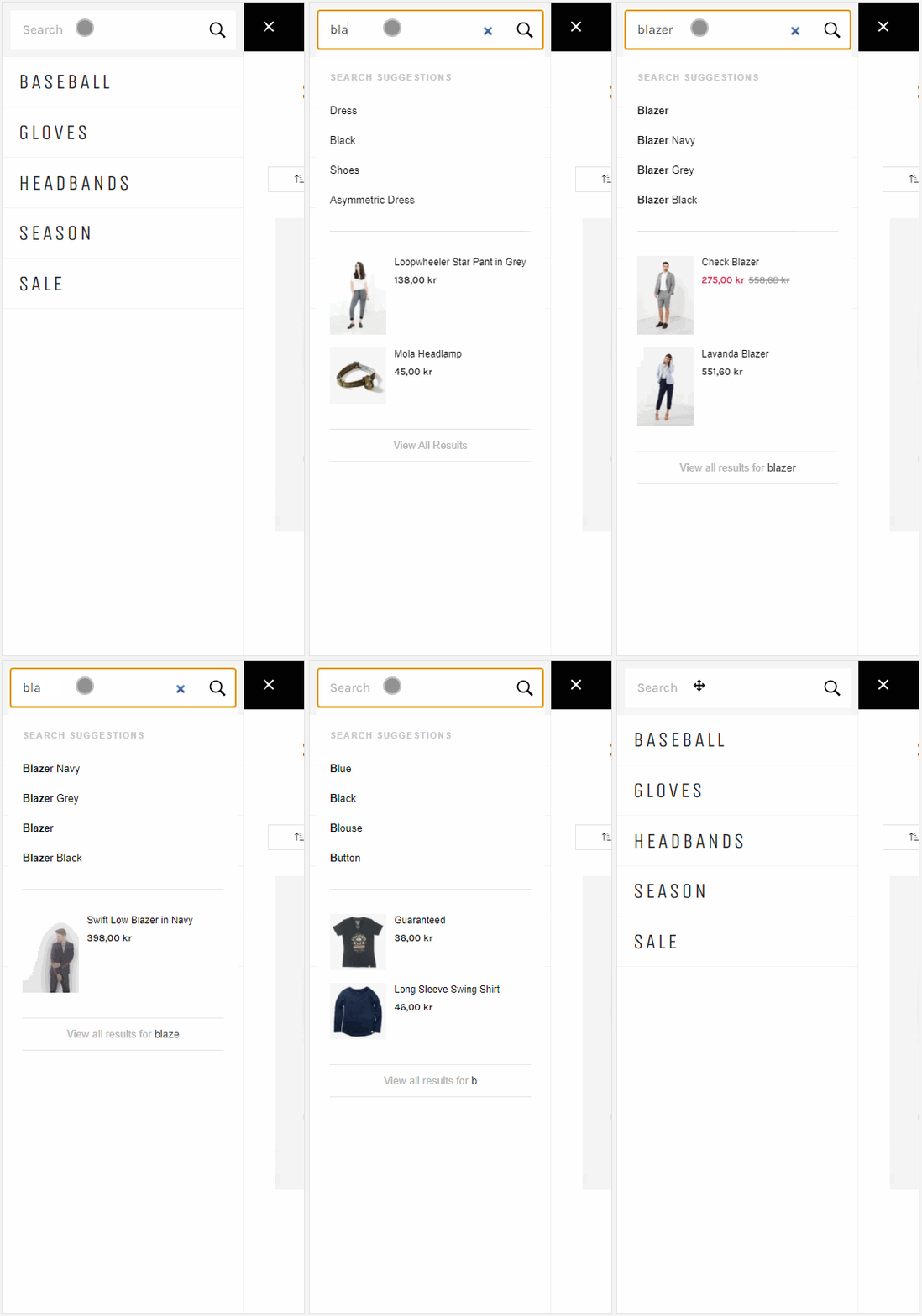
Mobile Autocomplete with trending products/searches and suggestions.
#4. Product Grid
Orientation: The product grid is the main component of the search results page and category/collection pages. It's closely linked to the Product Cards and Filtering & Sorting, and therefore commonly briefed in the same design, but separated in this overview for clarity.
Specific Search Result Page Component:
To simplify shopper navigation, it is advised to have the same design for the search result page and the category/collection pages, with one exception listed below. However, from a technical perspective it is of course easy to separate the designs if needed.
- Number of Products: Showcasing the number of products returned by the query - Advised to include! Position, phrasing, and styling can of course easily be altered.
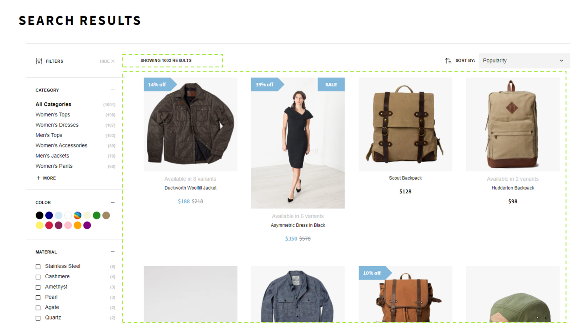
Product Grid for Desktop, here showcased with a search results page.
i) Required Design Elements
- Desired fonts, text color, and sizes: Default is Karla, sans-serif, dark grey, 12-14px.
- Product Information: Default is: Headings, Price, Discounted Price, Image, Available Variants.
- Element Structure: Image size and ratio. Number of products shown per row (Desktop: 4 by default with auto-scaling where breakpoints are adjustable in dashboard. Mobile: 1, where 1 or 2 are equally commonly used).
- Element Inclusion: See Product Cards for list of common inclusions.
- Promo Cards: Inclusion of non-product assets in the grid. Read more here.
ii) Dashboard Control
- Number of products per row.
- Titles Displayed: All texts displayed can be modified in the dashboard: e.g. "Showing X Results".
- Pagination vs. Lazy Loading: Whether products should be displayed in multiple tabs or endless scrolling.
#5. Product Cards
Orientation: The product card is the definition of all product information displayed in e.g. the grid. By default, the same components are used for products displayed across the site in the grid, Autocomplete, and Recommendations, but can of course be customized to include different elements and styling.
A product card presenting selected product information.
Out of the box:
- Heading
- Price
- Discounted Price
- Product Image
- Available Variants
- Variant Specific: All information is presented for the displayed variant i.e. if you group several products and have e.g. different prices, then price shown in the card will vary depending on which variant is displayed.
i) Required Design Elements
- Desired fonts, text color, and sizes.
- Product Information: Anything available in the product feed can be displayed.
- Element Structure: Placement of selected product information and additional functionalities.
- Element Inclusion: *Any components you want to add?
ii) Optional Design Elements
Product Cards are usually the most tailored components in order to tailor the experience to be in line with the store's requirements. Regularly included components include:
- Ratings From Reviews: Displayed through e.g. the Findify's Yotpo Integration.
- Stickers: Displaying messages or icons in the cards. Read More.
- Swatches: Showcase or browse available variants directly in the grid e.g. for Sizes or Colors. Read More.
- CTA: e.g. Add to Cart.
#6. Filtering & Sorting
Orientation: Findify's filters work dynamically. That means that no option, or even full filter groups, will ever be shown if there are no corresponding products. The purpose of this is to never show empty options. It also means that the page isn't reloading to show the updated results. The filters are also running on a variant level, only displaying corresponding variants.
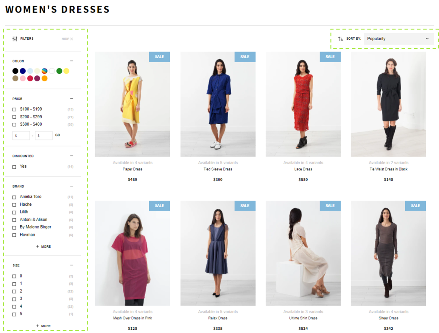
Findify filters on Desktop, here displayed vertically.
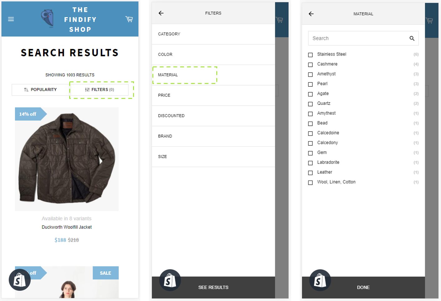
Findify filters on Mobile, here displayed with a Slide In - the most common option for mobile.
Out of the box:
- Orientation: By default, the filters are displayed vertically. Vertical orientation is the most widely used since it enables for a greater amount of filters. Horizontal orientation is commonly applied since it allows more products to be displayed in the grid. Slide In Option combines both benefits but gets one click further from the shopper.
- Sorting Options: By default, sorting options are displayed in the upper right corner and include the options: Popularity, What's New, Price H>L, Price L>H (Phrasing can be updated in the dashboard).
- Sorting of Filter Options: Size: from Smallest to Largest. Price: groups defined in dashboard. All other: by count of corresponding products.
- Selected Filter Behavior: By default, the selected filter is moved to the top of the list and bolded (Numerical values in Size and Price excluded). We also advise adding breadcrumbs of selected filters (See below for reference).
- Shown Options: By default, 6 filter options are shown. If more are available, a "+ More" option will appear and, when selected, will add a search box.
- Open/Closed: *By default, all filter groups are shown in open state.***
- Color Groups: Combining similar colors into one group to reduce options. Displayed with HEX colors or Patterns (uploaded with custom URL's). Read More.
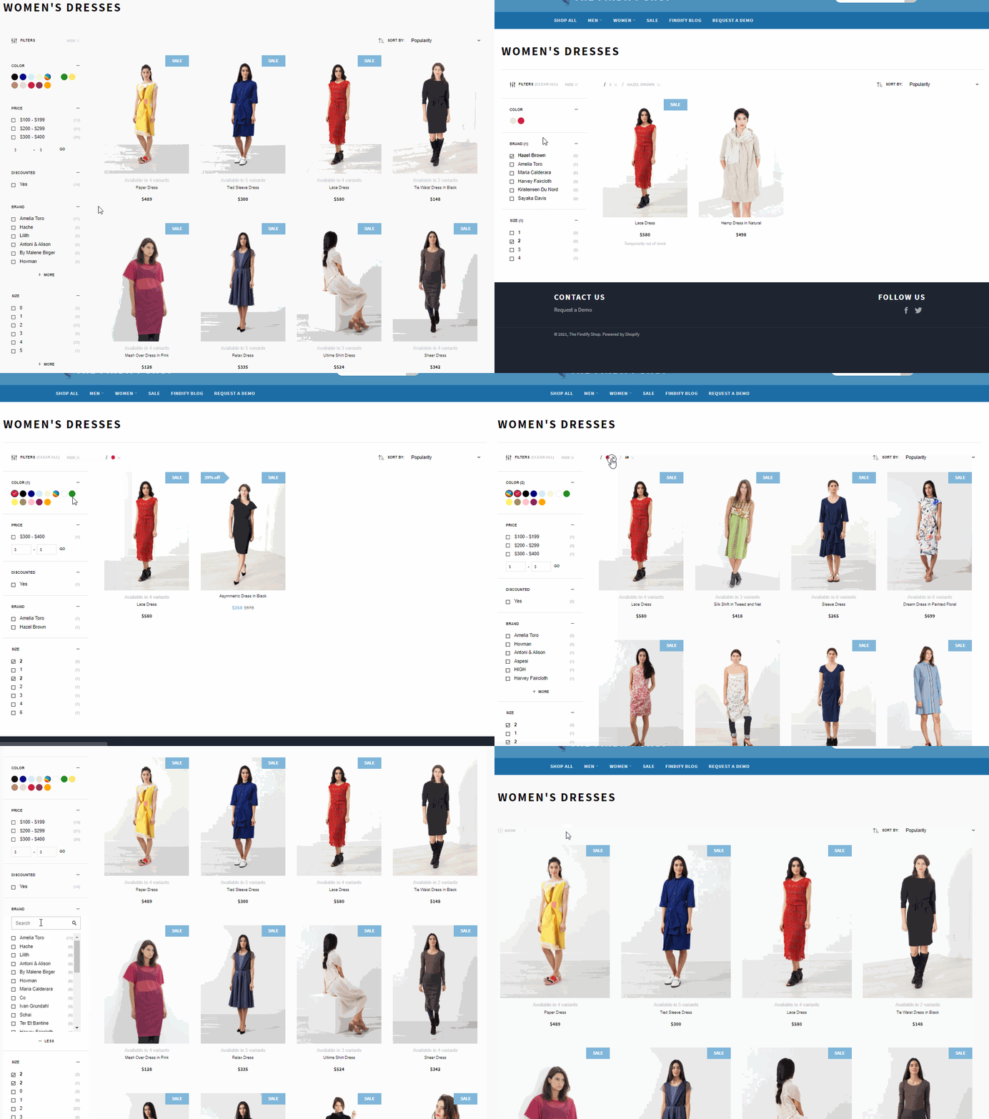
Default behavior of Findfy's filters.
i) Required Design Elements
- Orientation: Vertical, Horizontal or Slide In.
- Sorting Options: It is possible to configure options based on any field in the feed e.g. brands in alphabetical order, size dimensions in numerical order, average review score etc.
- Selected Filter Behavior: How selected options should appear and behave.
- Color Groups: If they are to be applied, or if color options are to be displayed in text.
ii) Optional Design Elements
- Open/Closed: *If some or all groups should be presented closed. If not selected, all filter groups will be shown in open state.***
- Sorting of Filtering Options: If any custom order should be applied for selected filter groups. If not specified, sorting will be applied by default logic.
- Shown Options: If a threshold should be applied before "+ More" appears, and preferred threshold. Also selection if wanting to remove the search box in unfolded state. Note: A threshold value is advised to ensure a filter group doesn't take up the entire screen.
iii) Dashboard Control
Filters can easily be managed from the Findify dashboard. Activation, Order, and Naming are only one click away. To read more, visit this guide.
Controlling filter appearance for individual collection pages
#7. Recommendations
Orientation: Recommendations can be showcased across the site to drive upsells, cross-sells or inspiration. Read more here. The recommendations can be applied with broad logics, or very tailored tactics. Read more about Recommendations Strategies. From an integration purpose, only one recommendation is required to be included to specify styling. Additional recommendations can be added on an ongoing basis, and strategies will be covered in the product training.
Out of the box:
- By default: The products shown in the recommendation widgets are styled according to the product card specifications. This can of course be customized. For elements to consider, please refer to the Product Card Sections.
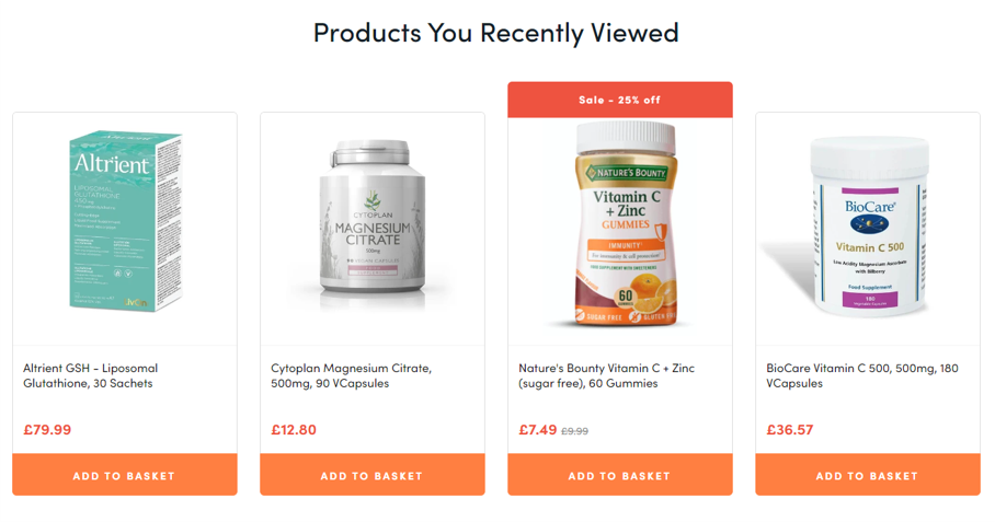
Recommendations displayed with multiple product card elements.
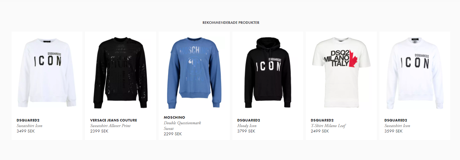
Recommendations displayed with few product card elements.
Updated almost 2 years ago
