Grid Control
Fully own the product experience by tailoring Product Card Sizes.
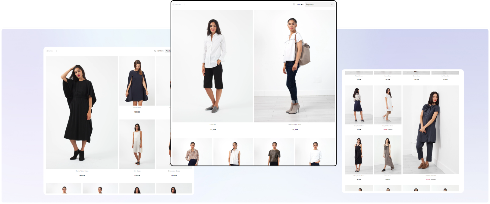
Breaking the static grid with large product cards to increase inspiration.
#1. What is Grid Control?
Grid control is about transforming the grid from a regular pattern to a customized experience.
It builds on insights from behavioral psychology around choice overload where highlighted products will help halt the shopper & capture their attention.
The core of grid control consists of three areas:
- The ability to break the regular pattern
- The ability to control where the large product cards appear
- The ability to alter appearance for different collections
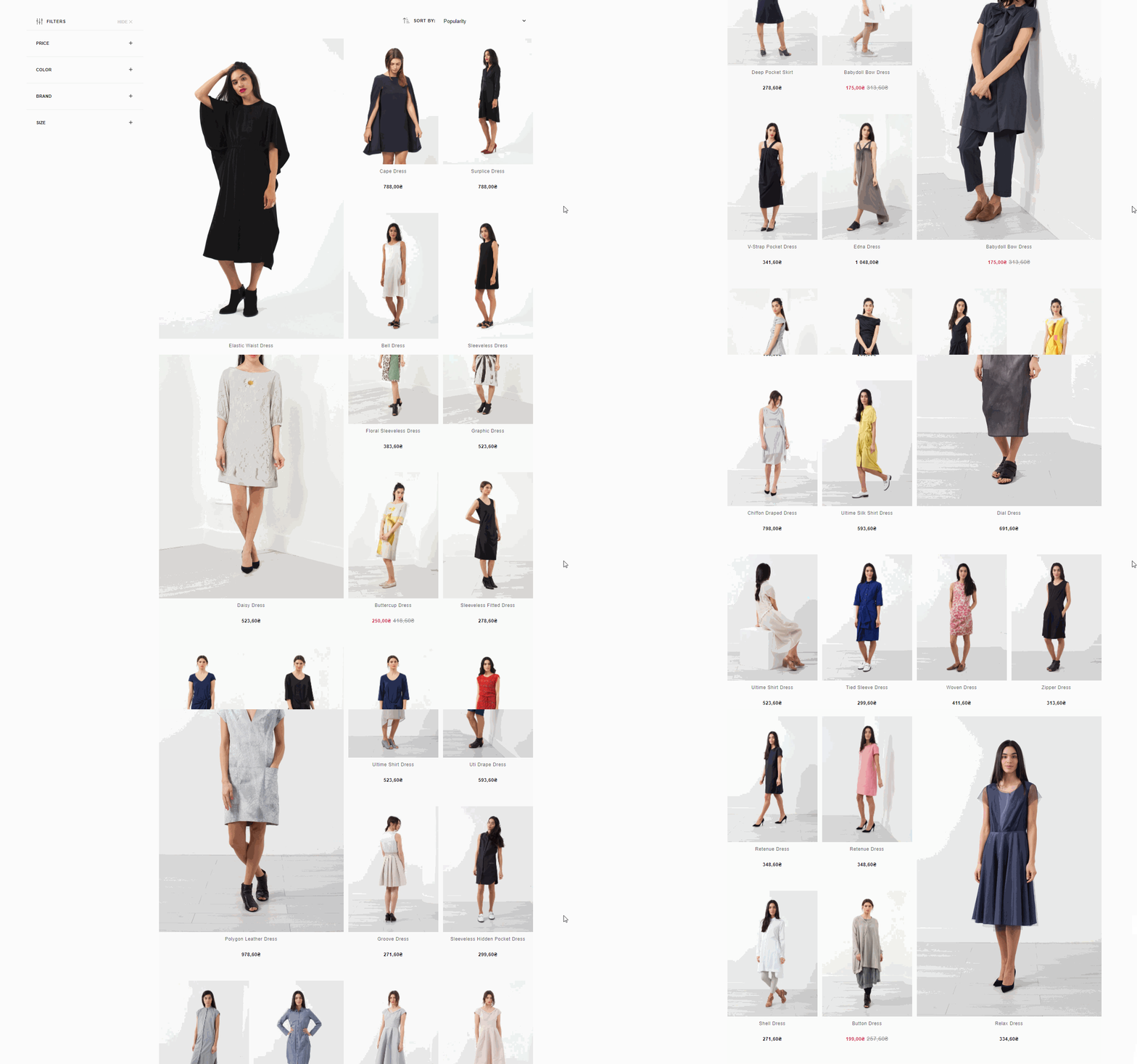
Overview of Grid Control applied
#2. Control Mechanism
Grid control can be set up on different levels.
Level: Basic
All collections and/or search results are set up with the same regular pattern.
No client action is required beyond deciding the pattern.
Control is King
Grid control is built on the principle of full control.
Merchants, therefore, have the possibility to control the appearance of individual collections, while the basic approach is available to not require any merchant action.
Level: Intermediate
Covers Use Cases #1 - 3.
This gives the merchant the ability to control each collection based on pre-determined profiles.
Level: Advanced
Includes Use Case #4.
This gives the merchant the ability to freely tailor collection appearances based on custom order per collection.
This freedom demands correct input values.
Merchants utilizing Use Case #4 can of course freely combine that with use cases #1 - 3.
Platform Compatibility
The following guide is written using data input fields in Shopify.
The solution is, however, platform agnostic. All that is needed are collection specific input fields that can be exposed to Findify's MJS. For advice or guidance, please contact Findify's Customer Success Team
#3. Grid Control Use Cases
Use Case #1. REGULAR GRID
Level: Intermediate
Output: To present the grid in a regular pattern, simply use the master switch to not apply grid control for that collection.
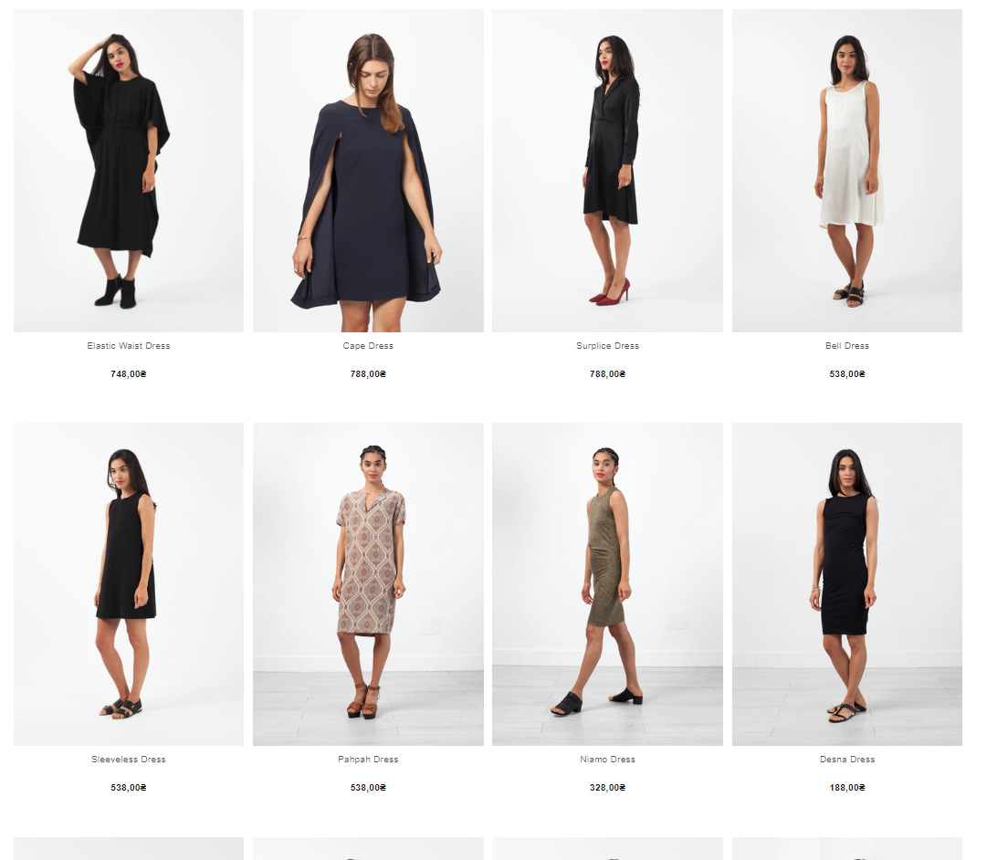
The grid is shown as usual, exemplified here with a 4 column design.
Collection Settings to Apply this:
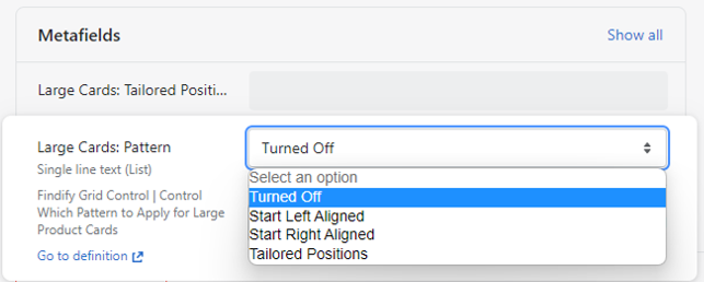
Collection Metafield used to control which collections that should be powered by grid control.
Use Case #2. LEFT ALIGNED PATTERN
Level: Intermediate
Output: Pre-determined profile with the following continuous pattern.
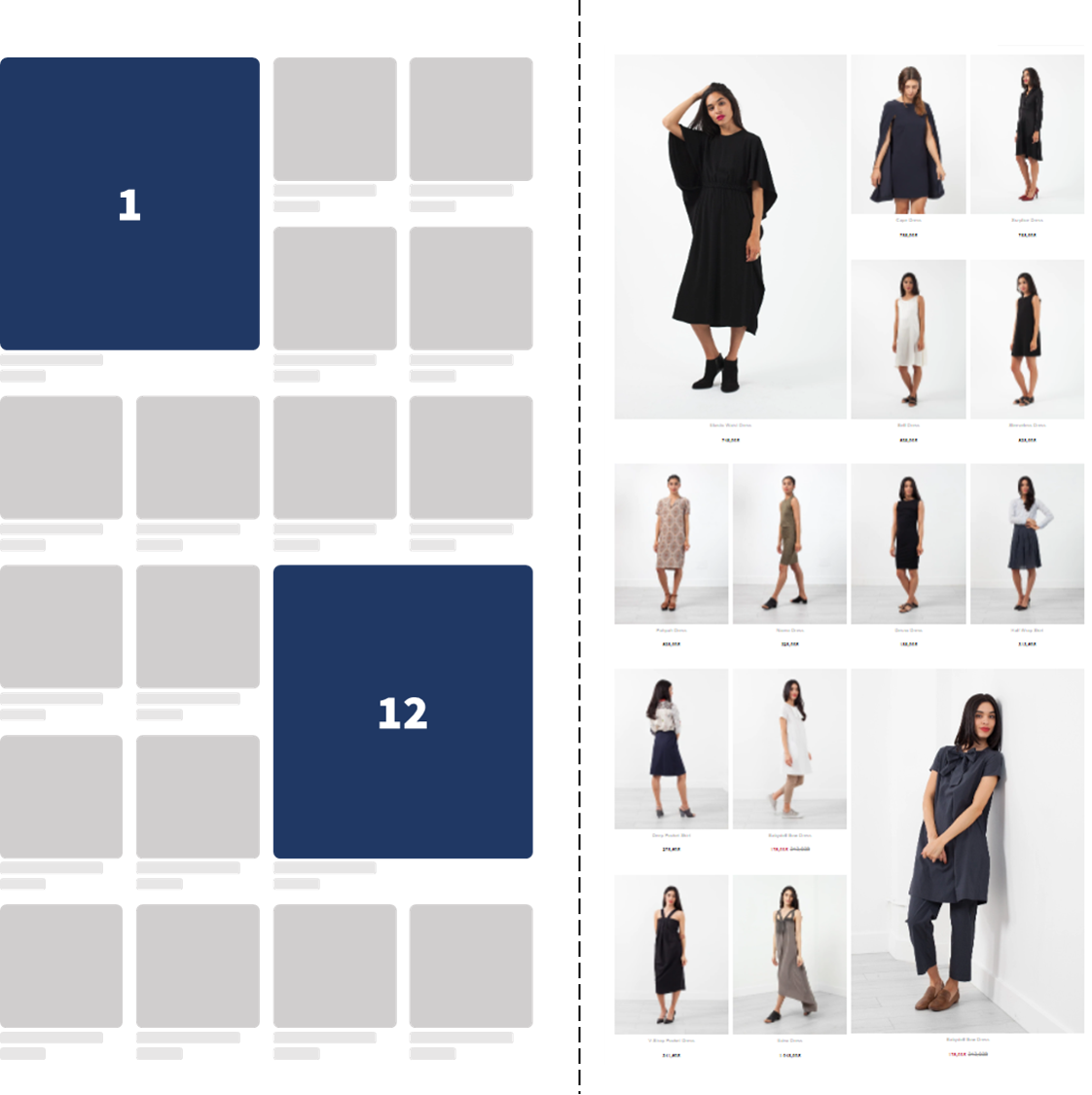
Hero Positions (Large Size) appears with a regular interval starting from the left side.
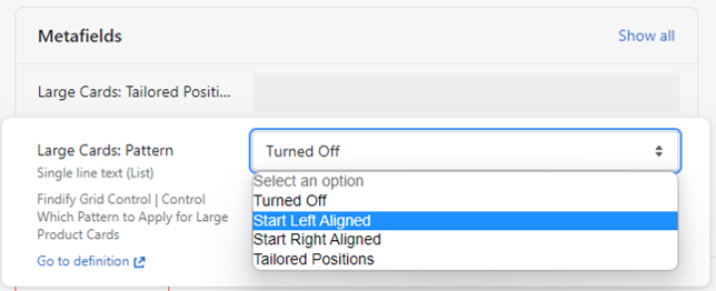
Collection Settings to Apply this:
Use Case #3. RIGHT ALIGNED PATTERN
Level: Intermediate
Output: Pre-determined profile with the following continuous pattern.
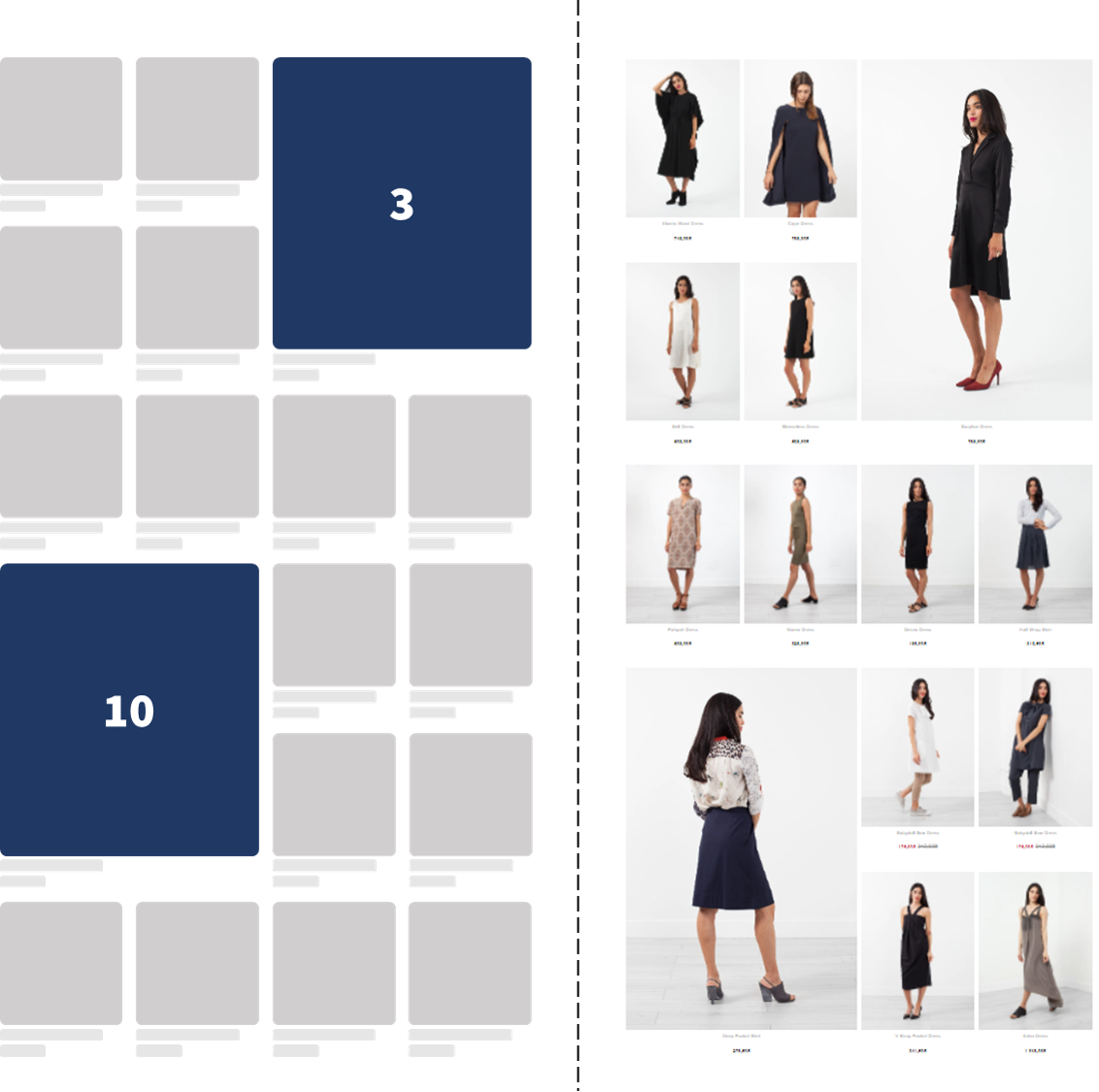
Hero Positions (Large Size) appears with a regular interval starting from the right side.
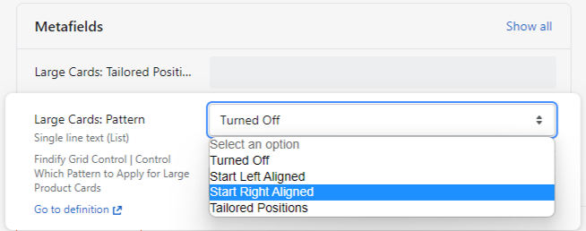
Collection Settings to Apply this:
Use Case #4. TAILORED PATTERN
Level: Advanced
Output: Fully customizable option where the merchant can tailor each collection appearance freely.
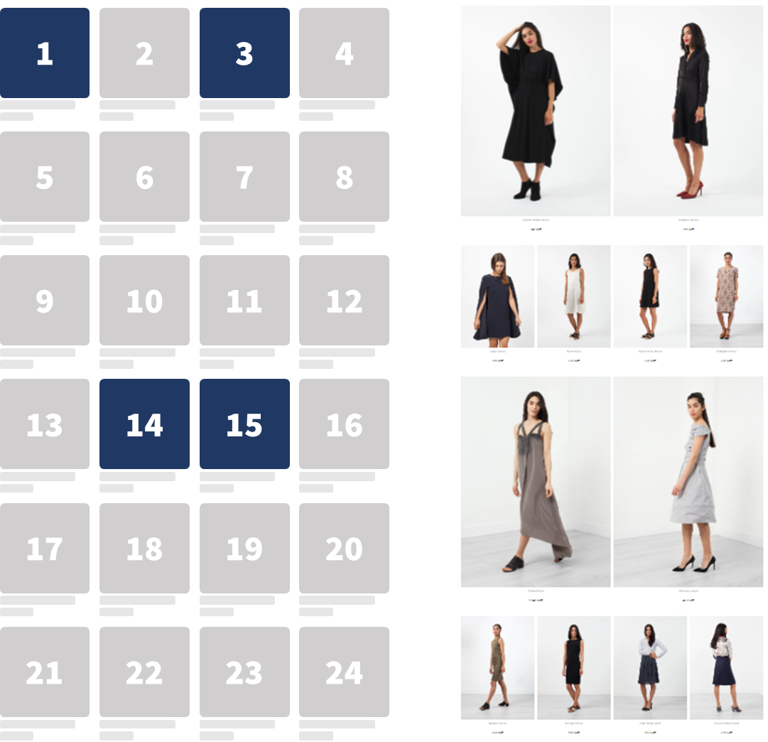
Hero Positions (Large Size) appears based on specified positions.
Collection Settings to Apply this:
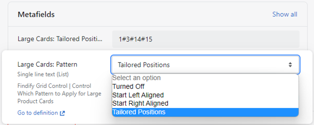
Read more about specific use cases related to Tailored Patterns in the FAQ Section
#4. Mobile Application
Due to it's limited screen space, grid control is more limited on mobile.
Advised approach is utilizing a regular pattern where every 5th or 7th product is highlighted in Hero Size.
It is, however, possible to set up a more tailored approach utilizing the same logic as for desktop.
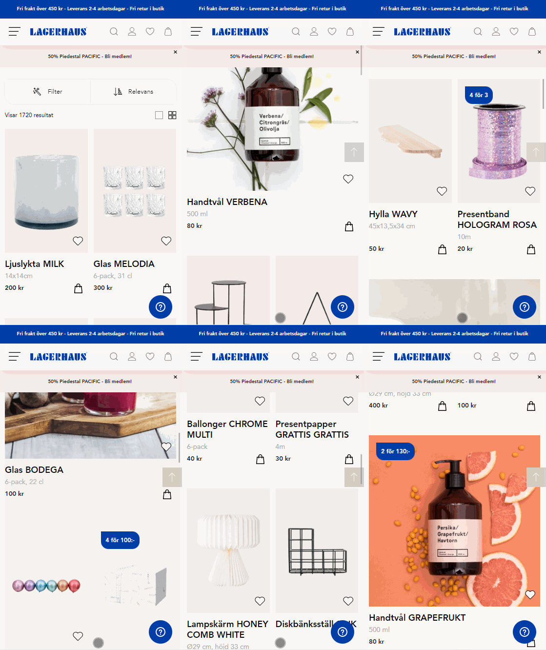
Mobile Grid Control with a regular pattern, showcasing hero sized images every fifth product. Lagerhaus.se
To be filled out
#5. Grid Control FAQ
Product Card Appearance
Q: Will hero positions include CTA's, swatches, stickers, etc. as the regular product cards?
A: Yes. Grid control will show your regular product card appearance, only larger. It will not limit Findify's core capability to fully customize the product experience.
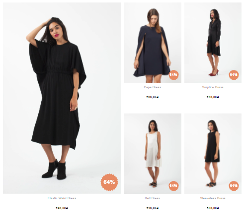
Example of stickers applied in hero positions. The experience can be fully customized to match clients' brand experience.
Q: Does grid control demand larger product images?
A: Ideal image size depends on overall grid layout. Best practice is to minimize image sizes to maximize site speed. In Shopify, it is very easy to specify exact image sizes Reference. The default for grid control is to load a larger image size for products appearing in the hero positions (1800 x 1800px) but that can easily be tailored in setup.
Product Control
Q: Which product will be shown in the hero space?
A: Grid control does not affect the order of products. The hero space is set to a position and the product in that position will be enlarged
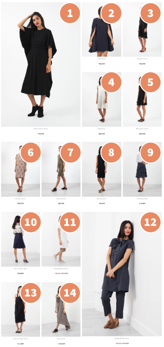
Order of products returned in the irregular pattern.
Q: Can I control which products appear in each hero image?
A: Yes. Grid control does not affect the order of the products. Findify's personalization, merchandising rules & pinning will work as usual.
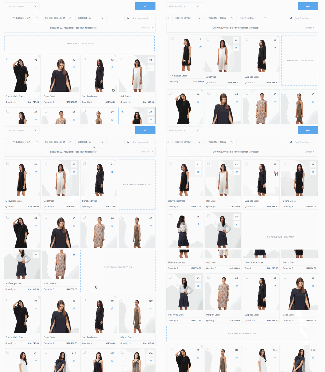
The regular visual merchandising can be used to influence product order.
Tailored Pattern
Q: Can I break the grid by selecting two overlapping positions?
A: No. If two positions are selected, the second will be disregarded
Example:

Two overlapping positions have been selected
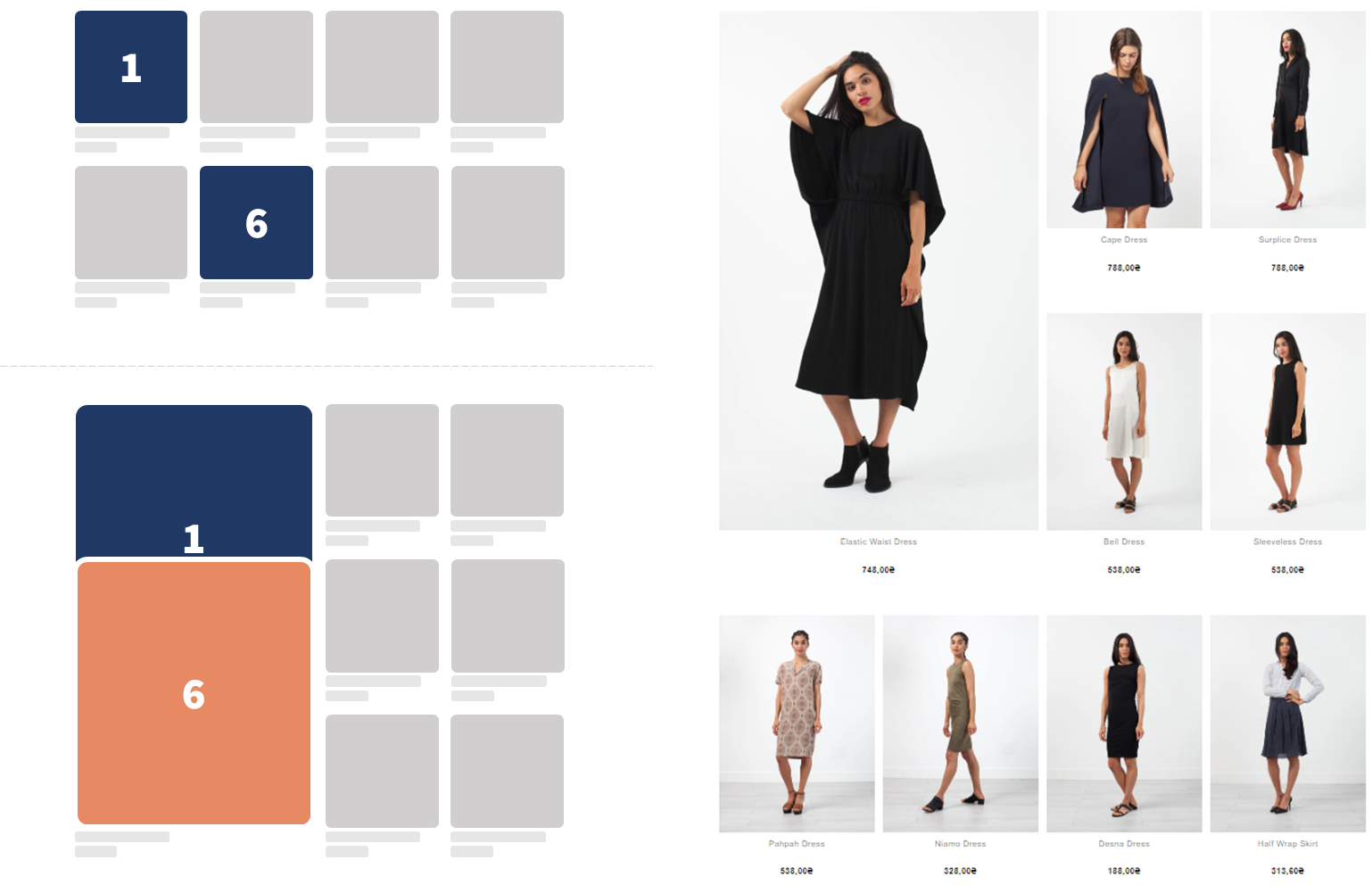
The second position (#6) is disregarded since it is overlapping with enlarged position #1.
Q: Can I activate a hero position in the middle of the grid?
A: Not by default. We've built grid control to be consistent across breaking points i.e. show the same experience on smaller screens with e.g. 4 product columns and large screens with e.g. 6 product columns. However, this is hence by design and not technical limitations. The feature is new and we want to evolve it to be as useful as possible. The best way to do that is from client feedback & real life use cases. Please connect with us to share your thoughts.
Q: For a tailored pattern, which product position will be enlarged?
A: The product in the selected position will be enlarged. Note the difference below where the hero is displayed in the same positions (#1, 2, 5, 6) but the product displayed differs based on the decided position.
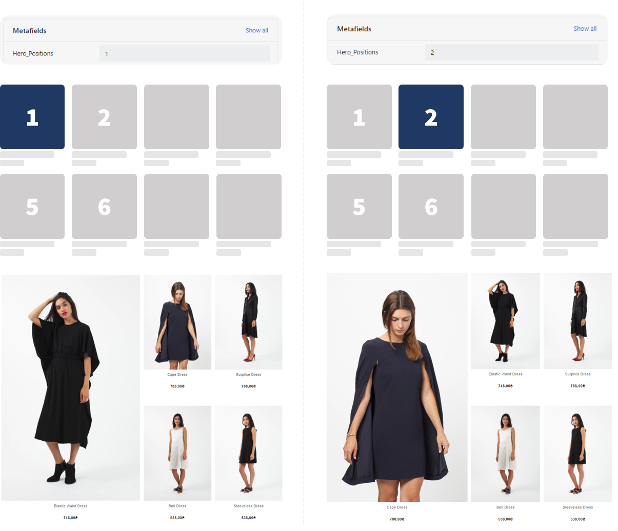
Product enlarged according to selected position in use case #4: Tailored Pattern
Q: I have defined the pattern to be left aligned, but I have also specified tailored positions. What will show?
A: A Left Aligned Grid. The Field "Large Cards: Pattern" is the master control to specify pattern. In order to apply the specified tailored positions, change pattern to "Tailored Positions".

Custom positions has been specified but the grid will show a regular left aligned pattern since this is selected in "Large Cards: Pattern"
Platform Compliance
Q: Is grid control only available for Shopify?
A: No, grid control can be applied on any platform. To apply use case #1-4, collection-specific input fields needs to be applied. The format of these will differ depending on platform structure. Get in touch with our team to discuss ideal setup.
Q: Is grid control available for API-integrations?
A: Grid control is rendered through Findify's React front-end library. In an API integration, this needs to be built into the experience. Get in touch with our team for advice how this is achieved in our setup.
General
Q: All examples in this guide includes 4 product columns. Is grid control available for grids in other sizes?
A: Yes. Like all other Findify components, grid control is built to match a wide variety of client experiences.
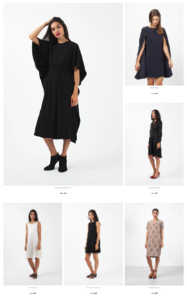
Grid control applied in a 3 product grid
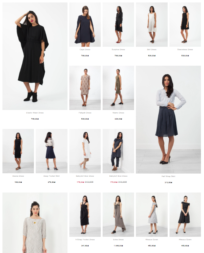
Grid control applied in a 6 product grid
Q: All examples in this guide includes a large size defined as: 2x2 regular products. Can I use other sizes?
A: Technically, yes. The current definitions are by design and not technical limitations. The grid control feature is new and we want to evolve it to be as useful as possible. The best way to do that is from client feedback & real life use cases. Please connect with us to share your thoughts.
Q: How quickly is the grid updating?
A: As soon as you save. If your changes don't appear in the grid, you are most likely looking at a cached version. Remove your cache and reload the collection.
Q: Will Grid Control work with any pagination?
A: Yes. But to maximize shopper experience, the number of products per page should be considered.
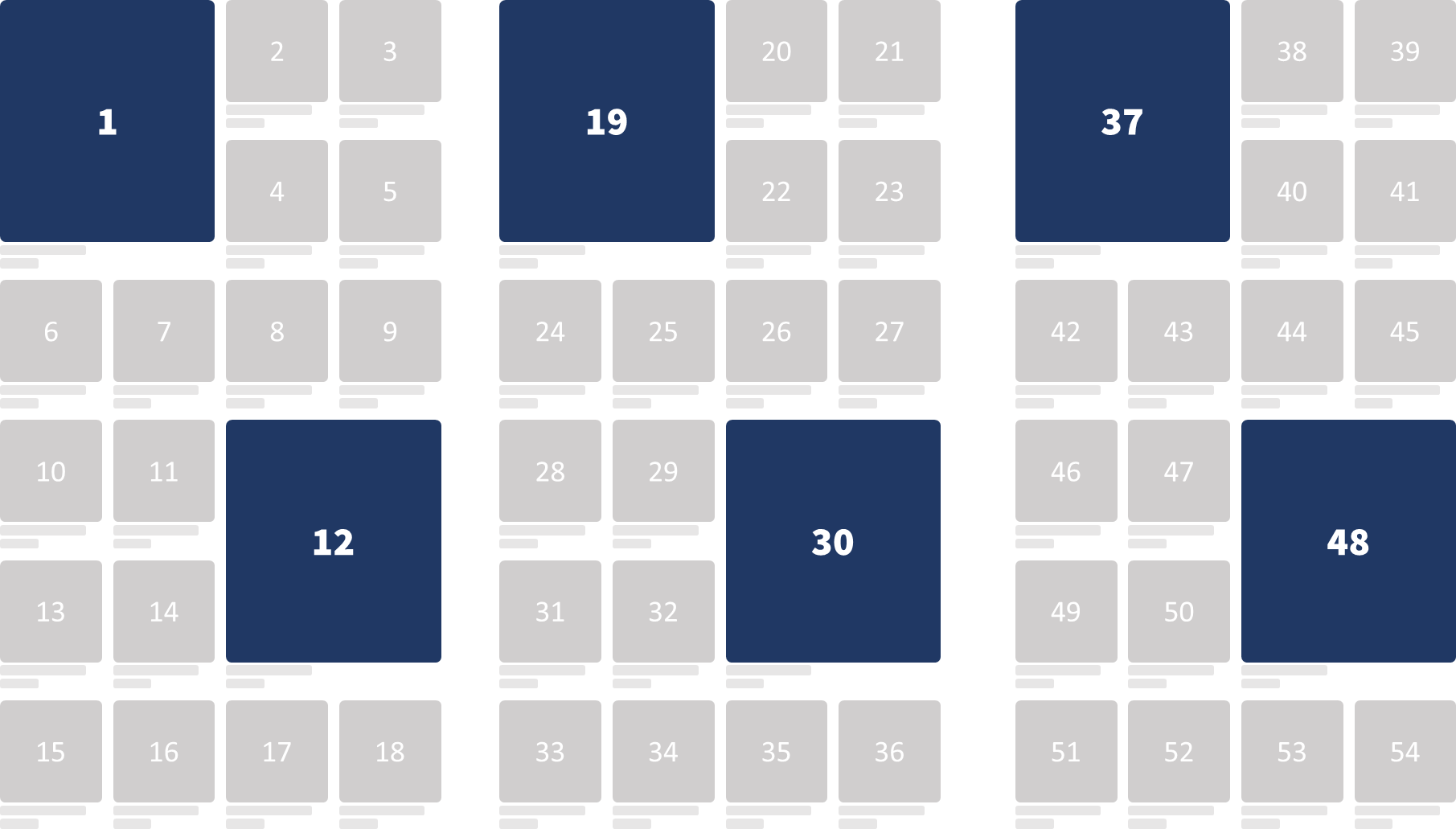
Each "block" with two rows of big products and one of small contains 9 products. Suggested settings for products per page are hence 18 products in a 4 column grid layout.
Q: Can I use Grid Control to display messages or campaigns?
A: Grid Control is built for products. For non-product information we already have the Promo Card Campaigns
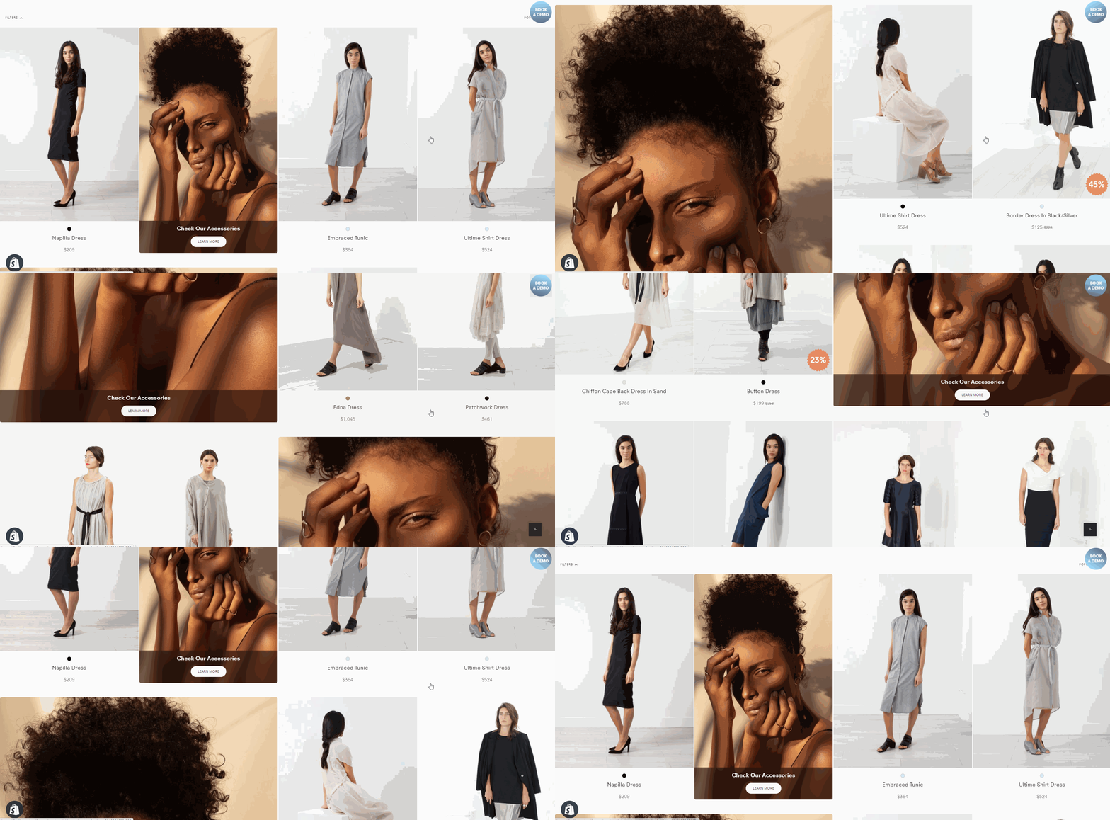
Promo Card Campaigns makes it easy to display content & information across the site in both Search & Collections.
#6. Merchant Requirements
Feature Activation
The steps outlined in #8. Technical Implementation can be manged by Findify's team or the merchant.
The below actions need to be taken by the merchant.
Level: Basic
No client action is required beyond deciding the pattern.
Level: Intermediate
- Set up this metafields definitions in your store (Time: 1 min)
- Populate these fields for applicable collections (Time: Depending on number of collections)

The required Collection metafield definition.
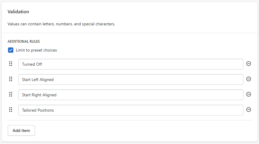
Options to include in metafield Definition. Exclude Tailored Position if not applicable.
Level: Advanced
- Set up these two metafields definitions in your store (Time: 2 min)
- Populate these fields for applicable collections (Time: Depending on number of collections)
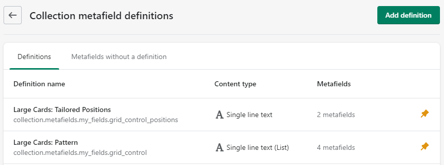
The two required Collection metafield definitions.
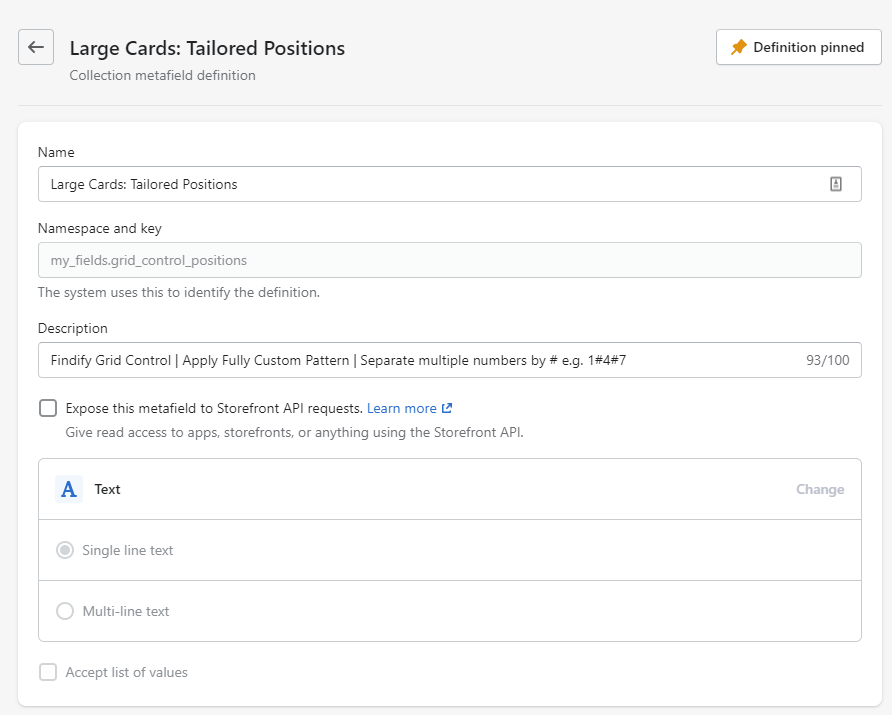
The definition for the Tailored Positions is a regular single line text.
#7. Technical Implementation
Firstly, we need to add metafields to our collections. To do that, go to Settings > Metafields.
Create three metafields:
gridPositions (One Line String)
gridControl (String List)
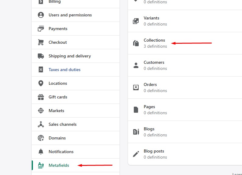

Then, we we need to add Findify's metafields script to our fallback in collection liquid file.
To do that, open your Shopify online store. Click 'Edit Code' for theme with integrated Findify.
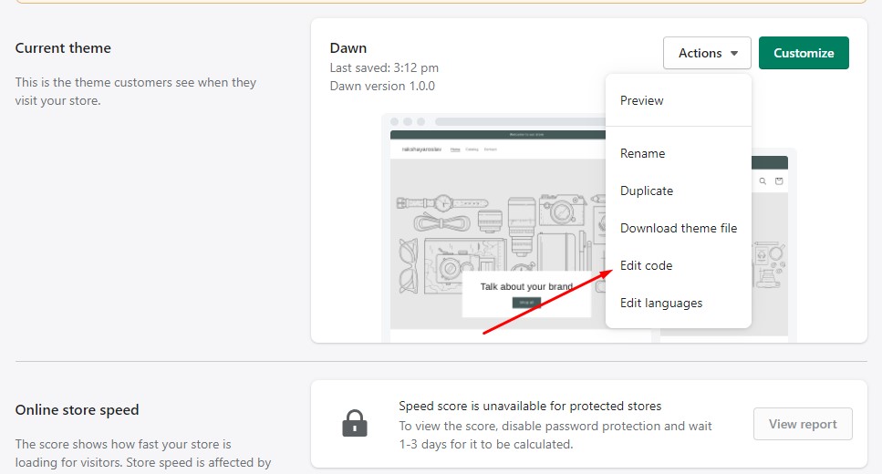
After that, open 'Sections' and choose 'collection.liquid' file. Add this code into findify-fallback container:
{/* ...some code... */}
<div class="findify-fallback" style="display:none;">
 <div class="findify-metafields">
		<script>
      		let gridPositions = `{{collection.metafields.my_fields.grid_control_positions}}`;
         	let gridControl = `{{collection.metafields.my_fields.grid_control}}`;

            /* Get collection metafields */
            window.findifyMetafields = {
              'gridPositions': gridPositions,
              'gridControl': gridControl
            }
      	</script>
	</div>
	{/* ...some code... */}
</div>
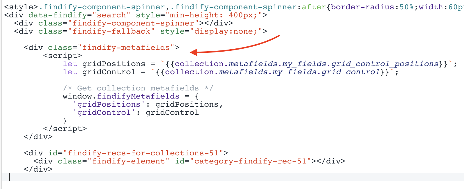
The following steps require the use of Findify DevTools - changing the React components in the front end. If you have any challenges, Findify's team for professional services would be happy to assist.
Please get in touch through: [email protected]
Findify DevTool Extension
To learn how to work with the DevTools, please read more here.
Components
- layouts/Search/index
- components/Cards/Product/ndex
- handleColumns
- breakGrid
Create handleColumns function and import it to layots/Search/index. This function is changing findify-data-grid attribute for search results container when breakpoints are updated. Don't forget to add some css!
import { handleColumns } from 'handleColumns';

{/* ...some code... */}
const sortedBreakpoints = config.getIn(['breakpoints', 'grid']).toJS().sort((a, b) => b.width - a.width);
const checkColumns = () => handleColumns(sortedBreakpoints);

useEffect(() => {
  checkColumns();

  {/* call func on resize */}
  window.addEventListener('resize', checkColumns);
  return () => window.removeEventListener('resize', checkColumns);
}, []);

{/* ...some code... */}
{/* function changes findify-data-grid attribute when
 		columns chaning and resets all broken-grid elements */}

export const handleColumns = (sortedBreakpoints) => {
  let currentColumn = false;
  sortedBreakpoints.map((el) => {
    if(window.innerWidth > el.width && !currentColumn) {
      if(currentColumn === el.value) { return false }
      currentColumn = el.value;
    }
  });

  const container = document.querySelector('ul.findify-components-common--grid[aria-label="Search Results"]');

  if(container && currentColumn) {
    if(parseInt(container.getAttribute('findify-data-grid')) !== currentColumn) {
      container.setAttribute('findify-data-grid', currentColumn);

      document.querySelectorAll('.big-grid').forEach((product) => {
        product.style.gridColumn = null;
        product.style.gridRow = null;
        product.classList.remove('big-grid');
      });

      window.currentColumn = currentColumn;
    }
  }
}
/* Grid Control */

ul.findify-components-common--grid[aria-label="Search Results"] {
  display: grid !important;
  padding-left: 0 !important;
}

li.big-grid .findify-components--cards--product__content {
  flex: 0;
}

li.big-grid .findify-components--cards--product__image {
  flex: 1;
}

li.big-grid .findify-components-common--image {
  height: 100%;
}

li.big-grid .findify-components-common--image img {
  height: 100%;
  object-fit: cover;
}

ul.findify-components-common--grid[findify-data-grid="2"] { grid-template-columns: 20% 20% 20% 20% 20%; }
ul.findify-components-common--grid[findify-data-grid="3"] { grid-template-columns: 25% 25% 25% 25%; }
ul.findify-components-common--grid[findify-data-grid="4"] { grid-template-columns: 33.333% 33.333% 33.333%; }
ul.findify-components-common--grid[findify-data-grid="6"] { grid-template-columns: 50% 50%; }
ul.findify-components-common--grid[findify-data-grid="12"] { grid-template-columns: 100%; }
import { defaultColumnsMapper } from 'helpers/withColumns';
{/ ... some code ... */}

const SearchLayout = ({ config, isMobile, isCollection, theme }) => {

  {/* get current column value */}
  const columns = defaultColumnsMapper();
  window.currentColumn = columns;

  return (
  	{/* add findify-data-grid attr with columns value */}
  	<div className={theme.root} findify-data-grid={columns}>
    	{/* ... some code ... */}
    </div>
  )
.findify-layouts--search .findify-components-common--grid {
  display: grid !important;
  padding-left: 0 !important;
}

.findify-components--cards--product {
  height: 100%;
  display: flex !important;
  flex-direction: column;
}

.big-grid .findify-components--cards--product__content {
  flex: 0;
}

.big-grid .findify-components-common--picture {
  flex: 1;
}

.big-grid .findify-components-common--picture, .big-grid .findify-components--cards--product__image-wrap {
  height: 100%;
}

.big-grid .findify-components-common--picture img {
  height: 100%;
  object-fit: cover;
}

.findify-layouts--search[findify-data-grid="2"] .findify-components-common--grid { grid-template-columns: 20% 20% 20% 20% 20%; }
.findify-layouts--search[findify-data-grid="3"] .findify-components-common--grid { grid-template-columns: 25% 25% 25% 25%; }
.findify-layouts--search[findify-data-grid="4"] .findify-components-common--grid { grid-template-columns: 33.333% 33.333% 33.333%; }
.findify-layouts--search[findify-data-grid="6"] .findify-components-common--grid { grid-template-columns: 50% 50%; }
.findify-layouts--search[findify-data-grid="12"] .findify-components-common--grid { grid-template-columns: 100%; }

.findify-components-common--grid__column-2, .findify-components-common--grid__column-3, .findify-components-common--grid__column-4 ,
.findify-components-common--grid__column-6, .findify-components-common--grid__column-12 {
  width: 100%;
}
In Cards/Product/index we need to import 2 functions. Later, we will create them.
- breakWithPositions
- breakWithoutPositions
We are using useEffect, so when component did mount, we call our functions depending on metafields.
Also, we are changing product image, if product card has big grid.
import { breakWithPositions, breakWithoutPositions } from 'breakGrid';
{/* ...some imports... */}

{/* ... some code ...*/}

{/* main function => */}
let ifBigProduct = container?.current?.parentElement?.classList.contains('big-grid');

useEffect(() => {
  if(document.querySelector('.findify-components-search--lazy-results__prev-button')) {
    return false;
  };
  let product = container?.current?.parentElement;
  if(product.tagName === 'LI') {
    const controlValue =  window?.findifyMetafields?.gridControl?.toLowerCase()?.replace(/[^a-zA-Z ]/g, "");
    controlValue === 'tailored positions' ? breakWithPositions(product) : breakWithoutPositions(product, controlValue);
  }
});

let newImage = ifBigProduct ? variant.get('image_url')?.replace('_large.', '_1800x1800.') : variant.get('image_url');
let newSecondImage = ifBigProduct ? variant.get('image_2_url')?.replace('_large.', '_1800x1800.') : variant.get('image_2_url');..some code... */}

return (
  	{/* ...some code... */}

    {/* Change image src if broken grid */}
    <Image
      aspectRatio={config.getIn(['image', 'aspectRatio'])}
      alt={variant.get('title')}
      lazy={!isAutocomplete && config.getIn(['image', 'lazy'])}
      src={
        config.getIn(['image', 'multiple'])
          ? [newImage, newSecondImage]
          : newImage || variant.get('thumbnail_url')
      }
     />
    {/* ...some code... */}
)
import { breakWithPositions, breakWithoutPositions } from 'breakGrid';
import React, { useEffect, useRef } from 'react'
{/* ...some imports... */}

{/* ... some code ...*/}
const ProductCardView: React.SFC<IProductCardProps> = ({
  item,
  config,
  theme,
}: any) => {

  const container = useRef(null);
  let newImage = false;
  if(container) {
    let ifBigProduct = container?.current?.parentElement?.classList.contains('big-grid');

    useEffect(() => {
      if(document.querySelector('.findify-components-search--lazy-results__prev-button')) {
        return false;
      };
      let product = container?.current?.parentElement;
      if(product?.getAttribute('role') === 'listitem') {
        const controlValue =  window?.findifyMetafields?.gridControl?.toLowerCase()?.replace(/[^a-zA-Z ]/g, "");
        controlValue === 'tailored positions' ? breakWithPositions(product) : breakWithoutPositions(product, controlValue);
      }
    });

    newImage = ifBigProduct ? item.get('image_url')?.replace('_large.', '_1800x1800.') : item.get('image_url');
  };
  {/* ... some code ...*/}

  return (
    <a
    {/* add ref to product container */}
  	ref={container}
    onClick={item.onClick}
    href={item.get('product_url')}
    className={classNames(
               theme.root,
                config.get('simple') && theme.simple,
                 theme.productCard,
                 )}
  	>
      {/* ... some code ...*/}
      {/* ... Replace Image with bigger one ...*/}
      <Image
        className={classNames(theme.image)}
        aspectRatio={config.getIn(['product', 'image', 'aspectRatio'], 1)}
        thumbnail={item.get('thumbnail_url')}
        src={newImage ? newImage : item.get('image_url') || item.get('thumbnail_url')}
        alt={item.get('title')}
      />
      {/* ... some code ...*/}

    </a>
  )
Finally, we need to create breakGrid component. Only 2 functions will be exported to Cards/Product/index.
If you are on MJS 6, please add "export" to defaultColumnsMapper function at "helpers/withColumns.ts" and change width values to window.innerWidth.
const checkForPromoOverlay = (product, column) => {
  let nodes = document.querySelectorAll('.promo-broken-grid');
  if(nodes.length > 0) {
    nodes.forEach((promo) => {

    let promoRowStart = parseInt(promo.style.gridRowStart);
    let promoColumnStart = parseInt(promo.style.gridColumnStart);
    let promoColumnEnd = parseInt(promo.style.gridColumnEnd);

    let productRowStart = parseInt(product.style.gridRowStart);
    let productRowEnd = parseInt(product.style.gridRowEnd) ;
    let productColumnEnd = parseInt(product.style.gridColumnEnd);
    let productColumnStart = parseInt(product.style.gridColumnStart);

    if(promoRowStart >= productRowStart && promoRowStart <= productRowEnd
      && ((promoColumnStart < productColumnEnd) || (promoColumnEnd > productColumnStart))) {
      product.style.gridColumn = null;
      product.style.gridRow = null;
      product.classList.add('promo-overlay');
    }
    })
  }
}

const columnRules = {
  '4': [7, 5],
  '3': [11, 7],
  '2': [19, 11]
}

const rightColumnStart = {
  '4': 2,
  '3': 3,
  '2': 4,
}

const pushProduct = (product, columnPosition, rowPosition) => {
  product.style.gridColumn = `${columnPosition} / ${columnPosition + 2}`;
  product.style.gridRow = `${rowPosition} / ${rowPosition + 2}`;
  product.classList.add('big-grid');
}

const checkForColumnState = () => {
  switch(window.currentColumn) {
    case(2): return 2;
    case(3): return 3;
    case(4): return 4;
    default: return false;
  }
}

export const breakWithPositions = (product) => {
  const column = checkForColumnState();
  const positions = window.findifyMetafields.gridPositions.split('#');
  const order = product?.style.order - 1;
  const productInList = positions.find((num) => num === `${order}`);

  if(product.classList.contains('big-grid') || (product.classList.contains('promo-overlay'))) {
    checkForPromoOverlay(product, column);
    return false;
  }

  if(column && !product.classList.contains('big-grid') && productInList) {
    const nodes = document.querySelectorAll('.big-grid');

    let currentColumnPosition = order % (12 / column);
    let currentRowPosition = Math.ceil(order / (12 / column));

    if(currentColumnPosition === 0) { currentColumnPosition = (12 / column) - 1 };

    if(nodes.length === 0) {
      pushProduct(product, currentColumnPosition, currentRowPosition);
    }
    else {
      let doNotPush = false;

      document.querySelectorAll('.big-grid').forEach((previousProduct) => {
        if(doNotPush) { return false };
        const preRowStart = parseInt(previousProduct.style.gridRowStart);
        const preRowEnd = parseInt(previousProduct.style.gridRowEnd) - 1;
        const preColumnStart = parseInt(previousProduct.style.gridColumnStart);
        const preColumnEnd = parseInt(previousProduct.style.gridColumnEnd) - 1;
        if(column === 4 && (currentRowPosition >= preRowStart && currentRowPosition <= preRowEnd)) {
          doNotPush = true;
        }
        if(currentColumnPosition >= preColumnStart && currentColumnPosition <= preColumnEnd && currentRowPosition >= preRowStart && currentRowPosition <= preRowEnd) {
          doNotPush = true;
        }
      });

      if(!doNotPush) {
        pushProduct(product, currentColumnPosition, currentRowPosition)
      }
    }
  }
};

export const breakWithoutPositions = (product, controlValue) => {
  const column = checkForColumnState();
  const order = product?.style.order - 1;

  if(product.classList.contains('big-grid')) {
    checkForPromoOverlay(product);
  }

  if(column && !product.classList.contains('big-grid') && (controlValue === 'start left aligned' || controlValue === 'start right aligned')) {
    let gridLeft = controlValue === 'start left aligned' ? true : false;
    const nodes = document.querySelectorAll('.big-grid');
    if(nodes.length === 0) {
      if(gridLeft) {
        pushProduct(product, 1, 1)
      }
      else if(order === (12 / column) - 1) {
        pushProduct(product, rightColumnStart[column], 1);
      }
    }
    else {
      const previousProduct = nodes[nodes.length - 1];
      const previousLeft = parseInt(previousProduct.style.gridColumnStart) === 1;
      const previousOrder = parseInt(previousProduct.style.order - 1);
      const previousRowEnd = parseInt(previousProduct.style.gridRowEnd);

      if(!previousLeft) {
        if(order - previousOrder === columnRules[column][1]) {
          pushProduct(product, 1, previousRowEnd + 1);
        }
      }
      if(previousLeft) {
        if(order - previousOrder === columnRules[column][0]) {
          pushProduct(product, rightColumnStart[column], previousRowEnd + 1);
        }
      }
    }
  }
};
const checkForPromoOverlay = (product) => {
  let nodes = document.querySelectorAll('.promo-broken-grid');
  if(nodes.length > 0) {
    nodes.forEach((promo) => {

    let promoRowStart = parseInt(promo.style.gridRowStart);
    let promoColumnStart = parseInt(promo.style.gridColumnStart);
    let promoColumnEnd = parseInt(promo.style.gridColumnEnd);

    let productRowStart = parseInt(product.style.gridRowStart);
    let productRowEnd = parseInt(product.style.gridRowEnd) ;
    let productColumnEnd = parseInt(product.style.gridColumnEnd);
    let productColumnStart = parseInt(product.style.gridColumnStart);

    if(promoRowStart >= productRowStart && promoRowStart <= productRowEnd
      && ((promoColumnStart < productColumnEnd) || (promoColumnEnd > productColumnStart))) {
      product.style.gridColumn = null;
      product.style.gridRow = null;
      product.classList.add('promo-overlay');
    }
    })
  }
}

const columnRules =  {
    '4': [7, 5],
    '3': [11, 7],
    '2': [19, 11]
  }

const rightColumnStart = {
  '4': 2,
  '3': 3,
  '2': 4,
}

const pushProduct = (product, columnPosition, rowPosition) => {
  product.style.gridColumn = `${columnPosition} / ${columnPosition + 2}`;
  product.style.gridRow = `${rowPosition} / ${rowPosition + 2}`;
  product.classList.add('big-grid');
}

const checkForColumnState = () => {
  switch(window.currentColumn) {
    case(2): return 2;
    case(3): return 3;
    case(4): return 4;
    default: return false;
  }
}

let withPositionsIndex = 0;
export const breakWithPositions = (product) => {
  const column = checkForColumnState();
  const positions = window.findifyMetafields.gridPositions.split('#');
  const order = withPositionsIndex;
  withPositionsIndex += 1;
  const productInList = positions.find((num) => num === `${order}`);

  if(product.classList.contains('big-grid') || (product.classList.contains('promo-overlay'))) {
    checkForPromoOverlay(product, column);
    return false;
  }

  if(column && !product.classList.contains('big-grid') && productInList) {
    const nodes = document.querySelectorAll('.big-grid');

    let currentColumnPosition = order % (12 / column);
    let currentRowPosition = Math.ceil(order / (12 / column));

    if(currentColumnPosition === 0) { currentColumnPosition = (12 / column) - 1 };

    if(nodes.length === 0) {
      pushProduct(product, currentColumnPosition, currentRowPosition);
    }
    else {
      let doNotPush = false;

      document.querySelectorAll('.big-grid').forEach((previousProduct) => {
        if(doNotPush) { return false };
        const preRowStart = parseInt(previousProduct.style.gridRowStart);
        const preRowEnd = parseInt(previousProduct.style.gridRowEnd) - 1;
        const preColumnStart = parseInt(previousProduct.style.gridColumnStart);
        const preColumnEnd = parseInt(previousProduct.style.gridColumnEnd) - 1;
        if(column === 4 && (currentRowPosition >= preRowStart && currentRowPosition <= preRowEnd)) {
          doNotPush = true;
        }
        if(currentColumnPosition >= preColumnStart && currentColumnPosition <= preColumnEnd && currentRowPosition >= preRowStart && currentRowPosition <= preRowEnd) {
          doNotPush = true;
        }
      });

      if(!doNotPush) {
        pushProduct(product, currentColumnPosition, currentRowPosition)
      }
    }
  }
};

let withoutPositionsIndex = 0;
export const breakWithoutPositions = (product, controlValue) => {
  if(product.getAttribute('findify-data-order')) { return false };
  const column = checkForColumnState();
  const order = withoutPositionsIndex;

  product.setAttribute('findify-data-order', order);
  withoutPositionsIndex += 1;
  if(product.classList.contains('big-grid')) {
    checkForPromoOverlay(product);
  }

  if(column && !product.classList.contains('big-grid') && (controlValue === 'start left aligned' || controlValue === 'start right aligned')) {
    let gridLeft = controlValue === 'start left aligned' ? true : false;
    const nodes = document.querySelectorAll('.big-grid');
    if(nodes.length === 0) {
      if(gridLeft) {
        pushProduct(product, 1, 1)
      }
      else if(order === (12 / column) - 1) {
        pushProduct(product, rightColumnStart[column], 1);
      }
    }
    else {
      const previousProduct = nodes[nodes.length - 1];
      const previousLeft = parseInt(previousProduct.style.gridColumnStart) === 1;
      const previousOrder = parseInt(parseInt(previousProduct.getAttribute('findify-data-order')) - 1);
      const previousRowEnd = parseInt(previousProduct.style.gridRowEnd);

      if(!previousLeft) {
        console.log(previousOrder)
        if(order - previousOrder === columnRules[column][1]) {
          pushProduct(product, 1, previousRowEnd + 1);
        }
      }
      if(previousLeft) {
        if(order - previousOrder === columnRules[column][0]) {
          pushProduct(product, rightColumnStart[column], previousRowEnd + 1);
        }
      }
    }
  }
};
Updated almost 2 years ago
