Mobile Autocomplete: Product Matches
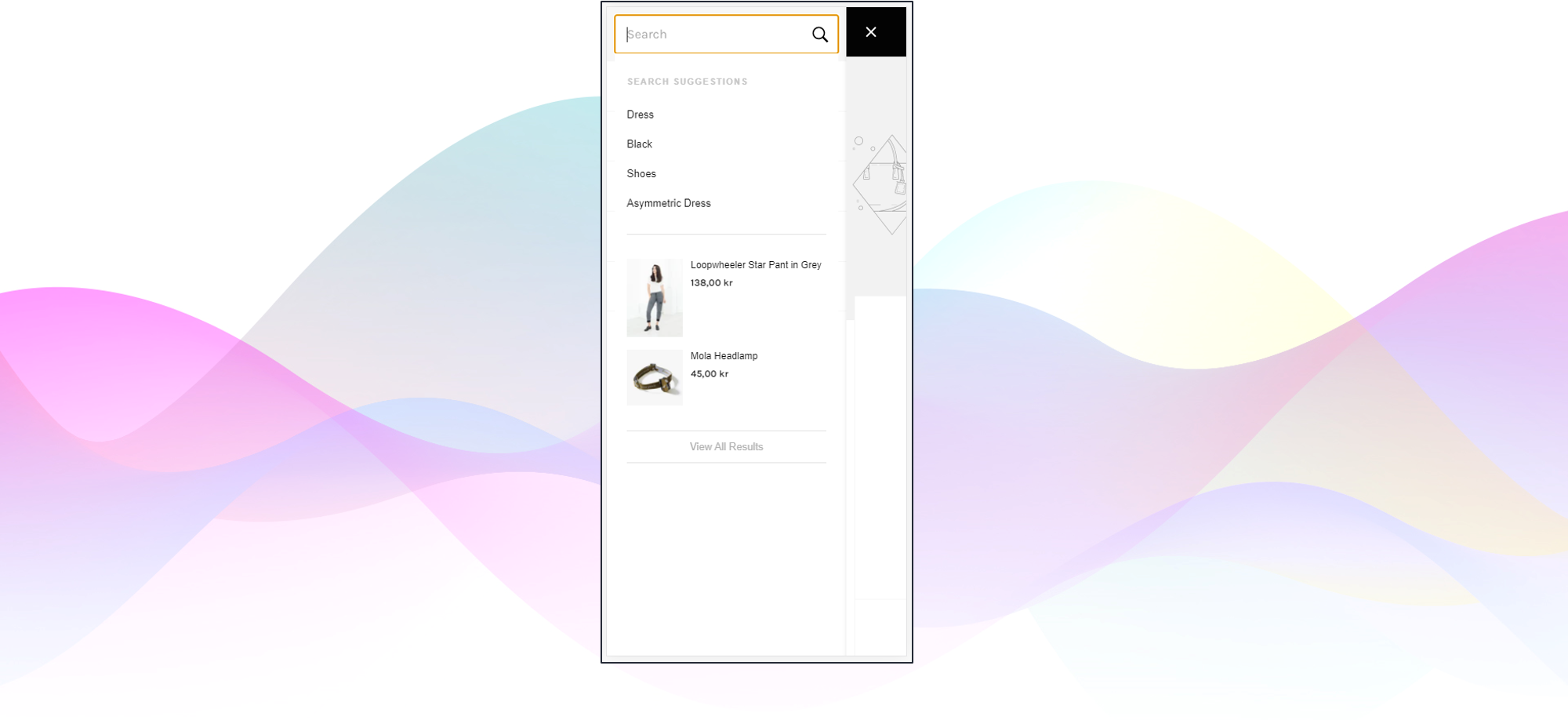
Mobile Autocomplete with Product Matches
#1. Background
For mobile, the fundamental requirement of the Autocomplete to simplify navigation becomes even more important. The limited "keyboard" size enhance the importance of trending searches & search suggestions. It is 26x times more common for the shopper to click on text rather than products.
Product suggestions should hence be shown secondary, but can still serve a valuable role. For visual categories, the confirmation of the query leading to relevant results can outweigh the added distraction and nudge the shopper to the search results page.
#2. Requirements
In order to apply this module without customizations, there are a few things to keep in mind:
API Response
The default elements used in every autocomplete are:
- product image
- product title
- product price
Behavior of The Search Input
This module is optimized for search bars that behave like an overlay to a page and therefore are not scrolling with the page. Therefore, the content within this module's autocomplete is going to be scrollable if the content is exceeding the screen's height.
#3. Time Estimates
Set up in Platform: N/A
Integration: 0.5 hour
Styling: 0-2 hours (optional)
#4. Functional Overview
To apply this module, we need to adjust a component in the code. We have prepared some snippets that we will link below in the Integration Steps. To give you an overview, these are the components we are going to work with:
- components/autocomplete/ProductMatches/view.tsx
- layouts/Autocomplete/Fullscreen/view.tsx
- components/autocomplete/SearchSuggestions/view.tsx
- styles
#5. Integration Steps
Each of the below steps links to a code snippet on GitHub:
- For this module we will import
Product MatchesandTipand add the components over here. - Alter the mobile search suggestions to display four as a maximum but keep the desktop settings untouched.
How to change the limit of search suggestions in the autocomplete?
By default, we will show the number of search suggestions as per the setting in the Findify Dashboard
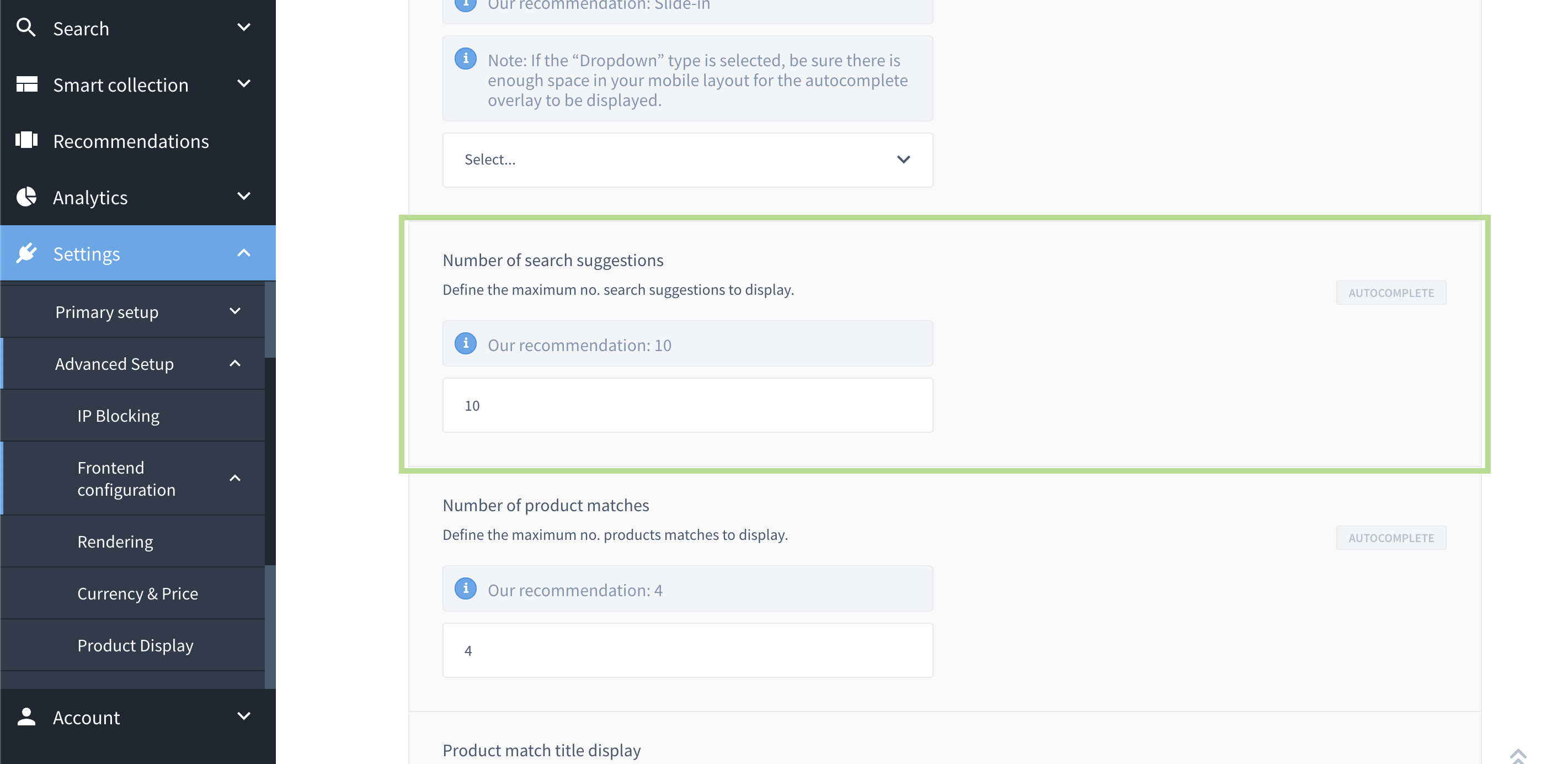
Frontend Configurations found in Dashboard > Settings > Advanced Setup > Frontend Configuratons
- So, in order to achieve this, you would have to start by adding this.
- Then you would have to pass down the isMobile props as shown over here so that you can use it to alter the component.
- Lastly, make sure to add the enhancer.
- This step follows a similar logic to step 2 – We will alter the mobile autocomplete to display two product matches on mobile only instead of showing the same amount that shows on the desktop in order to provide a better mobile UX.
- Let's create an enhancer to start with and make sure to add it over here as well.
- Pass down the props as shown here
- This is an actual use-case of limiting the mobile version to show two product matches on mobile as a maximum whilst keeping the limit on the desktop that is set in the Findify Dashboard.
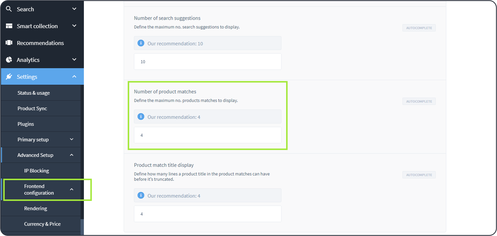
Frontend Configurations found in Dashboard > Settings > Advanced Setup > Frontend Configuratons
The complete module can be found here.
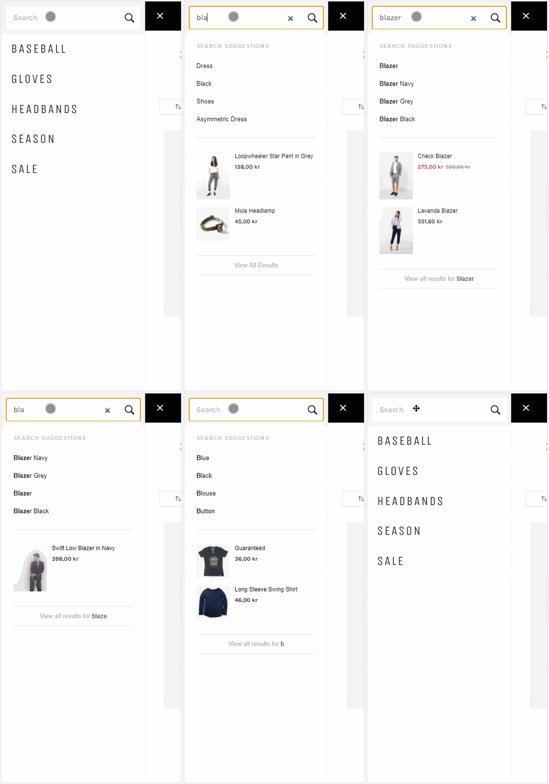
Mobile Autocomplete with horizontal product cards
#6. Modifications
Modifications are done through Findify's DevTools
Here's a guide on how to work with the devtools: Working with Findify's DevTool.
Fonts
By default, we are using the font family "Karla".
Here's a CSS snippet of our default source code:
:root {
    /* Fonts */
    --font-base: 'Karla', sans-serif;
}
If you want to alter the font family, you need to overwrite this default font family using the same pattern within our dev tools.
Below is an example of using a custom font-family. It is important to note that we can overwrite existing CSS using the same variable names or the same class names. In this case it's
:root {
--font-base: some value;
}
Or, using a real font family:
:root {
  --font-base: Helvetica,Arial,sans-serif;
}
Colours
This module is using Findify's default colour scheme that can be found throughout all components. Within the autocomplete, the applicable colour-assets would be:
- a grey tone (#c6c6c6) for the "Search Suggestions" title
- a black tone (#111) for overall texts including regular prices
And for products on sale, the sale price would show in red (#d0284b), the old price in grey (#8d8d8d).
This can be adjusted using CSS through the Findify Devtools.
Image Aspect Ratio
The images for this module are set to a width of 70px. Depending on the preferred design for your store, you might want to alter this.
Adjusting the Breakpoint
This module is using styling that is specifically set to change styling for desktop versions only to prevent the mobile autocomplete module to grab up any styling that is not supposed to be used in there. By default, our system's breakpoint is set to 767px.
This can be adjusted in
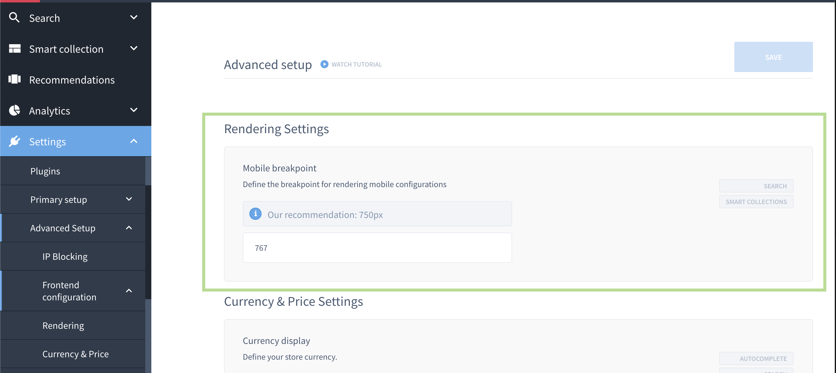
Frontend Configurations found in Dashboard > Settings > Advanced Setup > Frontend Configuratons
- the CSS snippet by altering the max-width.
#7. MJS Version
This module has been optimized for MJS version 6.16.10
Updated almost 2 years ago
