Color Swatches

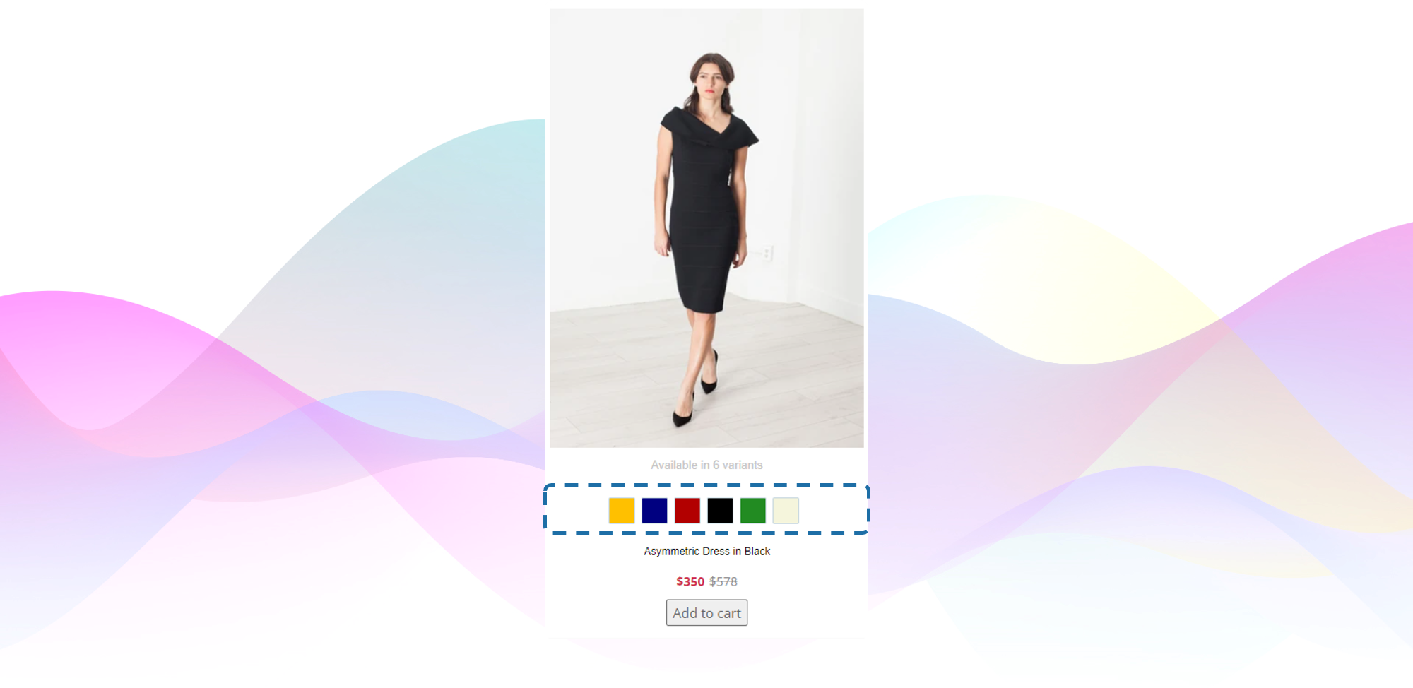
Color Swatches showcased in a product card
#1. The Value of Color Swatches
Color is often a crucial product variation but can easily be overlooked or misinterpreted if not clearly indicated in the product grid. (Source: Baymard Institute).
Applicable to many industries, color variations are key factors in a shopper’s product choice. If users are not aware of color options for products, there is a risk that they will not find a suitable item and leave the store page.
Variations indicated by text are often overlooked when scanning the webpage, while the visual representation of the available colors provides the shoppers with sufficient information and inspiration, when it comes to the variety of a given item.
#2. Color Swatches Components
Icons
- The icons will indicate the differentiation of available variants.
- The swatches should be large and well-spaced to ensure smooth interaction.
Preview color option
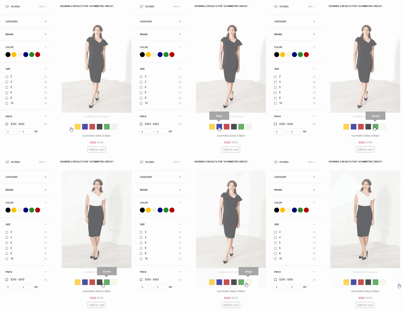
- When clicking on the color icons the shopper will preview the relevant image without having to visit the product page.
Additional variants
- When all color swatches don’t fit in one line within list items, the number of other colors available is clearly shown (e.g., “+8”), giving users a clear idea of the extent of the variations available.

Color Swatch showcasing available variants. Shifting variant on click.
#3. Implications for Mobile
When space becomes limited, which is often the case with mobile sites, it’s crucial to keep the icons large and prominent.
On mobile devices, even fewer swatches tend to be shown compared to desktop. Therefore, it’s critical to indicate the number of colors available so that the shoppers don’t get the impression that the color range is small.
#4. Requirements
Merchant Dashboard Settings
For this module to work, you will have to update a few settings in your Dashboard.
Color Mapping
This module uses Color Mapping. You can find the settings within your dashboard under Settings > Primary Setup > Color Mapping. (It's the same as for the filters that display color icons rather than text.)
Filter Settings
The Front-End is going to need some fields to be returned in the API response. Namely, the following fields are required:
- color
- id
- product_url
- image_url
In order to set this up, you can find a guide below that will walk you through what needs to be adjusted for every field listed above.
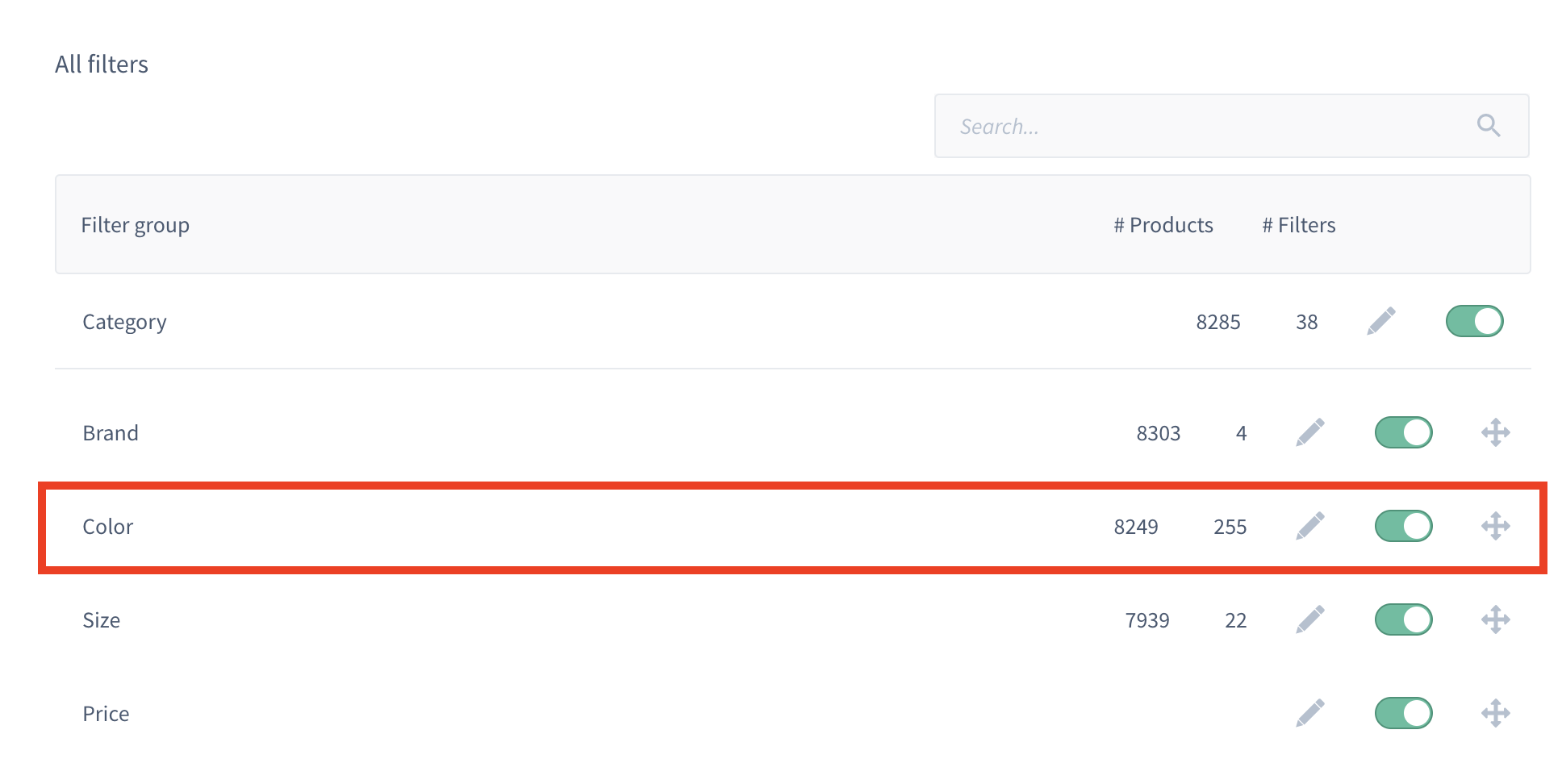
The filter doesn't have to be active as in the image shown below in order to be included in the API response that you are going to need.
Simply click on the pencil/edit icon to see further options ...

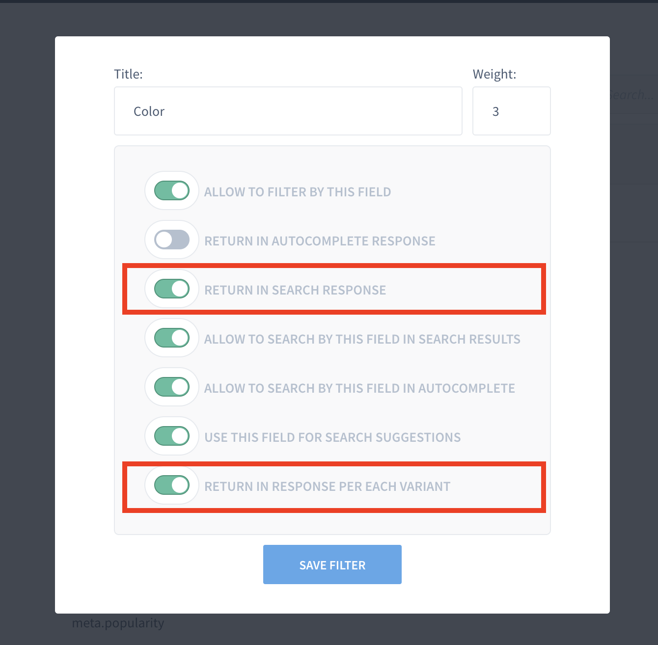
... and then you can return the colors in the API response by toggling on:
- Return in search response
- Return in response per each variant
Optionally you can enable return in autocomplete response if you plan on showing the color swatches in your autocomplete as well.

Last, but not least, you will have to sync the products. You can find the settings for this within your dashboard under Settings > Product Sync.

Now you're ready to adjust some code!
#5. Time Estimates
Set up in Platform: n/a
Integration: 0.5 hour
Styling: 0-2 hours (optional)
#6. Functional Overview
To apply the color swatches module, we need to adjust a component in the code. We have prepared some snippets that we will link below in the Integration Steps. To give you an overview, these are the components we are going to work with:
- components/Cards/Product/index.tsx
- styles
#7. Integration Steps
- Create a new component called ColorSwatches and you can add the code as per the example below.
import {useState} from 'react';
import {fromJS} from 'immutable';
import cx from 'classnames';


{/* search for available colors */}

const getColorSwatches = (variants, colorMapping) => {
  let arr = [];
  const reducedVariants = variants.reduce(
    (acc, item, index) => {
    const color = item.getIn(['color', 0], '');
      if(!color) acc[index] = false;
      if(color && arr.indexOf(color) < 0){
        acc[index] = {
          'id': item.get('id',''),
          'color': color,
          'swatchColor': colorMapping.get(color),
        }
        arr.push(color);
      }
      return acc;
    }
  , [variants]);
  return fromJS(reducedVariants.filter(i => i !== false));
}


{/* return an button element which changes color */}

const Item = ({currentId, item, id, setVariant, swatchColor}) => {
  return (
    <button
      className={cx('findify-product-color-swatch-item',{['findify-product-color-swatch-item-selected']: id == currentId})}
      onClick={
        (e) => {
          e.stopPropagation();
          setVariant(item.get('id'));
        }
      }
      style={{ background: `${swatchColor}` }}
    />
  )
}

{/* don't forget to accept all the props */}

const ColorSwatches = ({variants, setVariant, currentId }) => {
  const colorMapping = findify.config.get('colorMapping');
  const colorSwatches = variants && getColorSwatches(variants, colorMapping);
  const [isOpen, setState] = useState(false);
  return (
    <div
      display-if={colorSwatches}
      className={cx("findify-product-color-swatches-wrapper",{['findify-product-color-swatches-open-wrapper']: isOpen})}
    >
      <div className='findify-swatches-wrapper'>
        {colorSwatches.map(
          (item, index) =>
            {
              {/* iterate array of items and create a new component for available color */}
              return (
                <Item
                  display-if={isOpen || (!isOpen && index < 5)}
                  id={item && item.get('id','')}
                  item={item}
                  currentId={currentId}
                  index={index}
                  setVariant={setVariant}
                  swatchColor={item.toJS().swatchColor}
                />
              )
            }
        )}
      </div>
      <div
        display-if={colorSwatches && colorSwatches.size > 5}
        className="findify-product-show-more-colors"
        onClick={() => setState(!isOpen)}
      >
      </div>
    </div>
  )
}

export default ColorSwatches;
- Make additional changes within the component components/Cards/Product/index.tsx to import color swatches ...
- ... and add some CSS to match the styling you would prefer or feel free to refer to our example.
{/* import component */}
import ColorSwatches from 'ColorSwatches';

{/* ... some code ... */}

 	return (

		{/* ... some code ... */

		{/* bring variants and colorswatches components in one div */}
        <div className='findify-color-swatches-and-variants'>
          {/* dont't forget to pass down all props*/}
          <ColorSwatches
            display-if={!isAutocomplete}
            variants={item.get('variants','')}
            item={item}
            currentId={variant.get('id')}
            setVariant={setVariant}
          />
          <Variants config={config} item={item} />
        </div>

        {/* Our recommendation to put it under Title component */}

        <Title ...>

		{/* ... some code ...  */}
/* styles for color swatches */

.findify-color-swatches-and-variants {
  width: fit-content;
  margin: 0 auto;
  position: relative;
  padding-bottom: 20px;
  padding-top: 10px;
}

.findify-color-swatches-and-variants .findify-components--cards--product--variants__variants {
  position: absolute;
  right: 0;
  top: 50%;
  transform: translateY(-50%);
  margin: -2px -25px 0 0;
}

.findify-color-swatches-and-variants .findify-swatches-wrapper button {
  cursor: pointer;
  height: 26px;
  width: 26px;
  border-radius: 50%;
  margin-left: 7px;
  margin-right: 7px;
  border: 2px solid #fff;
}

.findify-color-swatches-and-variants .findify-product-color-swatch-item.findify-product-color-swatch-item-selected {
  width: 24px;
  height: 24px;
  border: 2px solid #5f5f5f;
}
#8. MJS Version
This module has been optimized for MJS version 7.1.15
Updated almost 2 years ago
