Filter Control in Shopify Using Metafields
#1. Use Case
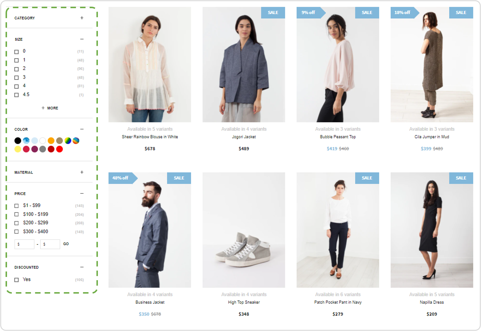
Filters displayed vertically next to the product grid.
Using filters is a great way to ease navigation for your shoppers. With Findify, you can add filters easily using Variant Options, Metafields, or Tags. Read more here.
Within the Findify Merchant Dashboard you can easily toggle filters on/off, change names, and alter the order of filters. By default, Findify's filters are dynamic and disappear if there aren't any values for the viewed search query/collection, but there are also cases when you want to control the order of filters on individual collections.
Working with Findify's DevTools, you can easily customize the order of filters shown, while this guide outlines a simple and non-technical method of control the experience on an ongoing basis (without having to change any code).
#2. Input Format
Populated data only required for collections that should be altered
This function is designed to offer control of individual collections without having to populate data for all collections. This function will only affect collections where this metafield is populated. Where it's left empty, all filters activated in the Findify dashboard will be presented in order specified within the dashboard.
The function follows a really simple format, controlling:
i) Which Filters to be included; and
ii) In what order they should be presented.
Format:
{"Filter Name": Position," Filter Name_2" : Position_2 , " Filter Name_n" : Position_n }
Example:
{"Discount" : 1," Color" : 2 , " Price" : 3}
In this case, the filters will be presented in the order of:
- Discount
- Color
- Price
While any other filter, such as Category, will be excluded.
#3. Requirements To Apply This Guide
- This guide is applicable for Shopify only.
- This integration requires the merchant to set up the field and populate the data needed for Filter Control using metafields.
- This solution is built for individual collection control. Bulk management can, however, be utilized by bulk editing the input values within metafields.
#4. Time Estimates
- Set up in Shopify: 1 hour
- Integration: 1 hour
- Styling: n/a
- Populating Filter Values: Depends on breath of scope. Each collection will take a few seconds.
#5. Overview Of Integration Steps
Step 1: Set Up Required Metafield Structure (Merchant)
Step 2: Populate Data to Control the Filters per Collection
Step 3: Make The Data Available
Step 4: Integrate Front End Activation Through Findify DevTools
Step 1: Set Up Required Metafield Structure (Merchant)
In order to manage metafields in Shopify, you need the capability in place.
For this overview, we have utilized the 'Custom Fields' app.
Choice of Meta Fields App
The following guide is done using the 'Custom Fields' app but meta fields are stored in Shopify so please use the meta fields app you prefer. The UX of the dashboard setup might alter, but functionality in your store will be the same.
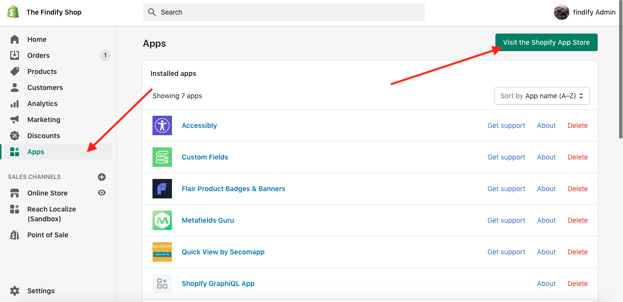
In your Shopify dashboard, visit the App Store.
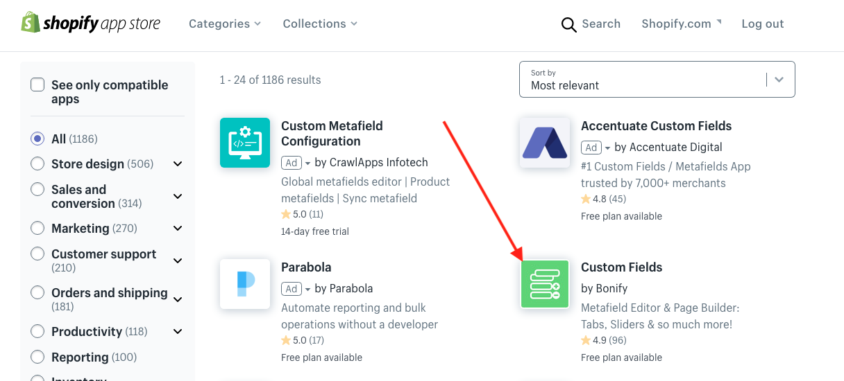
Install the 'Custom Fields' app.
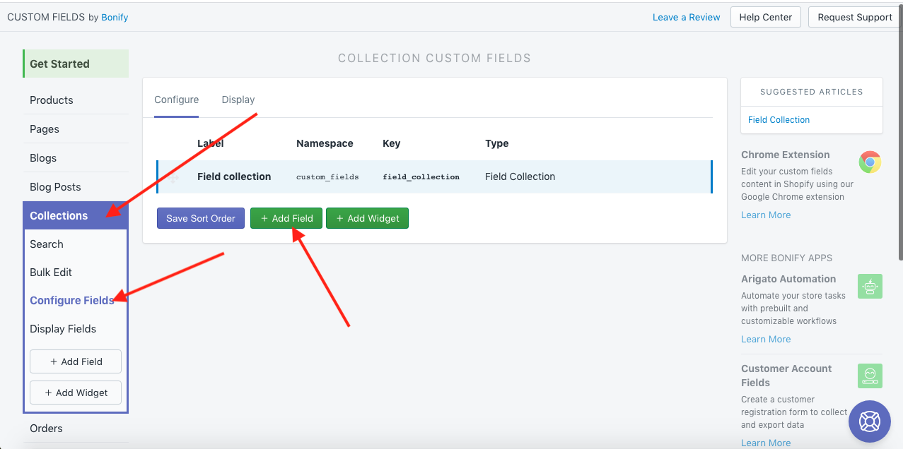
Enter the app & select 'Add Field' in the collection configurations.
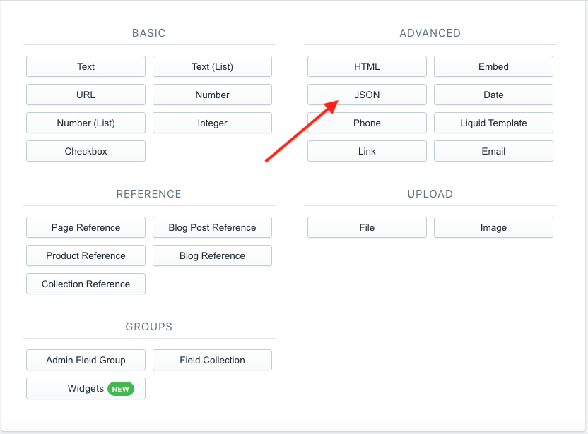
Select 'JSON' and set name 'Filters sorting'.
Step 2: Populate Data to Control the Filters Per Collection
Go back to the Shopify Dashboard and visit a specific collection page.
Products > Collections > "Collection Name"
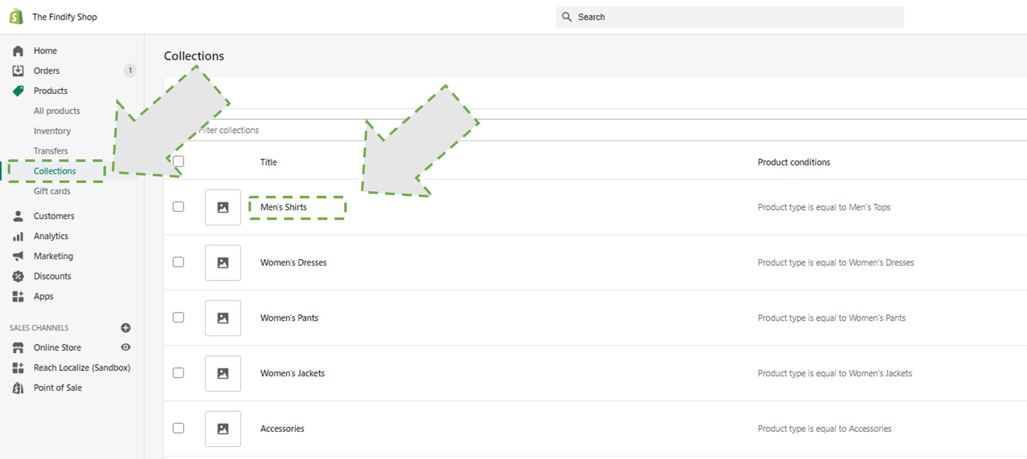
Select a collection to set up the Filter Control for.
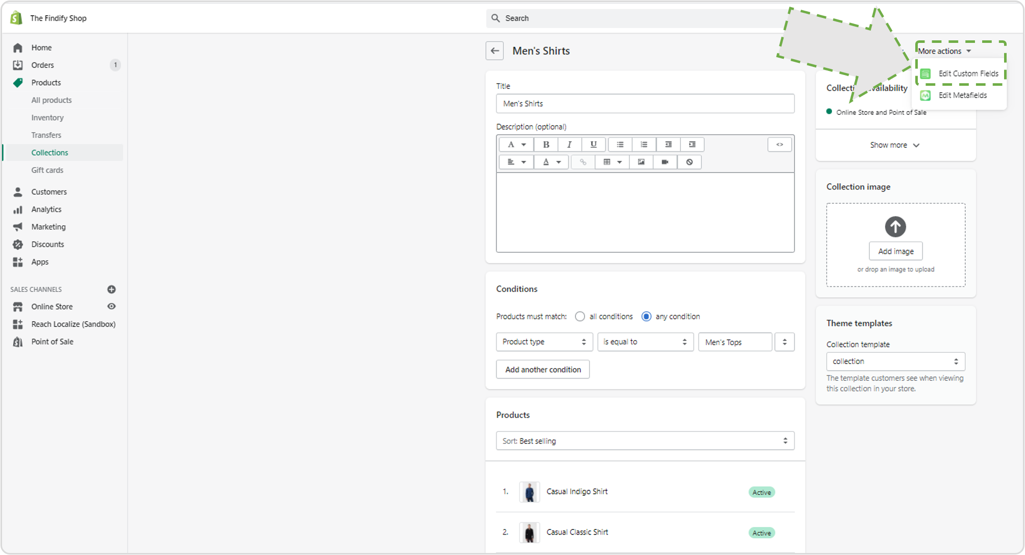
Click on 'More actions' and choose 'Edit Custom Fields'.
In the window, you can now control the the filters displayed following a json string to control:
- Which filters should be included; and
- In what order they should be presented.
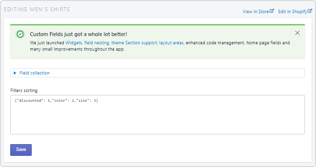
Example of metafield input.
Example
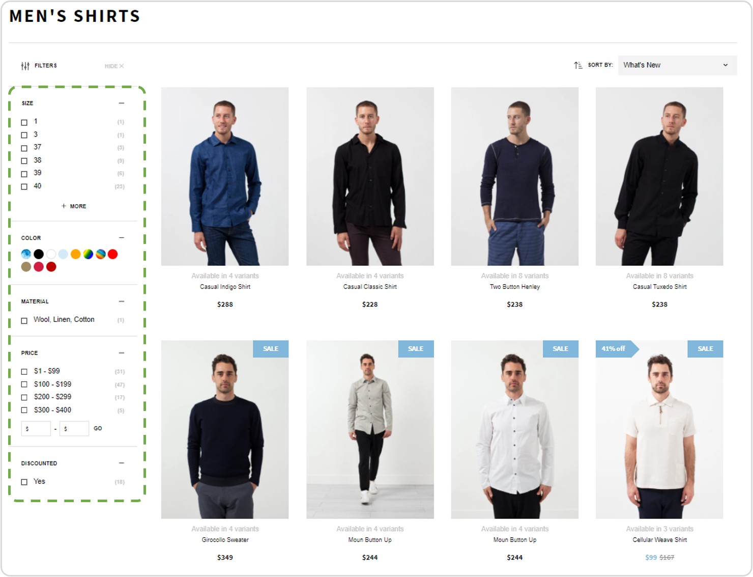
Before Applying Filter Control
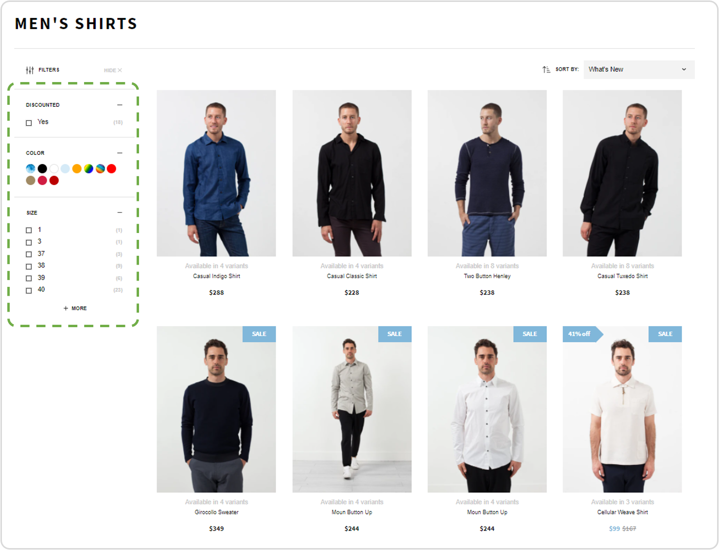
After Applying Filter Control
If you leave out a filter, it won't be displayed on your collection page. In this example only discounted, color, and size filters will be displayed on page. Other will be deleted.
Important
The filter names must be stated exactly as they are stated within Findify.
Note: In the Findify Dashboard, you can easily control the names of your filters. These settings are found in Settings > Primary Setup > Filters
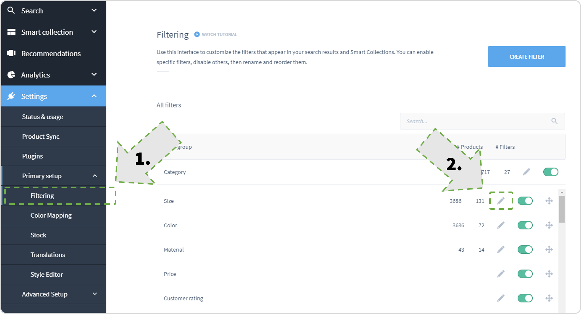
Visit filter options and click on the 'configure-icon' for the selected filter.
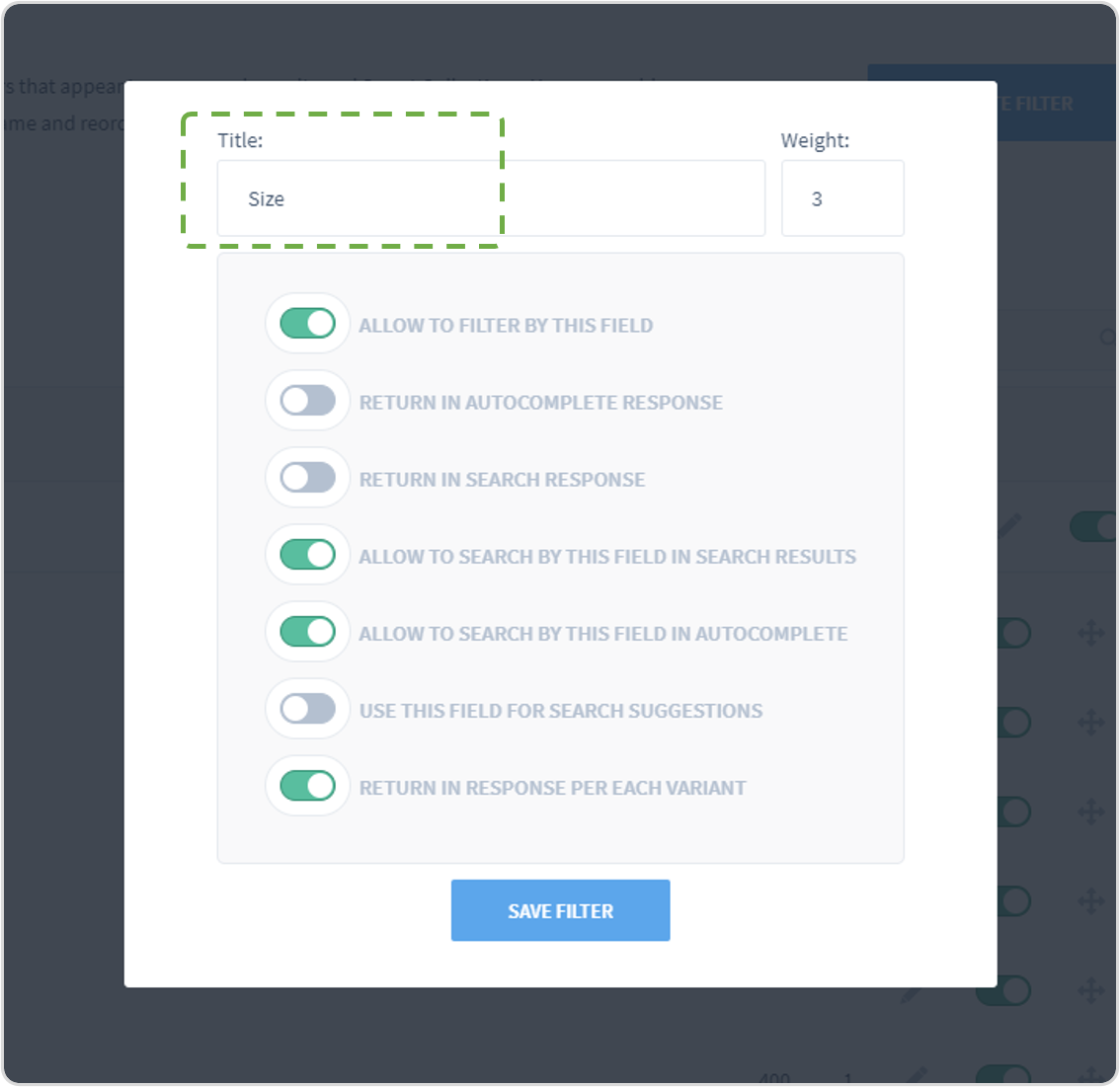
In the top, you can easily change the filter name which is how it will be displayed in the front end.
Step 3: Make The Data Available
Then, you need to add some code to your collection template. You need to go to the theme files and edit code.
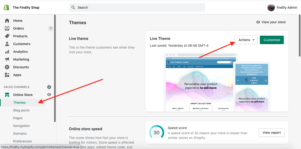
Open 'Templates' and choose 'collection.liquid' file. Add this code into findify-fallback container
<div class="findify-filter-sorting">
      <script>
        {{collection.metafields.custom_fields["filters_sorting"] | json}}
      </script>
    </div>
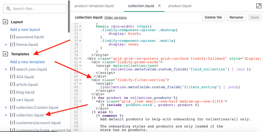
Example of required code added into the findify-fallback container in 'collection.liquid'.
Don't forget to save your changes
Step 4: Integrate Front End Activation Through Findify DevTools
The following steps require the use of Findify DevTools - changing the React components in the front end. If you have any challenges, Findify's team for professional services would be happy to assist.
Please get in touch through: [email protected]
Findify DevTool Extension
To learn how to work with the DevTools, please read more here.
To sort filters you need to edit these files:
-
- 'components/search/DesktopFacets/view.tsx'
-
- 'components/Facet/view.tsx'
-
- In 'components/search/DesktopFacets/view.tsx' you need to add 'sortFacets' function and 'enhancer'.
/**
 * @module components/search/DesktopFacets
 */

import React from 'react';
import Branch from 'components/common/Branch';
import MapArray from 'components/common/MapArray';
import Facet from 'components/Facet';
import Sticky from 'components/common/Sticky';
import Text from 'components/Text';
import Button from 'components/Button';
import Icon from 'components/Icon';
import { classNames } from 'classnames';
import * as titles from 'components/search/DesktopFacets/Title';
import { MJSConfiguration, ThemedSFCProps, IFacet, MJSValue } from 'types';
import { List, Map } from 'immutable';
import {withPropsOnChange} from 'recompose'; //import withPropsOnChange

const DefaultContent = ({ theme, children, config, title }) =>
  <section className={theme.root} role="region" aria-label={title} tabIndex={0}>{children}</section>

/** Props that DesktopFacets view accepts */
export interface IDesktopFacetsProps extends ThemedSFCProps {
  /** MJS Configuration */
  config: MJSConfiguration;
  /** Facets list */
  facets: List<IFacet>;
  /** Method called to reset facets */
  onReset: () => any;
  /** MJS API Response Metadata */
  meta: Map<string, MJSValue>;
  /** Method to hide facets */
  hideFacets: () => any;
  /** Shows visibility status of facets */
  visible: boolean;
}
// create sortFacets to sort facets
const sortFacets = (facets, config) => {
  const sorting = document.querySelector('.findify-filter-sorting script')
                    ? JSON.parse(document.querySelector('.findify-filter-sorting script').text)
                    : false;
  if(sorting){
    return facets.sort(
      (a, b) => {

        let x = 100000, y = 100000;
        const first = config.getIn(['facets', 'labels', a.get('name')], a.get('name')).toLowerCase();
        const second = config.getIn(['facets', 'labels', b.get('name')], b.get('name')).toLowerCase();

        if (sorting[first]){
          x = sorting[first];
        }
        if (sorting[second]){
          y = sorting[second];
        }
        return x - y;
    })
  }

  return facets;
}
//create enhancer to change facets positions and to get json from shopify
const enhancer = withPropsOnChange(['facets'], ({ facets, config }) => ({
  facets: sortFacets(facets, config),
  facetsJSON: document.querySelector('.findify-filter-sorting script')
                ? JSON.parse(document.querySelector('.findify-filter-sorting script').text)
                : false
}))

const DesktopFacetsView: React.SFC<IDesktopFacetsProps> =  ({
  config,
  facets, theme, onReset, meta, hideFacets, visible, facetsJSON
}: IDesktopFacetsProps) =>
<Branch
  display-if={!config.get('hidableFacets') || visible}
  theme={theme}
  condition={config.getIn(['view', 'stickyFilters'])}
  title={config.getIn(['facets', 'i18n', 'filters'], 'Filters')}
  left={Sticky}
  right={DefaultContent}>

  <Branch
    display-if={!config.get('showFacetsTitle')}
    meta={meta}
    config={config}
    theme={theme}
    onReset={onReset}
    onHide={hideFacets}
    condition={config.get('hidableFacets')}
    left={titles.hidable}
    right={titles.default}
  />

  <MapArray
    theme={{ root: theme.facet }}
    array={facets}
    factory={Facet}
    facetsJSON={facetsJSON}//export json to Facet/view
    config={config}
    keyAccessor={i => i.get('name')} />

</Branch>

export default enhancer(DesktopFacetsView);
/**
 * @module components/search/DesktopFacets
 */
import Branch from 'components/common/Branch';
import MapArray from 'components/common/MapArray';
import Facet from 'components/Facet';
import Sticky from 'components/common/Sticky';
import Title from 'components/search/DesktopFacets/Title';
import Breadcrumbs from 'components/Breadcrumbs';
import { useFacets } from '@findify/react-connect';
import { Immutable } from '@findify/store-configuration';
import { memo, useCallback, useMemo, useState } from 'react';
import useTranslations from 'helpers/useTranslations';
import { useEvents, emit } from 'helpers/emmiter';

import styles from 'components/search/DesktopFacets/styles.css';

const DefaultContent = ({ theme, children, title }) => (
  <section className={theme.root} role="region" aria-label={title} tabIndex={0}>
    <div className={theme.container}>{children}</div>
  </section>
);

export default memo(({ theme = styles }) => {
  const { facets, meta, onReset, config } = useFacets<Immutable.SearchConfig>();
  const translate = useTranslations();

  const [isHorizontal, isHidable, isSticky, isAccordion] = useMemo(
    () => [
      config.getIn(['facets', 'position']) === 'top',
      config.getIn(['facets', 'hidable']),
      config.getIn(['facets', 'sticky']),
      config.getIn(['facets', 'accordion']),
    ],
    []
  );

  const [visible, setVisible] = useState(true);

  /** Generate initial list of opened facets */
  const [openFacets, setFacetsStates] = useState(
    config
      .getIn(['facets', 'filters'])
      .filter((f) => !f.get('initiallyCollapsed'))
      .keySeq()
      .toArray()
  );

  const toggleFacet = (name) =>
    setFacetsStates((facets) => {
      const isOpen = facets.includes(name);
      if (isAccordion) return isOpen ? [] : [name];
      return isOpen ? [...facets.filter((k) => k !== name)] : [...facets, name];
    });

  useEvents({
    showFacets: () => setVisible(true),
    toggleFacet: (name) => toggleFacet(name),
  });

  const hideFacets = useCallback(() => {
    emit('hideFacets');
    setVisible(false);
  }, []);

  const parseJSON = () => {
    try {
      return JSON.parse(document.querySelector('.findify-filter-sorting script')?.text);
    }
    catch (e) {
      return false;
    }
  };

  const facetsJSON = parseJSON();

  return (
    <Branch
      display-if={true || !isHidable || visible}
      theme={{
        container: theme.container,
        root: isHorizontal ? theme.horizontal : theme.root,
      }}
      condition={isSticky}
      title={translate('facets.filters')}
      left={Sticky}
      right={DefaultContent}
      stickToTop={isHorizontal}
      offset={isHorizontal ? 0 : 25}
    >
      <Title
        meta={meta}
        theme={theme}
        onReset={onReset}
        onHide={hideFacets}
        hidable={isHidable}
      />

      <div className='breadcrumbs-container'>
        <Breadcrumbs />
      </div>

      <div className="findify-facets-wrapper"> // add this wrapper to order filters
        <MapArray
          array={facets}
          factory={Facet}
          config={config}
          isHorizontal={isHorizontal}
          onToggle={toggleFacet}
          openFacets={openFacets}
          facetsJSON={facetsJSON}
          keyAccessor={(i) => i.get('name')}
        />
      </div>
    </Branch>
  );
});
Then, you need to remove filters that are not included in json. To do this, you need to change the 'components/Facet/view.tsx' component.
Also for MJS 7 you need to add some style
/**
 * @module components/Facet
 */

import React from 'react';
import Button from 'components/Button';
import Text from 'components/Text';
import Icon from 'components/Icon';
import Component from 'components/Facet/Component';
import { ThemedSFCProps, IFacet, MJSConfiguration } from 'types';

/** Props that Facet view accepts */
export interface IFacetProps extends ThemedSFCProps {
  /** Facet component to render */
  FacetComponent: React.Component<any>;
  /** Flag to show open / closed state of facet */
  isOpen?: boolean;
  /** Flag to show if facet is opened on mobile */
  isMobile?: boolean;
  /** Title of facet */
  title: string;
  /** Facet object */
  item: IFacet;
  /** MJS Configuration */
  config: MJSConfiguration;
  /** Filters selected in facet */
  filtersSelected: number;
  /** Function to toggle open / closed state of facet */
  toggleFacet: () => any
}

const FacetView = ({
  FacetComponent,
  isOpen,
  theme,
  title,
  item,
  config,
  filtersSelected,
  toggleFacet,
  facetsJSON //import json
}: IFacetProps) => (
  <div
    display-if={(facetsJSON && facetsJSON[title.toLowerCase()]) || !facetsJSON}//add this line to remove filters that are not included in json
    className={theme.root}
    tabIndex={0}
    role='region'
    aria-labelledby={title}
  >
    <Button className={theme.title} onClick={toggleFacet} aria-expanded={isOpen} tabIndex={-1}>
      <Text primary uppercase className={theme.text}>{ title } {filtersSelected > 0 ? `(${filtersSelected})` : ''}</Text>
      <Icon name={isOpen ? 'Minus' : 'Plus'} className={theme.icon} />
    </Button>
    <Component
      display-if={isOpen}
      facet={item}
      config={config}
      theme={{ root: theme.body }}
      isMobile={true} />
  </div>
)

export default FacetView;
/**
 * @module components/Facet
 */
import cx from 'classnames';
import Button from 'components/Button';
import Text from 'components/Text';
import Icon from 'components/Icon';
import Component from 'components/Facet/Component';
import { ThemedSFCProps, IFacet } from 'types';
import { useCallback, useEffect, useMemo, useRef } from 'react';
import styles from 'components/Facet/styles.css';
import { Immutable } from '@findify/store-configuration';

/** Props that Facet view accepts */
export interface IFacetProps extends ThemedSFCProps {
  /** Facet component to render */
  FacetComponent: React.Component<any>;
  /** List of openFacets */
  openFacets: string[];
  /** Flag to show if facet is opened on mobile */
  isMobile?: boolean;
  /** Flag to show if facets orientation is mobile */
  isHorizontal?: boolean;
  /** Title of facet */
  title: string;
  /** Facet object */
  item: IFacet;
  /** MJS Configuration */
  config: Immutable.SearchConfig;
  /** Filters selected in facet */
  filtersSelected: number;
  /** Function to toggle open / closed state of facet */
  onToggle: (name: string) => void;

  /** Amount of items to be shown in "collapsed" mode */
  collapsedItemsCount?: number;
}

export default ({
  theme = styles,
  item,
  config: _config,
  isMobile,
  isHorizontal,
  onToggle,
  openFacets,
  facetsJSON //import json
}: IFacetProps) => {
  const { current: config } = useRef(
    _config.merge(_config.getIn(['facets', 'filters', item.get('name')]))
  );

  const selectedItemsCount = useMemo(
    () => item.get('values').filter((item) => item.get('selected')).size,
    [item]
  );

  const title = config.get('label') || item.get('name');
  const isOpen = openFacets.includes(item.get('name'));

  const onClick = useCallback(() => {
    onToggle(item.get('name'));
  }, []);

  useEffect(() => {
    window.dispatchEvent(new Event('resize'));
  }, [isOpen]);

  return (
    <div
      display-if={facetsJSON ? facetsJSON?.[title] : true}//add this line to remove filters that are not included in json
      className={cx(theme.root, {
        [theme.horizontal]: isHorizontal,
        [theme.mobile]: isMobile,
        [theme.expanded]: isOpen,
      })}
      style={{order: facetsJSON?.[title] ? facetsJSON?.[title] : null}} //add this line to order
    >
      <Button
        className={theme.title}
        onClick={onClick}
        aria-expanded={isOpen}
        aria-controls={`facet-${item.get('name')}`}
        tabIndex={0}
      >
        <Text primary uppercase className={theme.text}>
          {title} {selectedItemsCount ? `(${selectedItemsCount})` : ''}
        </Text>
        <Icon
          name={isOpen ? 'Minus' : 'Plus'}
          className={theme.icon}
          title={isOpen ? 'Collapse list' : 'Expand list'}
        />
      </Button>
      <div className={theme.body} hidden={!isOpen}>
        <Component facet={item} config={config} isMobile={isMobile} />
      </div>
    </div>
  );
};
.findify-facets-wrapper{
  display: flex;
  flex-direction: column;
}
Updated almost 2 years ago
