Styling Templates for Promo Cards and Collections
Findify provides advanced solutions for search, merchandising, and recommendations tailored for ecommerce merchants. Our native Shopify app, built using the Liquid language, allows users to customize the appearance and behavior of Collection Grids and Promo Cards for different templates. This documentation will guide you through configuring these components.
Collection Grid Template Configuration
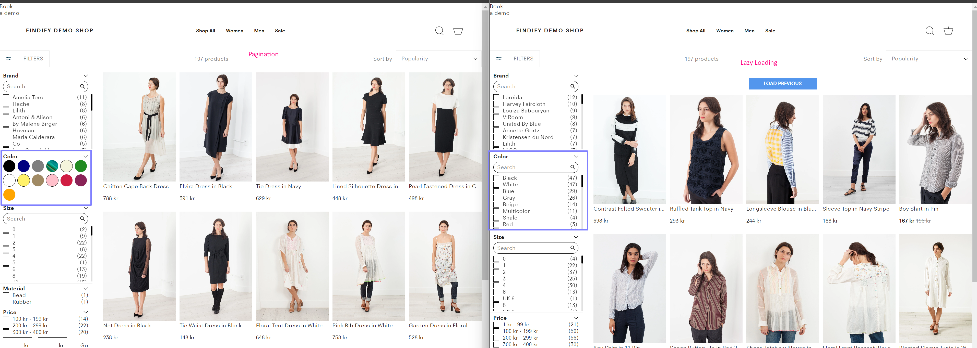
Collection Grids in Findify can be customized for each specific template. If you have multiple collection templates, settings must be configured separately for each one. This flexibility allows you to tailor the appearance and behavior of collection grids to suit different templates.

For example, two different collection templates can have distinct configurations, enabling a unique look and feel for each one.

Promo Card Template Configuration
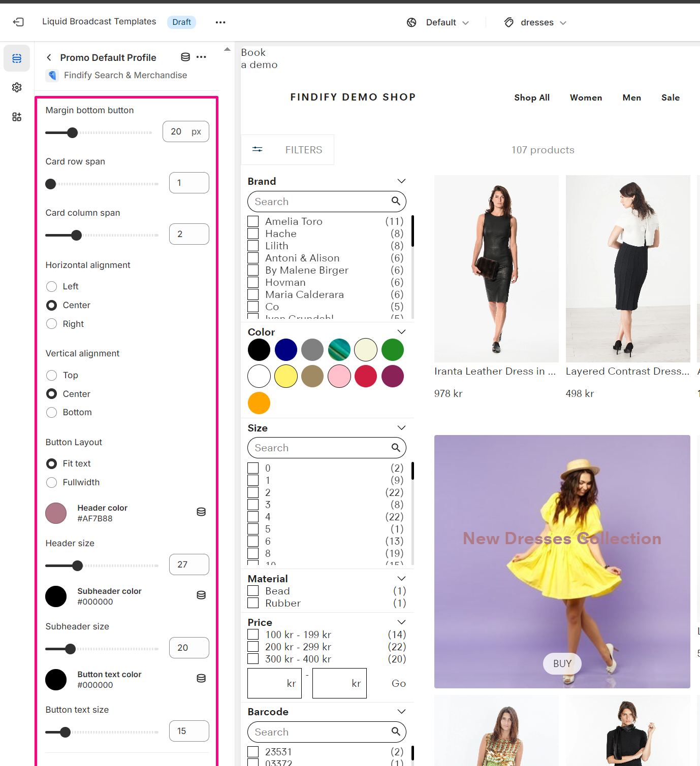
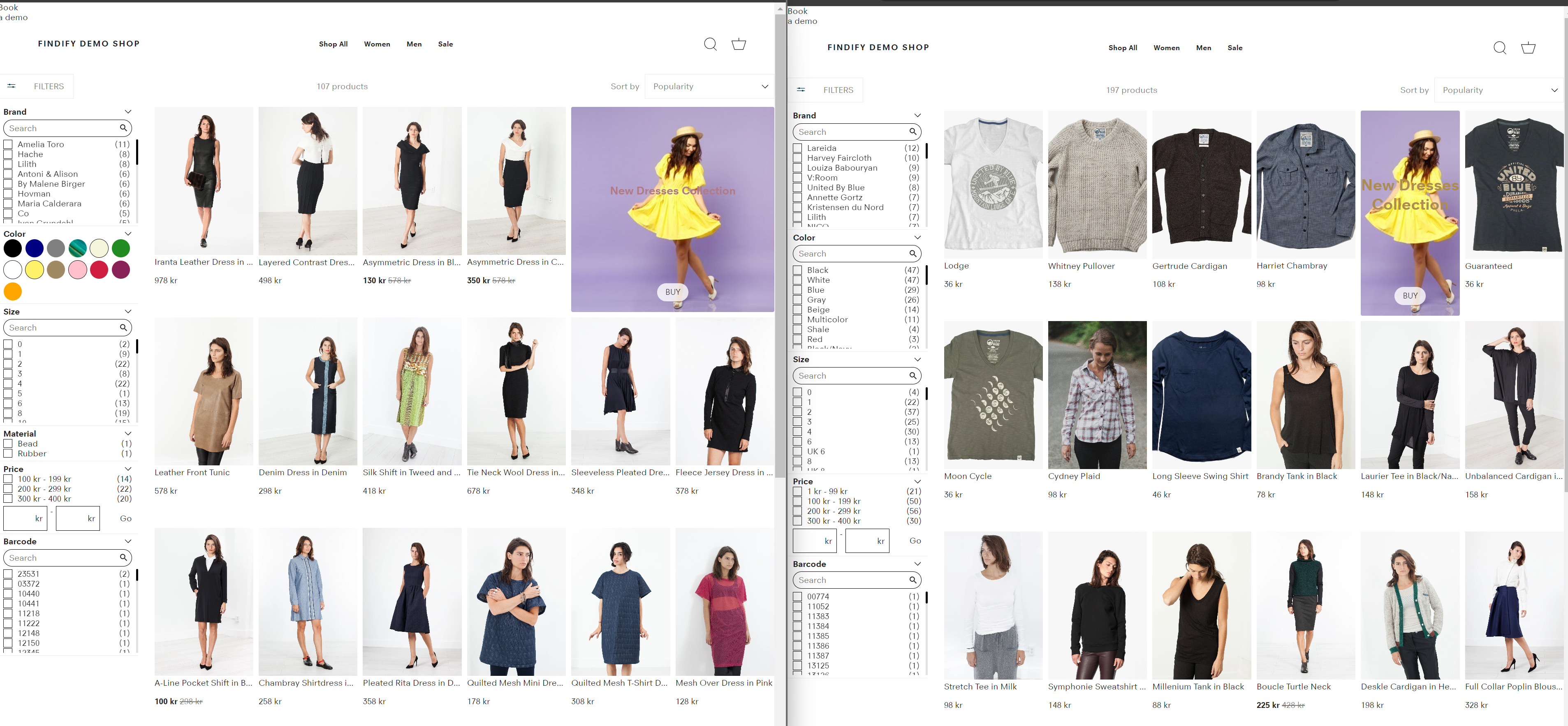
Similarly, Promo Cards can also be configured for individual templates. This allows you to design promo cards that align with the specific aesthetics and functionality of each template.

For instance, a single Promo Card in the Merchant Dashboard can appear differently across various templates, providing a customized user experience.

Adjusting Styles
To adjust specific styles for a collection template, use the Section ID and add styles to the relevant .css files. This approach allows for granular control over the appearance of different sections within your templates.
Example
Add the following CSS to your stylesheet to target a specific section ID:
/* Example CSS for a specific section ID */
#section-id-1234 .collection-grid-item {
    background-color: #f5f5f5;
    border-radius: 8px;
}

By utilizing section IDs, you can ensure that each collection template and promo card has a distinct and tailored design that aligns with your brand's needs.
For further assistance or inquiries, feel free to contact us at [email protected].
Updated 11 months ago
