Working with Findify's DevTool
Learn how to install the Findify React Devtools and begin to use it immediately!
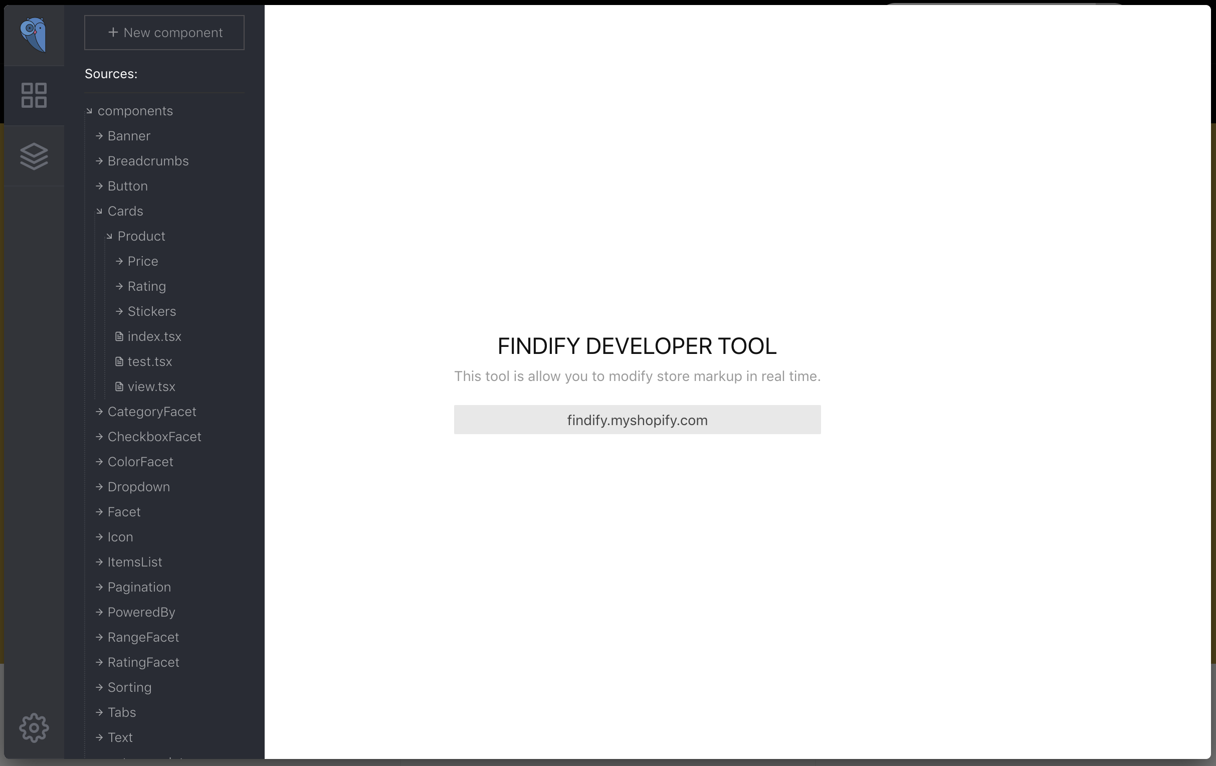
Front page of the Findify Developer Tool
What you will learn here
The Findify React Devtools extension is a complete toolbox to modify every visual aspect of Findify Search, Recommendations and Smart Collections.
In this hands-on guide, you will learn how to:
- Install the Chrome extension,
- Enable it within your store,
- Understand the way the extension is structured,
- Manipulate components,
- Create new components.
Install the Chrome extension
Use this link to install the extension into your Chrome browser (Applicable for MJS version 7.1.52, or newer. For older version get in touch with us and we'll share applicable link).
Once this is done, go to your store. The Findify icon next to your URL box should become colored: Findify extension is ready. Click on it!

Click on the Findify icon to open the devtools interface
- Type in your email and password that are used to login into Findify's Merchant Dashboard.
- In the dropdown, select the name of your store that you would like to make modifications in.
- The interface of the extension should then appear with the components and styles of your store.
What should I look for in the Chrome extension?
The content of the Chrome extension can be hard to understand at first but no worries, we will get you covered in a few minutes!
Components
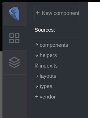
Left panel in the Chrome extension
Components are the low-level blocks. All the experience in Findify consists of several blocks. For instance, the search results page is built of 3 components: ItemsList, Pagination and Powered by.
Some components are built using other components. For instance, ItemsList has an array of the Cards / Products component. Each Product contains Image, DiscountSticker, Rating (for the review), Title, Description and Price components.
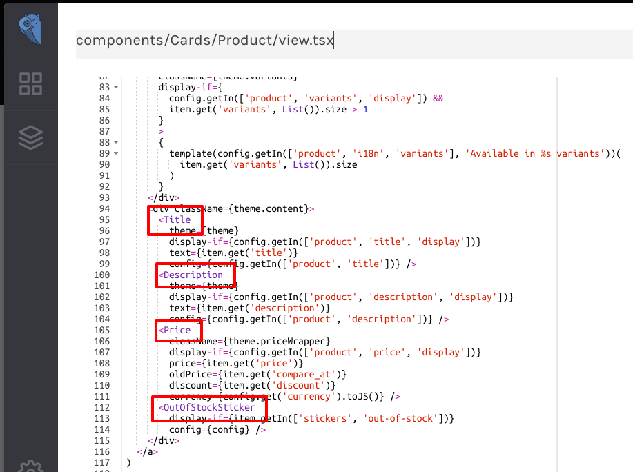
Components that are part of Cards / Products
Every component has always at least the 2 following files: index.ts, view.tsx.
index.ts contains the logic of the component: what happens when you click on a button, when a filter is clicked, etc. Normally, we do not recommend modifying this file as wrong manipulations can have unexpected results. Be careful if you do!
view.tsx contains the visual description of the component. This is often the file you will need to modify so that the interface fits what you would like it to display.
What is .ts and .tsx?
These extensions characterize Typescript files. Typescript is a superset of Javascript that compiles things into Javascript. In Findify, we use Typescript because of its static typing advantage.
Styles
In order to modify the styles of a component, click on the Styles button.
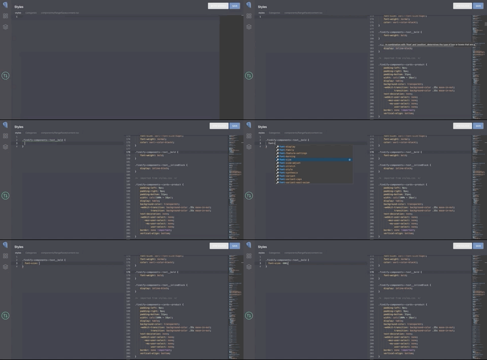
Clicking on the styles button will display the CSS styles. Clicking on Show Source will display default Findify styles. You can right click and use 'Pick definition' to copy over the selector
You will see all the CSS for all the components in this section. In order to simplify your life, the CSS section supports autocompletion, variable definitions and nested rules.
By default you will see an empty editor with no styles, as the editor only shows styles that you've added on top of default styling.
You can show default styles by clicking 'Show Source' button on the top right of the screen.
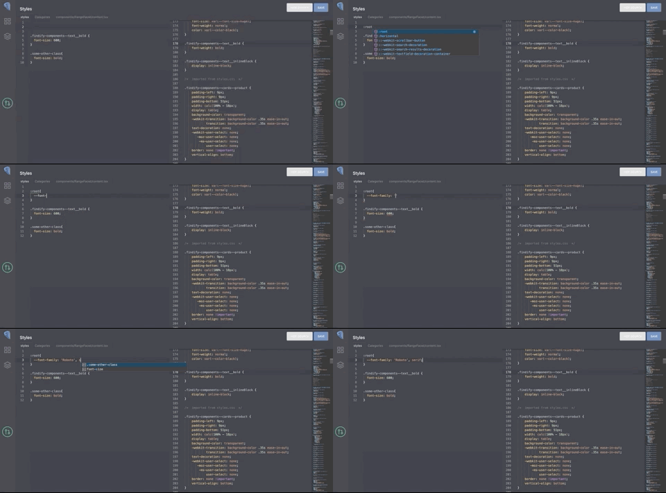
Autocompletion and CSS spell check are available in the editor
You can override default styling by using the same selector and providing updated properties in the selector. Our build system will then check if you use the selector that already exists in the default CSS file and will override exactly the property that you have specified.
The build system will not merge rules that are not present in our default CSS and will just add them to the end of the file, so you can use extra styles if needed as before.
To make it easier to modify default styles, we've added a Pick function that will copy over the style definition into the working editor that you can invoke by right-clicking the style definition in the default source code.
Known issues with overriding default CSS
- If you want to override a style that include '@supports' definition, you need to override it together with @supports
Try it to learn!
In order to get more knowledge about the components in the Merchant JS, open the extension and look at the view definition of the following components:
- Card / Product
- Sorting
Creating a button "Add to cart" in the product box
Create a new component
We are going to show you how to create an "Add to cart" button that will appear in the product box. Clicking on this button will add the product from the box to your e-commerce cart.
There are 2 options to add this "Add to cart" button:
- We can create the component inside the view
components/Cards/Product/view.tsx. - We can create a standalone component with its own path (
components/AddToCart/view.tsx) and import it in thecomponents/Cards/Product/view.tsxview file.
For this tutorial, we will select the first option.
Here is the code we will be inserting into the components/Cards/Product/view.tsx file:
import { withHandlers } from 'recompose';

const AddToCartButton = withHandlers({
  onClick: ({ item }) => async (event) => {
    // Prevent clicking item
    event.stopPropagation();
    const item_id = item.get('id');
    // Send events
    await item.analytics.sendEvent('add-to-cart', { item_id, quantity: 1 });
    window.location.href = `/cart.php?action=add&product_id=${item_id}`;
  }
})(({ onClick }) =>
  <button className='YOUR CSS CLASS' onClick={onClick}>
   Add to cart
  </button>
)
- In this example, we use the method
withHandlersprovided byrecompose.js. The first line imports the method inside the file, so it can be used.withHandlersallows you to create handlers, which are functions that do things in response to DOM events being triggered. More information is provided here: link. - In the component above, you can see that several actions are being made once someone clicks on the "Add to cart" button. These actions are:
- Prevent any parent holder from being notified of the event (stop propagation),
- Get the id of the item that has been clicked on,
- A call is made to the analytics system of Findify for the add to cart action,
- The product is added to the eCommerce system by a call.
- The part in the last block describes HTML and CSS around the button.
Helpers libraries
Like "recompose.js", the Merchant JS contains others libraries included by default:
- @findify/react-connect - To request remote data
- react-spring - To display nice animations
These libraries are already included in the MJS, so you just need to import them if you want to use them.
Insert it
In the file components/Cards/Product/view.tsx, you can add your AddToCartButton wherever you would.
<div className={theme.content}>
      <Title
        theme={theme}
        display-if={config.getIn(['product', 'title', 'display'])}
        text={item.get('title')}
        config={config.getIn(['product', 'title'])} />
      <Description
        theme={theme}
        display-if={config.getIn(['product', 'description', 'display'])}
        text={item.get('description')}
        config={config.getIn(['product', 'description'])} />
      <Price
        className={theme.priceWrapper}
        display-if={config.getIn(['product', 'price', 'display'])}
        price={item.get('price')}
        oldPrice={item.get('compare_at')}
        discount={item.get('discount')}
        currency={config.get('currency').toJS()} />
      <OutOfStockSticker
        display-if={item.getIn(['stickers', 'out-of-stock'])}
        config={config} />
      // We will write our component here
      <AddToCartButton item={item} />
</div>
When defining your component, you can add CSS classes.
In order to do that, go to the "Styles" section of the Chrome extension to setup styles of the button.
Do not forget to click on the "Save" button before seeing the results getting deployed into your store.
Modifying the "sort by" labels of the search results
After adding the Add to Cart button to the product box, it may make sense for you to modify the created component according to your needs.
Here we are going to show you how to modify the labels in the sorting dropdown.
We are not looking to modify the visual aspect of the component, rather its logic. In order to do that you'll need to modify the index.tsx file of the component:
export default compose(
  setDisplayName('Sorting'),
  withTheme(styles),
  connectSort,
  withPropsOnChange(['config'], ({ config, selected }) => {
    const labels = config.getIn(['sorting', 'i18n', 'options']);
    if (!labels) return;

    const items = config.getIn(['sorting', 'options']).map(i =>
      i.set('label', labels.get([i.get('field'), i.get('order')].filter(i => i).join('|')))
    );
    return { items }
  }),
- The
withPropsOnChangemethod belongs torecompose.js. You can find more documentation here.
We will replace this part with the following:
const labels = {
  "default": "Popularity",
  "price|desc": "Price: High to low",
  "price|asc": "Price: Low to high",
  "created_at|desc": "What's new"
};

export default compose(
  setDisplayName('Sorting'),
  withTheme(styles),
  connectSort,
  withPropsOnChange(['config'], ({ config, selected }) => {
    const items = config
    .getIn(['sorting', 'options'])
    .map(i =>
      i.set('label',
        labels[[i.get('field'), i.get('order')].filter(i => i).join('|')]
      )
    );
    return { items }
  }),
Click Save when it is done.
Next steps
To follow up the tutorial, we suggest taking a look at examples of other customisations you can add to your store.
Updated 5 months ago
