Autocomplete Fullscreen on Desktop

Components:
Basic Example
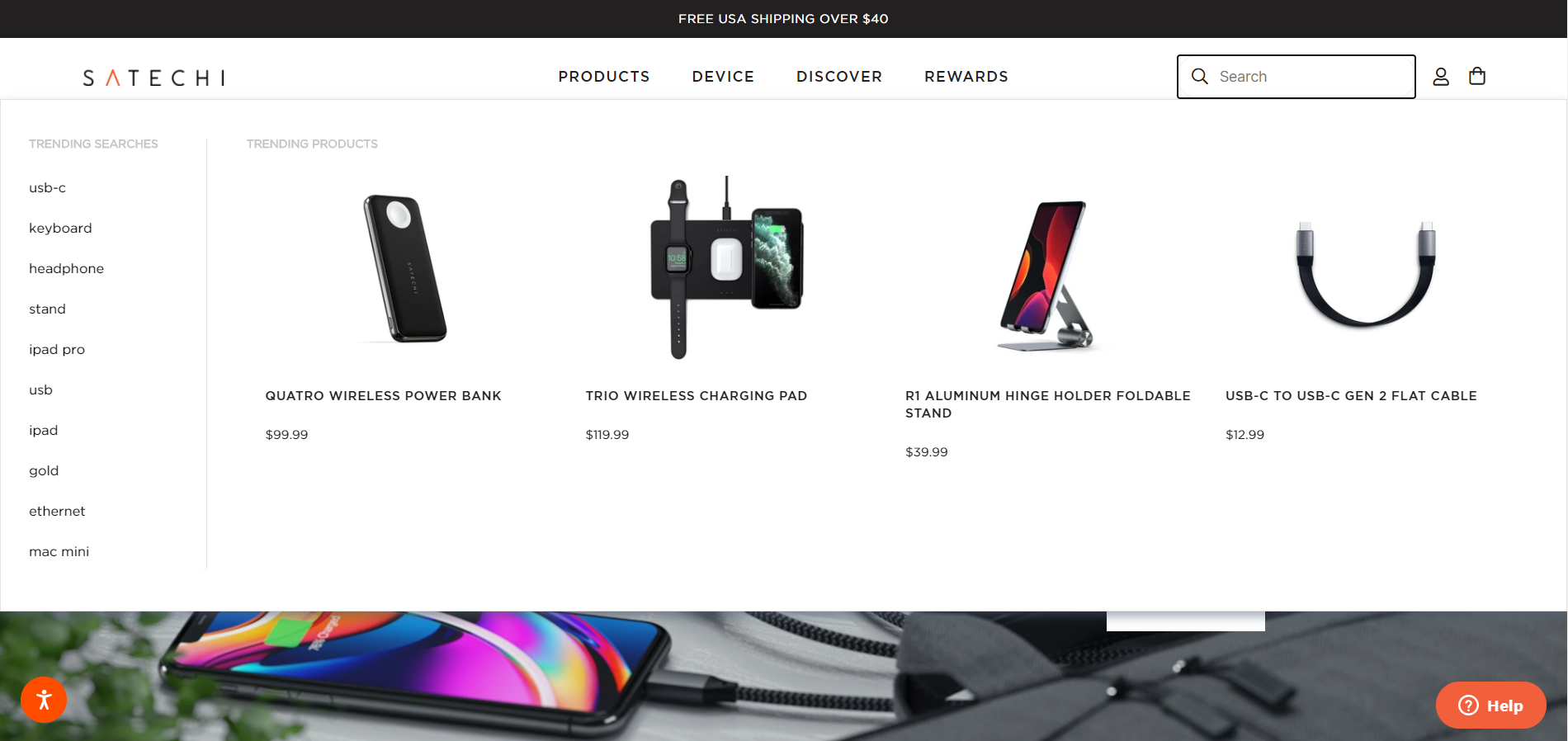
To start with, let's change the autocomplete's container to cover the whole width of the browser's window.
@media (min-width: 767px) {
  .findify-container.findify-autocomplete {
      width: 100%!important;
      left: 0!important;
  }

  .findify-layouts--autocomplete--dropdown {
    width: 100%!important;
  }
}
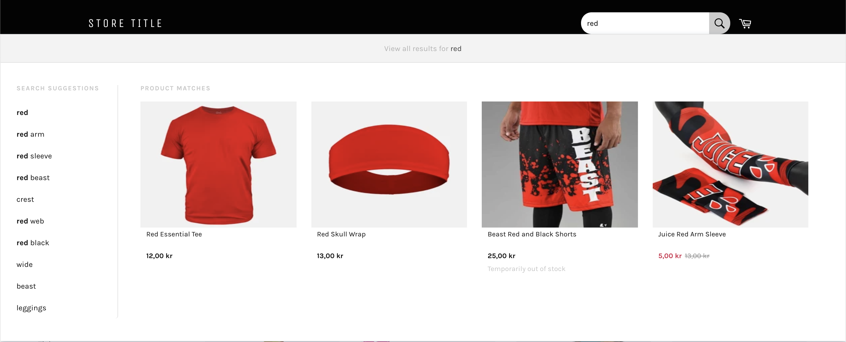
Now we can style the product cards the way we want them to be. The following example is kept very simple. It shows how to change the amount of products per row you would like to display in the product matches section as well as how to change the image source to use different sizes to improve their quality.
You can check the tabs below for further instructions, they include a few hints and descriptions.
// ... some code ...

<ItemsList
      wrapper={Grid}
			// adjust columns to display as many products per row as you'd like
			// e.g. 12/1 as a default setting  would display one product per row, 12/4 would display 4 products per row
      columns={String(12 / 4)}
      columnClass={theme.gridColumnClass}
      className={className}
      limit={config.getIn(['meta', 'item_limit'])}
      factory={(props) => productCardFactory({...props, columnClass, config, theme })}
      />

// ... some code ...
<Image
  className={classNames(theme.image)}
  // There are two aspectRatio settings, "0" would display the Image component as an actual <img> element, whereas "1" would use a <div> with a background image. For this example to work we will set aspectRatio to "0".
  aspectRatio={0}
  thumbnail={item.get('thumbnail_url')}
  // The autocomplete uses a thumbnail_url from the response. Here we can adjust the size of the image for a better quality. For example we could replace the default image size of "small" to be "233x233".
  src={item.get('image_url') || item.get('thumbnail_url').replace('_small', '_233x233')}
  alt={item.get('title')}
 />
/* let's remove this styles to not have a border bottom anymore */
@remove .findify-components-autocomplete--product-matches__grid-column-class:not(:last-child):after;

/* change the image to be displayed on top instead of next to the product description  */
.findify-components-autocomplete--product-matches__product-card .findify-components-autocomplete--product-matches__imageWrap {
    display: block;
}

/* remove width of the image so it will fill the container  */
.findify-components-autocomplete--product-matches__product-card .findify-components-autocomplete--product-matches__image {
    width: unset;
}

/* removes the padding of the product matches container */
.findify-layouts--autocomplete--dropdown__product-matches-container > .findify-components-autocomplete--product-matches {
    padding: 0;
}

/* add some padding to the product cards in the autocomplete */
.findify-components-autocomplete--product-matches__product-card {
  padding: 5px;
}
By now you would have a very basic example of the autocomplete using the full screen width, as you can see in the image below.

Additional Customization Ideas
Close Button

Components
Near the end of the following component we are going to add a container with a "x" that we can click on. For the onClick event we can use closeAutocomplete which is already a provided function within the component.
<div onClick={closeAutocomplete} class="findify-close-autocomplete">x</div>
Then we can provide some CSS as in the example below.
// ... some code ...

const AutocompleteDropdownView: React.SFC<IAutocompleteDropdownProps> = ({
  config,
  theme,
  meta,
  suggestions,
  position,
  innerRef,
  closeAutocomplete,
  ...rest
}: IAutocompleteDropdownProps) =>
<div display-if={suggestions && suggestions.size > 0} className={theme.wrapper}>
  <div className={theme.overlay} display-if={config.get('showOverlay')} onClick={closeAutocomplete}></div>
  <div
    className={theme.root}
    data-findify-autocomplete={true}
    tabIndex={0}
    ref={innerRef}
    style={{ [position]: 0 }}>
    // add <div> here
    <div onClick={closeAutocomplete} class="findify-close-autocomplete">x</div>
    <Tip
      className={theme.tip}
      title={config.getIn(['i18n', 'tipResults'])}
      widgetKey={config.get('widgetKey')} />
    <div className={theme.container}>
      <SearchOrZero
        theme={theme}
        meta={meta}
        config={config}
        suggestions={suggestions}
        {...rest} />
    </div>
  </div>
</div>

export default AutocompleteDropdownView;
.findify-close-autocomplete {
  position: absolute;
  right: 60px;
  top: 5px;
  font-size: 25px;
  cursor: pointer;
}
Updated almost 5 years ago
